University Press Coverage, July 2026
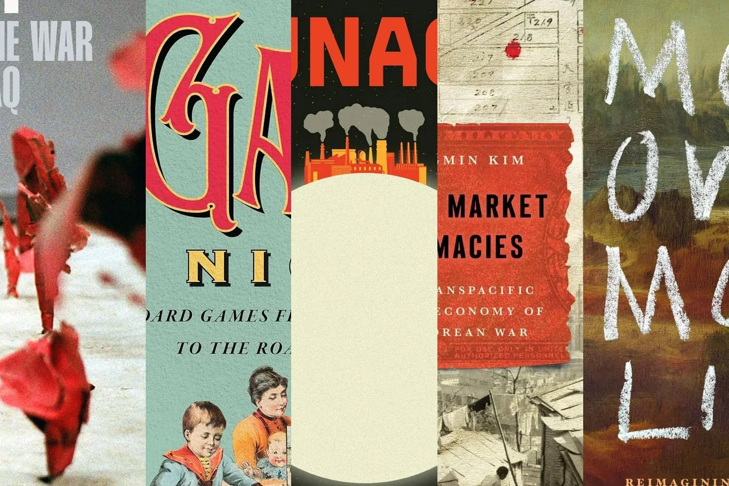
Welcome to our University Press Coverage — known as the Uni-Press Round-Up on the right side of the Pond — a ongoing feature in which we highlight, with commentary, a selection of university and academic cover designs published this month. Please enjoy this celebration of amazing work.
The selections are in alphabetical order by press. Where possible, credits are listed in the captions (often with links to the designers’ other work), and each cover includes a link to the university’s official page for that title.
As with all cover designs we feature, we encourage you to head to your local library, college or university library, or bookstore to view the works in their full splendor.

“From 1954 to 1991 in the Soviet Union, nearly forty thousand citizens were executed after the death penalty was reinstated as a punishment for homicide,” the description tell us, introducing us “to the many citizens in this period — women and men of all ages and backgrounds — who found themselves on death row and tried to escape it in the only way available to them: asking for forgiveness.”
Compelling enough to attract the unaware (which would be almost all, assumedly), and poignant once you understand: excellent.

Duke University Press. Cover design by Courtney Leigh Richardson; art director, Dave Rainey.
How do you “trace the story of how cis entered contemporary gender lexicons”?
How do you illustrate it?
With an “incisive yet playful eye,” as it turns out. One of those where the cover and the description just mesh — where, now that it’s done, you can’t imagine it being done differently.
Read more about this title. (A page which uses the term, “unplumbed archives,” an interesting choice.)
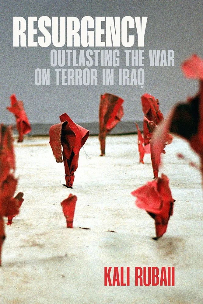
“Resurgency examines how Iraqi farmers outlast the long shadow of US military,” the description reads — but the plants in this image, at a glance, read as explosions. (Something the local famers would definitely like to outlast, along with “social and environmental fallout from toxic military waste, depleted ecosystems, and transformed political economies.”)
A visual double-entendre of the first order. But also one that introduces a truth both telling and terribly bleak: “Don’t be naïve: we are your future.”
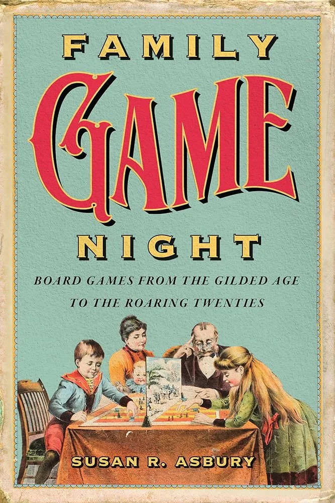
I saw something recently where an interior designer — houses, not books — used one end of a long-and-skinny living room not to add a second couch or TV setup, but instead as a games area. “There’s something you don’t see enough of anymore,” I said to myself, looking back through rose-color glasses.
As it turns out, that thought was more rosy than imagined. “Board game makers and marketers capitalized on leisure and family gathering trends by peddling a certain exclusionary brand of the American dream,” showing “how games incorporated and promoted concepts related to progress and abundance, including a clear delineation of the purported beneficiaries: white middle-class families.”
Of course, in order to be able to communicate that message in the text, the cover needs to lean into the warm and fuzzy — here accomplished with aplomb.
McGill-Queen’s University Press. Cover design by cover designer: Jeremey John Parker; art director: Elena Goranescu.
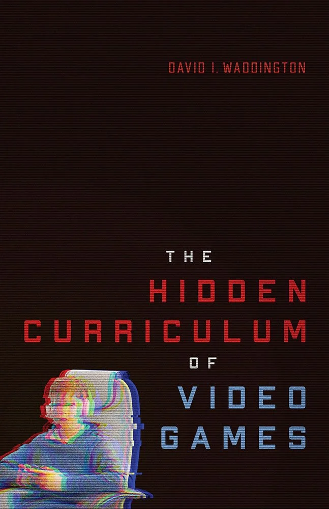
While we’re on the subject of games, let’s cover something more modern — and deal with a stereotype: “the real risk of video games lies not in their violent imagery but in the ethical and political sensibilities they normalize,” “contribut[ing] to a commitment to radical capitalism and a belief in highly individualistic worldviews.”
Chromatic shift together with CRT-style lines turn a small illustration against a black background into something quite a bit … more.
(Plus, I learned the word, “technolibertarian.”)

University of Nebraska Press. Cover design and art direction by Lindsey Welch.
From the “simply, elevated” department comes … a period photo and some text.
But elevated: a deceptively “normal” photo that belies the perfection of its choice; just the right amount of colorization; and, of course, the chef’s kiss that is the title container.*
Looking effortless is just one of those things: sometimes, you just “got it.”
*For those not in the U.S., the National Parks Service uses signs in this shape — wooden, hand-carved, often with a stone pillar — at park and national forest borders and entrances nationwide.
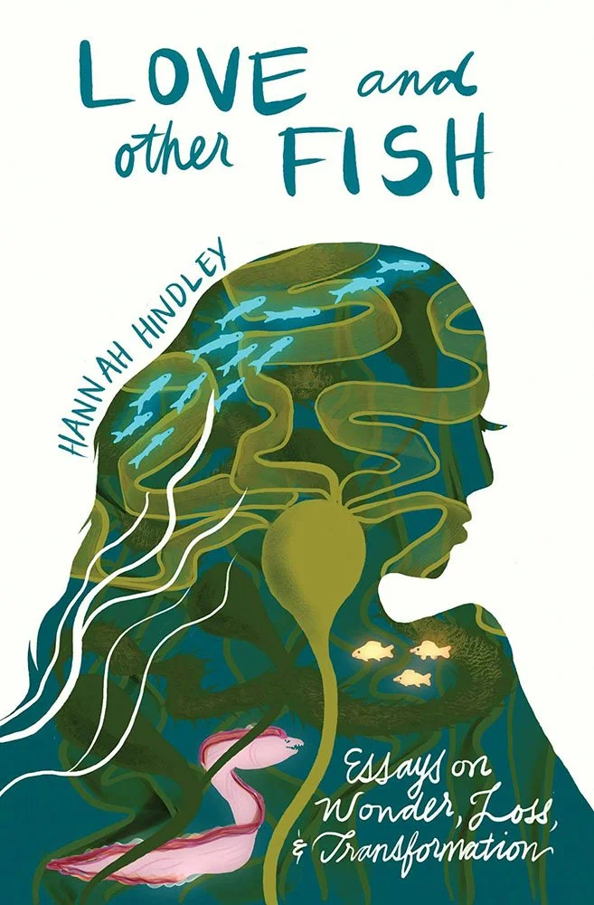
University of New Mexico Press. Cover design by Felicia Cedillos, with illustration by the author. Production manager, James Ayers.
A wilderness guides writes a collection of essays that “braid grief, science, and love so tenderly that the world itself feels newly textured.”
Okay, so there’s a brief.
You’ve got a great title, and, thankfully, the author is available to supply an awesome, interesting illustration. Pair it with another fantastic holding container and just the right style of hand lettering and … poof! A great cover.
(’Cause we all know it was just that simple.)

New York University Press. Cover design and art direction by Rachel Perkins.
“In the aftermath of the Holocaust, Eastern European survivors created yizker bikher — Yiddish for ‘memorial books’ — to honor their towns destroyed and loved ones murdered during the Second World War”; “these collaboratively-written volumes were one way for survivors to reclaim their lives and memories.” This title “recovers these largely forgotten volumes and repositions them as critically important sources that reveal the rich diversity of prewar Jewish life.”
That background is helpful to understand why this cover works on several levels.
But even with just the subtitle, here smartly leading the way, you’ve got enough to appreciate how well this works: a great intersection of type and illustration, the latter a digitally colored detail from the frontispiece of a yizker bukh — “fire” against an appropriately black background.
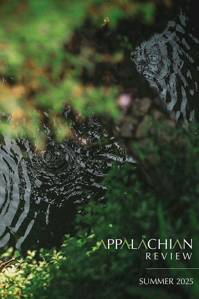
The University of North Carolina Press / Berea College (Kentucky).
A photograph that practically defines “soothing,” combined with the journal’s long-running logo, brings us something that’s elevated because of its simplicity.
Here’s the journal’s link at UNC, or visit its website. You can also explore its connection with the Loyal Jones Appalachian Center and find out more about Berea College, “A Little College Where Tuition is Free and Every Student is Given a Job” at The Atlantic magazine. (Or, if you’d prefer, the BBC.)

Oxford University Press.
There’s nothing about this that isn’t great: the colors, the components, the combinations. It even feels like something you’d see on stage.
Never mind that the title does the serious work of discussing “crucial parts of politically engaged popular entertainment” (to paraphrase) — the cover is a party we all want to attend.
You can read more about this title on the OUP website.

Princeton University Press. Cover design by Katie Osborne; art director, Jess Massabrook.
“If certain business titans, corporations, and governments have their way, humans will someday be living, working, and vacationing in space,” the description reads. “This is the much-vaunted New Space Age, and in Lunacy, philosopher Ben Bramble explains why it is a giant mistake.”
Possibly eclipsing the clever title is a great cover. From the scale of the factories to the implausibility of smoke rising into the lack of atmosphere, it’s an effective visual accompaniment to the myth-busting that eats false promises for launch.

Stanford University Press. Cover design by Lindy Kasler; art director, Michele Wetherbee. Cover art: Map of Kunitachi, Japan, National Archives and Records Administration; photograph of refugee dwellings in Busan, Korea, United Nations Archives; US military payment certificates note, US Army Finance Corps.
“She is meticulously attuned to the myriad stories of daily life during the Korean War but also exceptionally savvy about the international flows of goods, currencies, and power in the post World War II era, and her graceful prose and ability to traverse scales makes for a page-turner,” writes Nan Enstad in one of this title’s blurbs.
Quoted because it’s both brief and an effective summary. (In other words, a great blurb.)
The cover, however, asks questions. Illustrations and scripts combine in myriad ways; maps plot; and blood drops. Rather than telling you what the title is about, it suggests that it’s not easily summarized.
In all the right ways.

The cover art is simple: periodical clippings from the Iranian Jewish press, archived in the National Library of Israel and the National Library and Archives of Iran, digitally stacked with some text.
But it’s the how that unites us all in enjoying a great cover put together with skill and care.
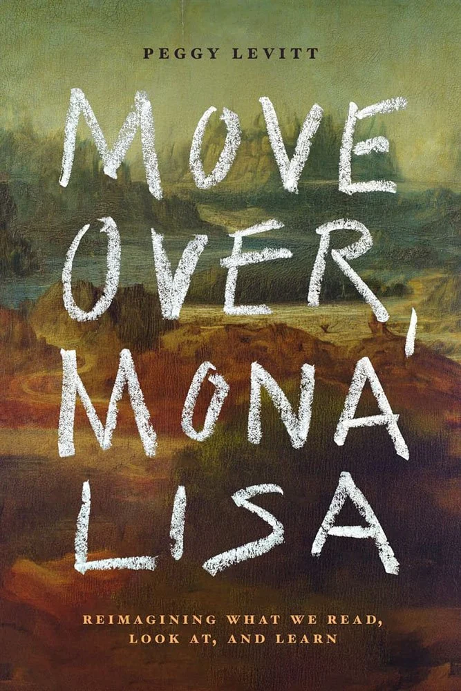
Stanford University Press. Cover design by Jan Šabach; art director, Michele Wetherbee.
This may just be a “digitally altered public domain image,” but when combined with the chalk-style title, it’s bold and demanding of your attention.
It’s also an interesting approach for a title that discusses how the traditional gatekeepers of art and publishing — even ideas — are being bypassed (“decentered cultural globalization”) because while it’s incredibly compelling, it’s also incredibly available: public domain + talent based anywhere.
Cover design in support of an argument. Nice.
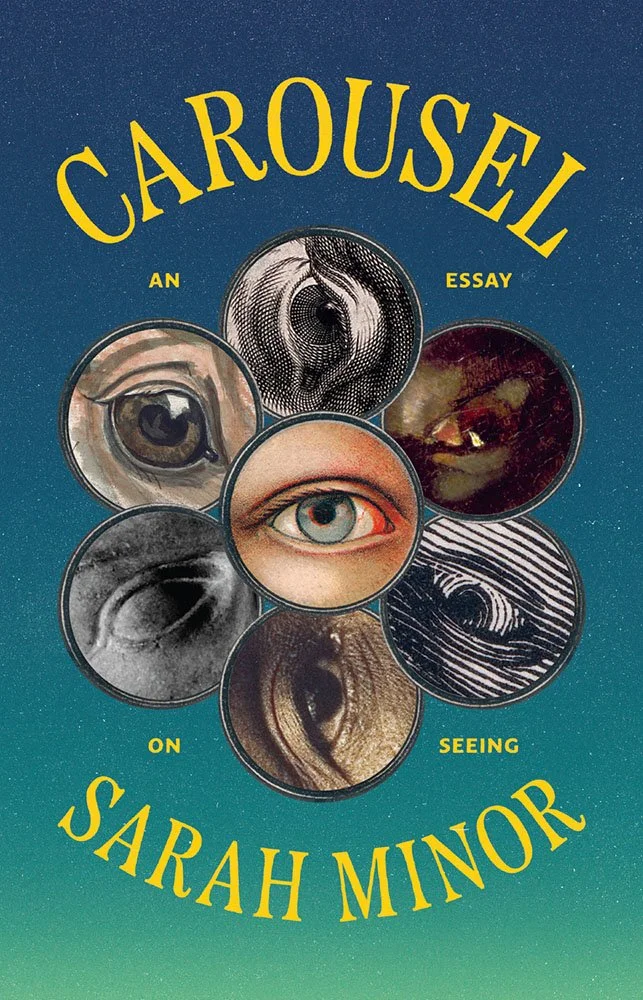
“The manuscript was one of the more unusual I’ve read and warranted an unusual design,” designer Vera Villanueva writes. “The editor wanted to feature a ring of eyes on the cover, and the author asked that the eyes be diverse in both kind and time period. I spent a lot of time searching through archival images to find a range of eyes, including that of a horse, a prominent motif in the book.”
It’s tempting to resort to “eye-catching,” but I wouldn’t do that to you, dear reader.
“An Essay on Seeing,” however, seems to be just right: a subtitle, yes, but also praise for the design.
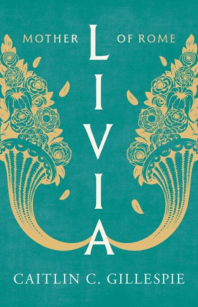
Yale University Press. Cover design by Kathleen Lynch, Black Kat Design; art director, Dustin Kilgore.
Special callout for the vertical title!
The blue/green is fantastic. The illustrations are great, too, especially the way they tuck into the “A,” so to speak, with bonus points for the slightly different leaves.
Are you a book cover creative, art director, or publicist? If you want your work, or the work of your press, to be reviewed be sure to get in touch with us.
Please include the cover designer’s name, the art director’s name, any additional details like illustrator or photography credits, and the publication date. (Yet-to-be-published titles are welcome, with embargo dates if applicable.) Images should measure 1200-1500px on the long side, preferably in JPG format and the sRGB color space.
We look forward to featuring your work soon!

A freelance designer and photographer, Giles has been writing about book design for nearly thirty years. During his spare time, he walks, explores architecture, and enjoys music on a great stereo. He lives in Middle Georgia with a dog and cat.