University Press Coverage, October 2026
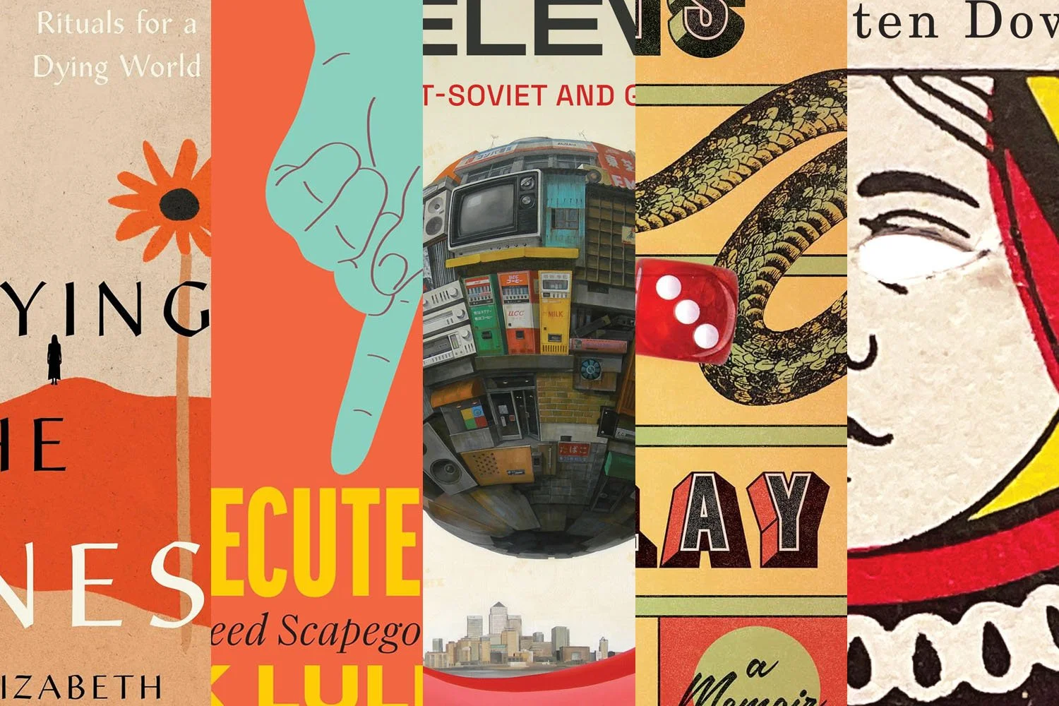
Welcome to our University Press Coverage — known as the Uni-Press Round-Up on the right side of the Pond — a ongoing feature in which we highlight, with commentary, a selection of university and academic cover designs published this month. Please enjoy this celebration of amazing work.
The selections are in alphabetical order by press. Where possible, credits are listed in the captions (often with links to the designers’ other work), and each cover includes a link to the university’s official page for that title.
As with all designs we feature, we encourage you to head to your local library, college or university library, or bookstore to view the works in their full splendor.

University of California Press. Cover design by Lia Tjandra. Illustration, “Elizabeth Kelley Presents Sounds & Visions: A Celebration of Music, Dancing and Optimism for the 80s,” William “Will” Noffke Papers, GTU 2001-8-01, Graduate Theological Union Archives, Berkeley, CA.
Take your own journey, “traveling to unexpected spaces of creation and listening,” tracing the history of New Age: “tracing back to the spiritual exploration of the 1970s, when a cohort of musicians created cosmic soundscapes sparkling with the afterglow of ecstatic spiritual revelations, psychedelic experiences, near-death encounters, and meditative practices.”
This could have been a rehash — pardon the expression — of last month’s Trip Report, but instead, the designers have chosen fire an arrow in the direction of art deco. The results are both more casual (“sketchy,” in the best meaning of the word) and more formal (subject and typography) than expected.

Cornell University Press. Cover design by David Fassett. Illustration, Air Force Technical Order (TO) 1F-86F-1, Flight Handbook USAF Series F-86F Aircraft. March 29, 1957.
This “examination of the US use of airpower to prevent the expansion of communism in southeast Asia during the Cold War” looks at “diplomats in flight suits” and their role in “building bilateral agreements of mutual interest as a means of great power competition.”
The combination of USAF illustration and aged photograph, together with US colors, take disparate pieces and put them together in a way that work well together, while the fighter’s distinctive nose with its six guns is offset the “friendly” nature of the mid-century-style illustration. The inclusion of the “handshaking wings” insignia, apparently from the nations’ force exercises, is the perfect capper.
Full disclosure: Cornell UP is a former client; the AD I was hired by left, and I haven’t worked with them in a long while. Like all items that appear in this column, the cover was selected on merit.

Duke University Press. Cover design by Matthew Tauch with calligraphy by Md. Zahid Hasan; art director, Dave Rainey.
“According to Islamic tradition, God has at least ninety-nine names,” the description says. But it’s the flower on the cover — a mosaic of script, best described as a “calligraphic gift” — that catapults this to the fore. Combined with a simple and classic title treatment, only one characterization is needed: brilliant.
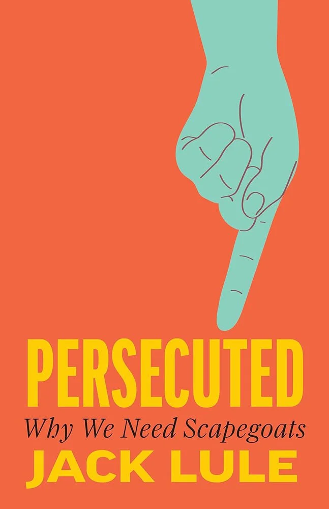
Johns Hopkins University Press.
Arguing that “scapegoating as essential to human society,” the title “helps explain how and why people unite, shaping the ways groups define belonging, exclusion, and collective identity.”
Taking the most elemental part of that — literal finger-pointing — is a great choice; using colors that avoid suggesting conclusions to the potential reader, together with a interesting arrangement, add up to a compelling case that an unpopular idea might be worth exploring.
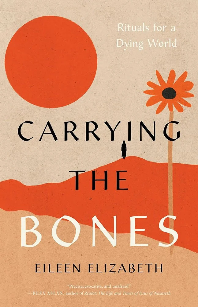
University Press of Kentucky. Cover design by Kat Lynch; art director, Laura Hohman.
“Eileen Elizabeth explores how grief can be more than private sorrow—it can become an artistic, communal, and ecological practice,” the description tell us, “empower[ing] individuals … to craft new rites of remembrance.”
Designer Kat Lynch has crafted with care here, using texture, shape and color to compel interest. (The type is especially awesome.) One of those titles where, after either a ton of work or a stroke of genius — perhaps a little of both — a not-simple brief turns into a deceptively-simple solution.

Essays “so compassionately about being human,” one blurb reads.
But the cover: a combination of elements that evoke games, sure, but with a level of sophistication that reads as the opposite of game-play; having “a memoir” as a landing area — a destination — defines awesome. And then there are the dice, whose shadows are so good, I’d swear they are a practical effect.
Vrana sprinted past “go” on this one.
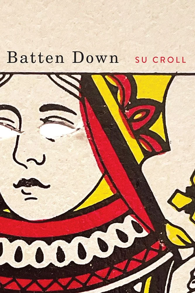
McGill-Queens University Press. Cover design by David Drummond; art director, Elena Goranescu.
Verse that “rages across landscapes”: Here / is where we ride out our grievance-parade / and endless he-said she-said teetering / arguments in this world of dizzying / bumper car days
“Yes, I used a perfectly good playing card for this,” designer David Drummond writes. ”I put it back in the pack and the next time someone plays a card game someone will wonder what happened to it.”

MIT Press. Cover design by Margarita “Marge” Encomienda.
The brief went like this: the "cover should have quite large, simple typeface that can be read from a distance. Less busy backgrounds and fewer colors are generally preferred."
To say that the designer took the brief and ran with it is an understatement — it’s exponential.

University of New South Wales Press / NewSouth Books. Cover design by Mika Tabata; art, Noel McKenna.
“A masterful novella about the importance of animals in language and life,” the description reads, a “homage to the exquisite sadness of Chekhov’s famous short story.”
This short title needed something both bespoke and moving. Noel McKenna’s art rises to the occasion in a spare manner astonishingly filled with emotion.

New York University Press. Cover design by Anna Becker; art director, Rachel Perkins.
A “story about movement — through space, emotion, and identity,” this title works to both examine and dispel stereotype as part of a 50-state quest, navigating “the trail by reflecting on what it means to be a runner and what it means to be a Black runner.”
Another from the not-easy-to-summarize-visually department, done well.
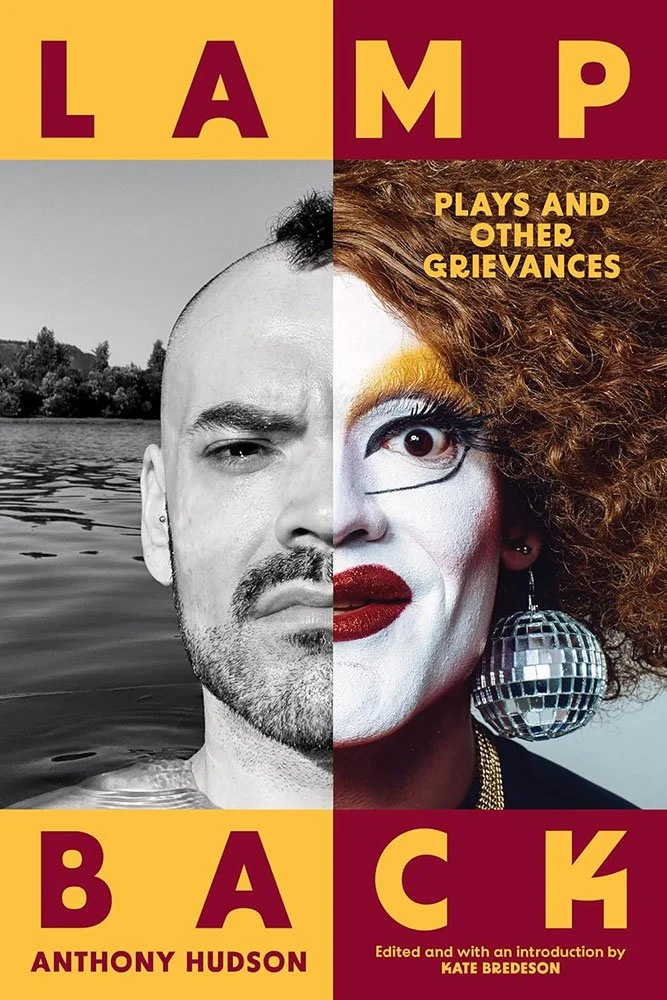
Northwestern University Press.
Portland, Oregon’s “premier drag clown,” Carla Rossi, together with her “quieter“ side, queer Indigenous artist and agitator and Anthony Hudson, don’t need anything other than this awesome split screen the sell this title — while the colors and type star as A-list support cast, to everyone’s benefit.
Kudos also to the editorial team for a superlative subtitle.
Read more about this title (including several laugh-out-loud blurbs).

University of Regina Press.
It’s no secret that I’m a sucker for a beautifully-done cover utilizing old-style maps or illustrations, but this one does it better than most — as it should: “both a history and a reclamation,” the title is an extraordinary First Nation documentation of a 150-year-long struggle all too common in the Americas.
What started with a sacred covenant deserves nothing less.

Great title type perfectly compliments the amazing artistry of Masakatsu Sashie, whose “futuristic floating urban orbs” are described by designboom as, “notions of destruction and abandonment in an anti-utopian futurescape — [including] a city-like sphere which seems to levitate above a failed civilization.”
One that could — and indeed, might very well — read as “post-global.”
Just sayin’.

West Virginia University Press.
There was a time where I would have objected to a hyphen in a title as used here, but the benefits gained from the size and weight of the title far outstrip any old-fashioned qualms. Combined with its placement over and behind the house in the dust-bowl-era photograph, it elevates, even demands.

Yale University Press. Cover design by Henry Sene Yee; art director, Dustin Kilgore.
Harold Cruse, “the activist who never finished high school became a tenured college professor, a founder of the field of Black Studies, and a mentor to countless student activists,” has largely “faded from view;” this “sympathetic biography” strives to remind the world of his influential work.
The photographs utilized on the cover paint a picture more poignant than “fast-paced,” but that picture definitely lives up to the “passionate, brilliant, strange, and visionary” life within. Special mention for the vertical title, which serves to highlight the angst in that particular portrait.
Are you a book cover creative, art director, or publicist? If you want your work, or the work of your press, to be reviewed be sure to get in touch with us.
Please include the cover designer’s name, the art director’s name, any additional details like illustrator or photography credits, and the publication date. (Yet-to-be-published titles are welcome, with embargo dates if applicable.) Images should measure 1200-1500px on the long side, preferably in JPG format and the sRGB color space.
We look forward to featuring your work soon!

A freelance designer and photographer, Giles has been writing about book design for nearly thirty years. During his spare time, he walks, explores architecture, and enjoys music on a great stereo. He lives in Middle Georgia with a dog and cat.