University Press Coverage, September 2026
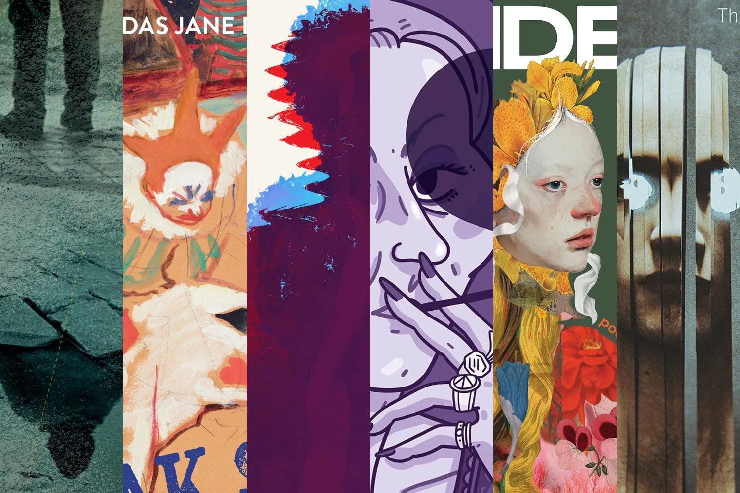
Welcome to our University Press Coverage — known as the Uni-Press Round-Up on the right side of the Pond — a ongoing feature in which we highlight, with commentary, a selection of university and academic cover designs published this month. Please enjoy this celebration of amazing work.
The selections are in alphabetical order by press. Where possible, credits are listed in the captions (often with links to the designers’ other work), and each cover includes a link to the university’s official page for that title.
As with all designs we feature, we encourage you to head to your local library, college or university library, or bookstore to view the works in their full splendor.
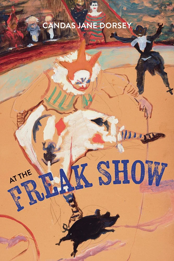
University of Calgary Press. Cover design by Melina Cusano. Artwork: At the Circus Fernando: Medrano with a Piglet by Henri de Toulouse-Lautrec, ~1889.
The belle époque artwork was selected for its “movement and playfulness,” reflective of the title in all the right ways.
At least, one assumes: it’s the story of the lone survivor of a catastrophic attempt to separate conjoined twins, and a life of success, trials, and what could have been. (If only I had the ability — let alone the time — the read titles before highlighting their covers.)
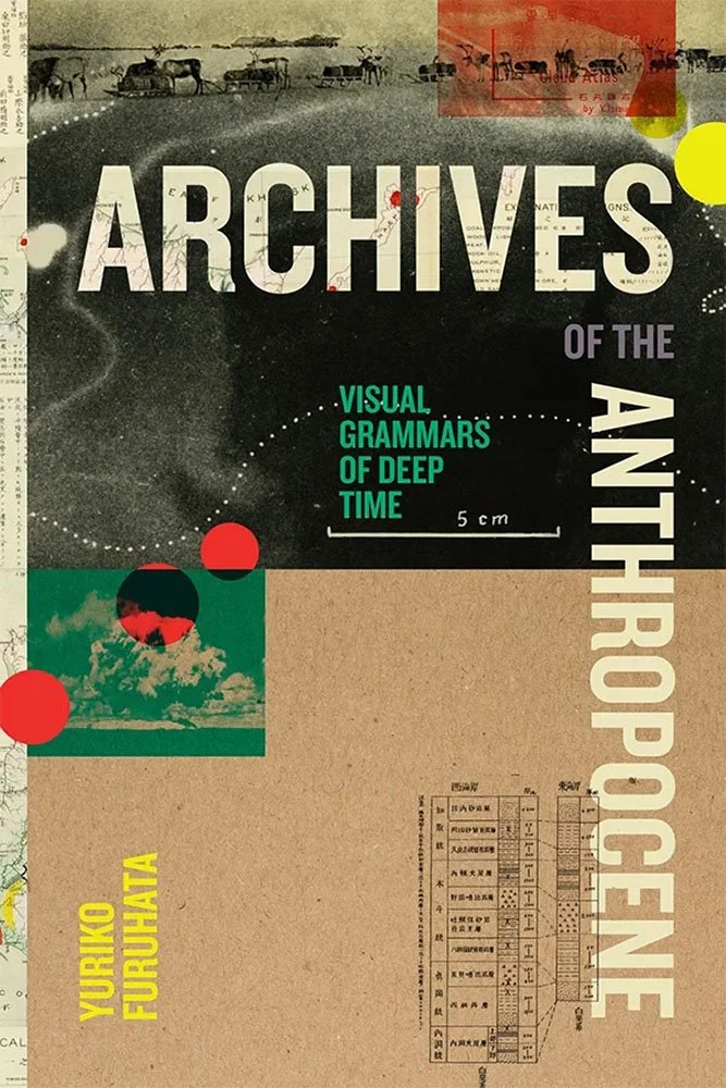
Duke University Press. Cover design by Courtney L. Baker; art director, Dave Rainey. Cover art: (Collage of images, top to bottom): cover of Ishimaru Yūkichi’s Cloud Atlas (Kumo no shashin to zukai); colonial postcard of a dogsled and a reindeer sled from the northern colony of Karafuto on the island of Sakhalin; radioautograph of a giant clam from Bikini Atoll; mushroom cloud above Bikini Atoll (1946); stratigraphic columns in Shōwa jūichi nen do yuden chishitsu chōsa hōkoku [the geological survey report on oil elds] (1938). (Background) Benjamin Smith Lyman, A Geological Sketch Map of the Island of Yesso, Japan (1876).
Okay, that’s a list of credits — included to show the level of thought that went into this design. As collages go, this one has it all, and more.
“[B]rilliantly pulls media studies into site-specificity by re-framing questions of empire, extractivism, histories of science, and of ‘the archive’ in one sweep,” one review reads.
“Covered exactly right,” this review concurs.
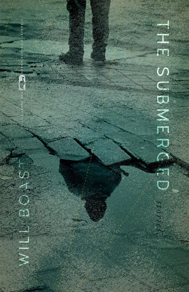
Ten “unforgettable portraits of those forced into exile and those who choose it themselves,” perfectly illustrated, complimented with a title overlay that’s anything but sidelined, “stories” peeking out from the pavement, subtle dashes that may or may not indicate direction, and an incredibly-well-integrated award call-out.

I’m a sucker for simple covers done in a style that is — or could be — practical photography. (Admittedly, it’s relatively easy to approximate these days.) But no matter how the cover image got there, it has that realistic quality.
It’s also one of Drummond’s specialties — see also The Book of Malcom, as one of many, in this style on his site. This soothing blue features often, as well.
Either way: ladled goodness that isn’t at all wooden.
Parenthetically, the title’s not just about food. It’s a “compendium of culinary, medicinal, and domestic recipes from before 1800,” including, for instance, waterproofing a coat.

“Throughout twentieth- and twenty-first century Ukraine, letters were lifelines. Under two of history’s most repressive regimes – Soviet Russia and Nazi Germany – Ukrainians wrote to sustain family ties, affirm identity, and resist erasure, even as every word passed through the machinery of surveillance and censorship.”
Okay, I might have altered that quote a little.
In the U.S., at least, stumbling from crisis to crisis has meant that waving the Ukrainian flag has slipped out of the public consciousness. That’s a tragedy. (Apologies for editorializing.)
Meanwhile, the cover’s great, too: part letter, part title page, all good.
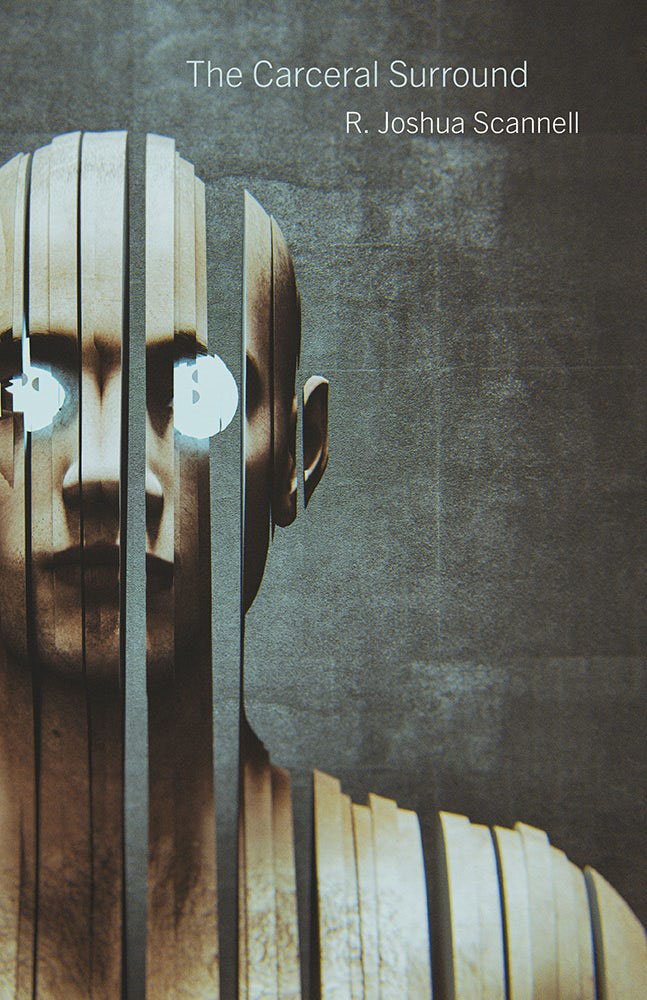
Art director Rachel Moeller writes, “Martyn was aiming for a design that was both disorienting and slightly horrific, one whose unsettling vibe immediately conveys the idea of being watched, the panopticon, the insidiousness of quelling dissent and targeting individuals.”
Nailed.
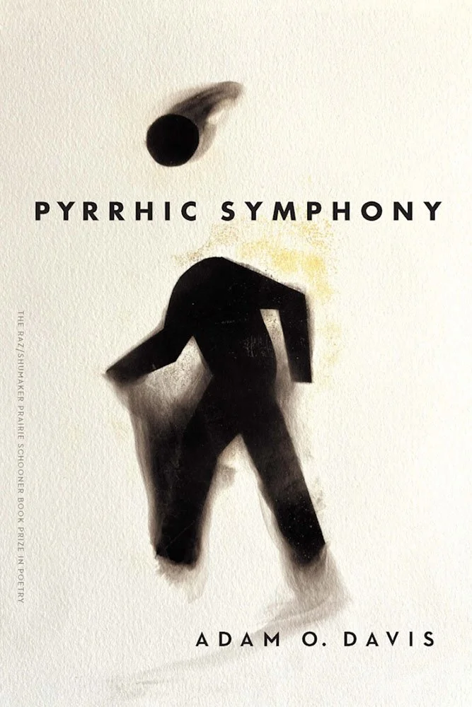
University of Nebraska Press. Cover design by Andrea Shahan.
“In Pyrrhic Symphony, the speaker asks, ‘Should a poem be the pill or the pharmacy?’ And the book replies: Why not both?”
A better description of the poems within cover could not be immediately located.
The second cover where an award is tastefully included rather than stamped all over the design. Kudos.
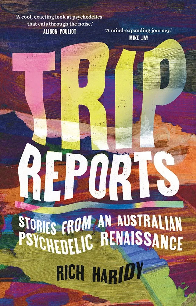
A “deep dive into the experimental science and treatments happening across Australia and the world, from the little-known history of psychedelic use in medicine in 1960s Melbourne to the latest science on the impacts of microdosing (or lack thereof) and new models for psychedelic therapies,” the description reads.
No discussion of what mind-altering substances (or lack thereof) went into the cover design. Shucks.
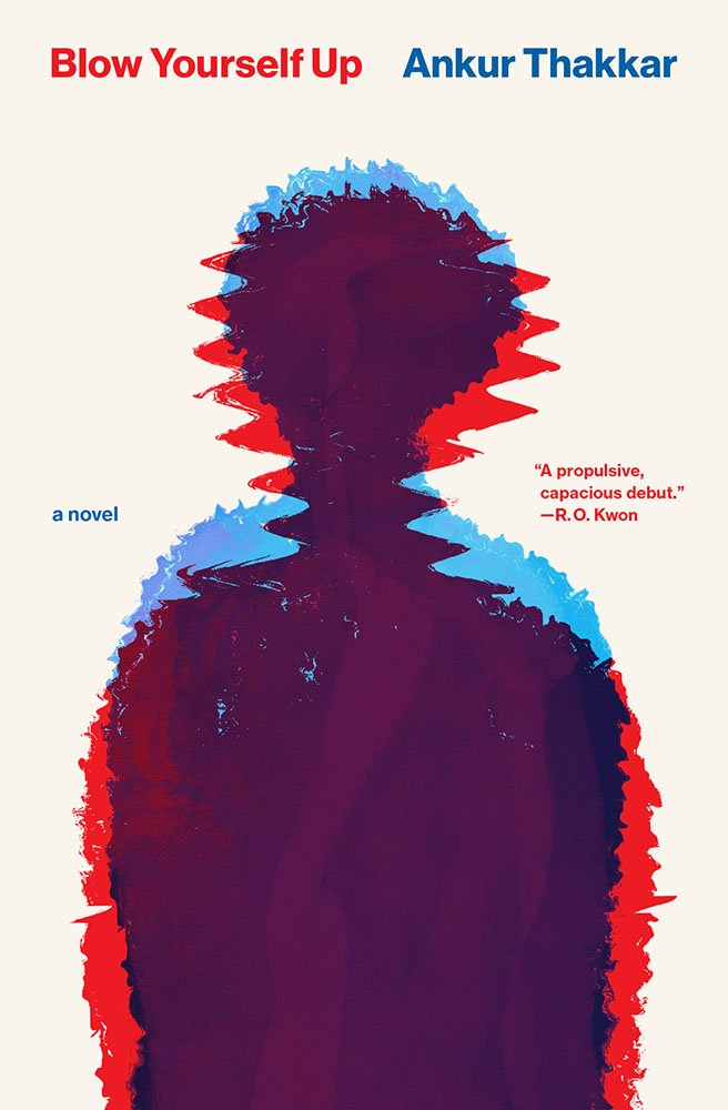
“The novel has two main characters that are very much online,” designer Matt Avery writes. “But we didn’t want any overt references to social media or the internet. […] Are we seeing two people? One person transmogrifying? Or a digital will-o’-the-wisp?” “I couldn’t have dreamt it up myself, but it felt so right,” the author agrees.
Read the rest of the interview (and cover reveal) at Electric Lit, a link provided by Northwestern publicity, or read more about the title on Northwestern’s site.

Brilliant illustration complimented by an appropriately great title and color treatments.
Matteo’s other works include Manhattan Unfurled, a 24-foot-long, two-year illustration effort, London Unfurled, at 26 feet — insert joke here — and the interestingly-named Laboratory of Literary Architecture:
How many times have we paused while reading a book and had the feeling that we were inside a structure built, knowingly or unknowingly, by the writer? Not simply imagining the locations and architectural settings described in the text, but rather sensing our being immersed in a space, a literary space, designed by someone else.
The Laboratory of Literary Architecture is a cross-disciplinary exploration of narrative and space.
He’s certainly qualified to ask. Visit LabLitArch, or read more about Fire in the Heart of the City.

Ohio State University Press. Cover design by Brad Norr Design; art director, Juliet Williams. Illustration by Maria Stoian.
The “2020s UK has proved fertile ground for ‘gender-critical’ feminism,” the description says with an understatement about as subtle as the cover — which could be best described as, “a riot.”
Better still, Norr’s found the perfect way to overlay a title on the amazing illustration. Not a surprise, really — if you look through his portfolio, “quiet” is not the first thing that springs to mind.

A “renowned folk saint and religious healer in northern Mexico and the US borderlands in the 1890s,” Teresa Urrea was never officially canonized — despite many believing that she “possessed miraculous powers — thousands of pilgrims sought out her cures and divine intervention.”
Urrea died of tuberculosis at 33.
The title “reflect on her politics in relation to her spirituality, foregrounding what Urrea herself took most seriously in life,” with the cover depicting her with what’s about as close to a halo as should be.
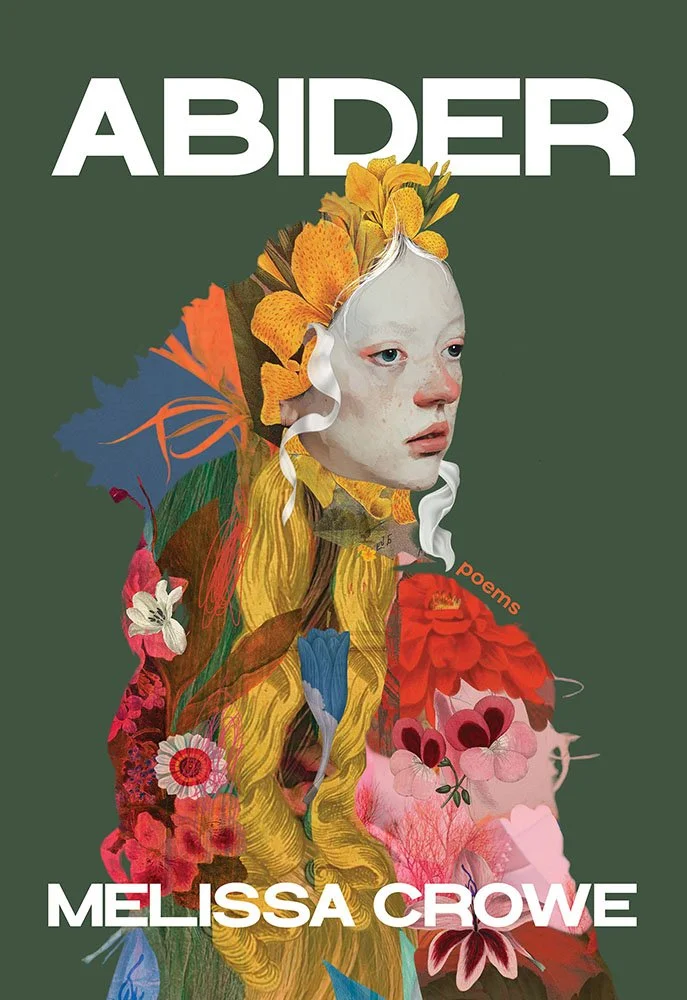
“The author wanted a cover that balanced the light and dark elements of the book, one that wasn't cheerful, but didn't depict despair,” writes Pitt publicity’s Lesley Rains. They found the perfect way to do that with an amazingly additive artwork from Sarah Jarrett, who “hope[s] to transport you to a world that is enchanting and mysterious.”
It does that, and more.
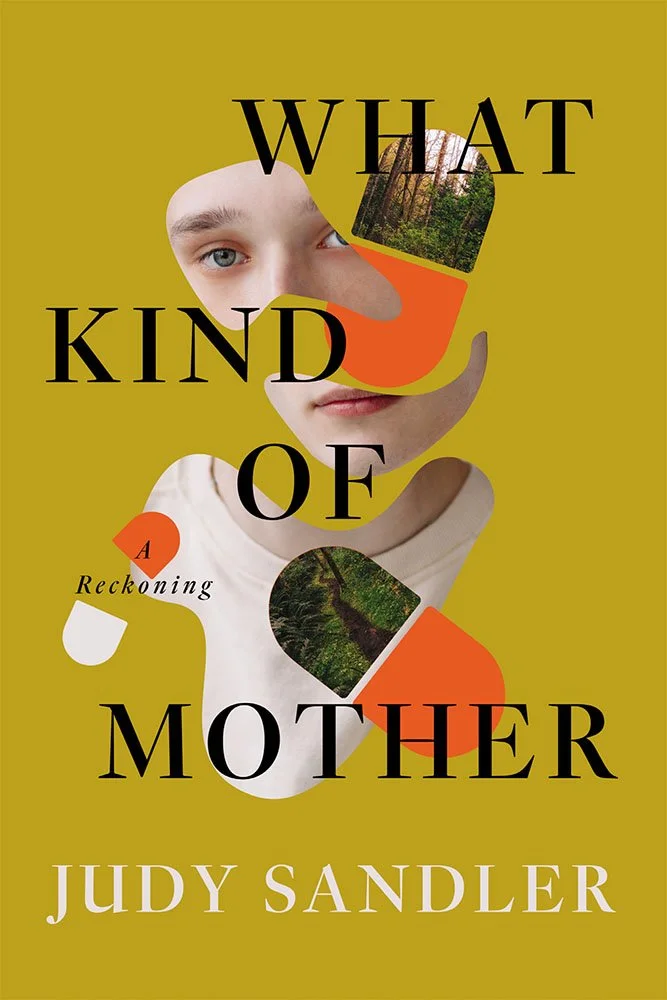
“In the memoir What Kind of Mother,” designer Zoe Norvell writes, “a mother reflects on and reckons with her son’s addiction. After abusing pills, her son spent time at an alternative, natural ‘facility’ in the north east, in lieu of receiving a proper medical diagnosis. This experience only exacerbated his problems.
“With this in mind, I explored imagery of a young man (the son), an older woman (the mother), a forest, and pills. The concepts featuring the mother were tricky to land: because this is a memoir about a real person, using stock imagery to represent her felt undesirable. Ultimately, the author and team gravitated toward depicting the son instead.
“In the final cover, his face is disjointed and swirls among pills that also contain glimpses of the forest, visually suggesting that he has lost his way. We kept the mustardy ochre background to contrast with the green of the forest and because it’s a color we don’t often see on book covers, helping the design stand out.”
Zoe, if you’re not familiar, is the founder of INeedABookCover.com.

“Brooks radically exposes us to the hidden queerness of Georgian and Victorian science,” the description reads. This “iconoclastic history” shows a reality “far more messy and ambiguous,” “the heart of evolutionists’ thinking about the natural world.”
Best use of a rainbow gradient I’ve seen in a long while; the asymmetric moth, a gynandromorph gypsy illustrated in 1877, is the perfect accompaniment.
Originally published in August by Yale London — hence the single quotes on the cover — and out this month in the US. Read more about this title.
Are you a book cover creative, art director, or publicist? If you want your work, or the work of your press, to be reviewed be sure to get in touch with us.
Please include the cover designer’s name, the art director’s name, any additional details like illustrator or photography credits, and the publication date. (Yet-to-be-published titles are welcome, with embargo dates if applicable.) Images should measure 1200-1500px on the long side, preferably in JPG format and the sRGB color space.
We look forward to featuring your work soon!
A freelance designer and photographer, Giles has been writing about book design for nearly thirty years. During his spare time, he walks, explores architecture, and enjoys music on a great stereo. He lives in Middle Georgia with a dog and cat.