University Press Coverage, August 2026
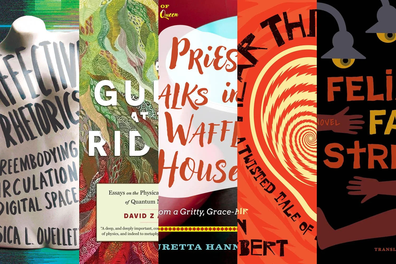
Welcome to our University Press Coverage — known as the Uni-Press Round-Up on the right side of the Pond — a ongoing feature in which we highlight, with commentary, a selection of university and academic cover designs published this month. Please enjoy this celebration of amazing work.
The selections are in alphabetical order by press. Where possible, credits are listed in the captions (often with links to the designers’ other work), and each cover includes a link to the university’s official page for that title.
As with all cover designs we feature, we encourage you to head to your local library, college or university library, or bookstore to view the works in their full splendor.
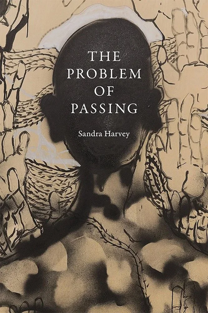
Duke University Press. Cover design by Mattson Gallagher; art director, Dave Rainey. Cover art, Not Stuck in a Briar Patch, by William Downs, 2021. Ink and spray paint on wood panel, 36 × 28 in. Courtesy of the artist and Derek Eller Gallery, New York. Photographed by Terrell Clark.
“[B]rings light to new ways of thinking about subjects as diverse as Black Lives Matter Movements to colonial studies and philosophy as ‘passing zones’ that seek to further eradicate the rights of Black, Indigenous and ‘othered’ subjects,” one review says.
A simple title and author treatment gets out of the way here, allowing the viewer to take a minute enjoying a deceptively simple work of art — one that will speak to you on more levels the more time spent with it.
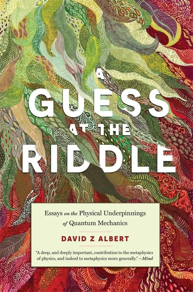
Harvard University Press.
The first of two layered-paper-style covers. This one’s a digital interpretation, with incredibly rich colors and complexity appropriate for the subject, with a beautifully-interleaved title and a simple holding area for supplementary information.
It’s a shame that “meta” has been co-opted, as it would be an excellent summary of this design; when an “an objective, realistic, and mechanical picture” isn’t available, this’ll do very nicely indeed.

Johns Hopkins University Press.
The second layered-paper cover is a more literal interpretation of the style, done in a simple yet surprisingly compelling way. The title argues that, “the future of education will depend on how well families and institutions balance flexibility with connection,” without “advocating for a single solution”; by presenting this with an approachable title and friendly artwork, it’s more likely to find an audience.
One that, in this country at least, needs some finding. (Not that I editorialize.)

University of Louisiana Press.
A musician’s hearing turns against him, and dark comedy, medical mystery, and psychological thrillers ensue — here perfectly illustrated.

Corporate pursuits conflict with a colonial power: you know it isn’t the people’s interests being served. The beautiful Pacific landscape is represented here as halftones threatening to moiré, with mining titles literally scraping paradise back to reveal … nickel.
Sometimes, a literal representation works best.

We’ll set aside, for the moment, which flavor of grits the author prefers — this “cheeky spiritual memoir with an audacious message of hope” has a cover that actually manages to live up to the great title — as American diners do, heavy on color, light on “substance” … but darned if you don’t leave satisfied.
Okay, moment over: Country. Smothered, chunked, and covered, please. Thanks.
Full disclosure: Mercer University and this column’s author are both located in Macon, Georgia. There is no affiliation.

University of Minnesota Press. Cover design by Sandra Friesen; art director, Rachel Moeller. Cover art: glass model of Passiflora laurifolia by Leopold and Rudolf Blaschka, 1893.
“The author explores three nineteenth-century efforts to immortalize the fleeting moment in this title,” writes art director Rachel Moeller. “One of these, the hyper-realistic Blaschka glass flowers, felt like the ideal image to highlight on the cover. A gorgeous typeface, with echoes of the nineteenth century and yet utterly contemporary, nestles into the flower's leaves. The ‘perfect’ cover for this fascinating book."
Going to call out color on this, too; rather than the painterly background so on-trend, the black here allows nature’s colors to shine.

University Press of Mississippi. Cover design by Cassie Winship.
Sometimes, the “features” speak loudest through their absence.
Another where color takes center stage, to a standing ovation.

University of Nebraska Press. Cover design by Ashley Muehlbauer; designer-compositor, Andrea Shahan.
“The quiet details of a life inside the imperative distance,” expressed brilliantly.

New York University Press. Cover design — and cross stitch — by Sally Rinehart; art director, Rachel Perkins.
“Fraying of society,” writ large: I especially appreciate the resemblance to running tears. And if you step back, the comfort of the choice of medium — the cross-stitch — is the perfect foil to “panicky public discourse about family estrangement as a trendy moral failing.”
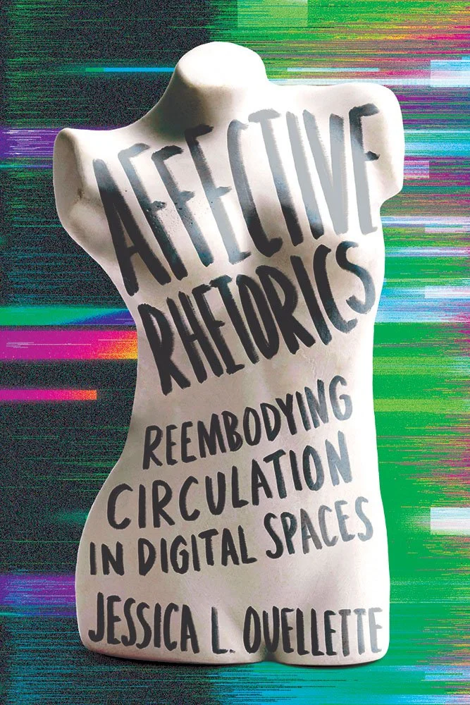
“In March 2013, nineteen-year-old Tunisian citizen Amina Sboui posted photographs on social media — topless with feminist slogans written on her chest — in response to policies curtailing women's rights,” the description reads. “Her post sparked a series of events that would become the subject of news articles, blogs, and social media posts around the globe. As the images and commentary circulated, so too did bodily rhetorics.”
One of those where simple ingredients create a dish of extraordinary merit.
“Reembodying,” by the way, is a new-to-me synonym of “treatment,” and there just has to be a bonus point or three for the placement of the “V.”
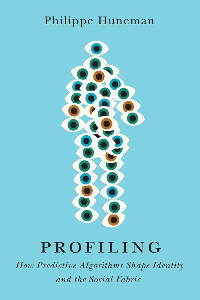
I refuse to suggest that, when confronted regarding the deliciously over-the-top nature of this concept, Drummond shrugged and said, “Flock it.”
Laughter and tears are, sometimes, too close for comfort.

The leitmotif — a recurring theme — is on full display, using the cover to echo the text. But instead of a joke (“two incompetent police officers stand over a body”) it’s treated as an art form, from the streetlights to the body parts to the occasionally-supernatural blackness, without and within.
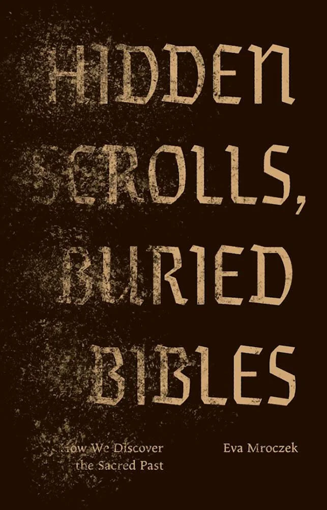
“The author suggested mysterious cave or desert imagery for the book cover,” designer Vera Villanueva writes. “I spent a day exploring different directions, though none felt quite right. On the train home from work, I looked up ‘desert music’ on a whim. The picture that came to me as the first notes played was of sand blowing through the air. I knew immediately that would be the idea behind the final design.”
Trains are good for the soul.
Are you a book cover creative, art director, or publicist? If you want your work, or the work of your press, to be reviewed be sure to get in touch with us.
Please include the cover designer’s name, the art director’s name, any additional details like illustrator or photography credits, and the publication date. (Yet-to-be-published titles are welcome, with embargo dates if applicable.) Images should measure 1200-1500px on the long side, preferably in JPG format and the sRGB color space.
We look forward to featuring your work soon!
A freelance designer and photographer, Giles has been writing about book design for nearly thirty years. During his spare time, he walks, explores architecture, and enjoys music on a great stereo. He lives in Middle Georgia with a dog and cat.