“Insert (Y/N) Here”: Universality and Anonymity on Modern Romance Covers
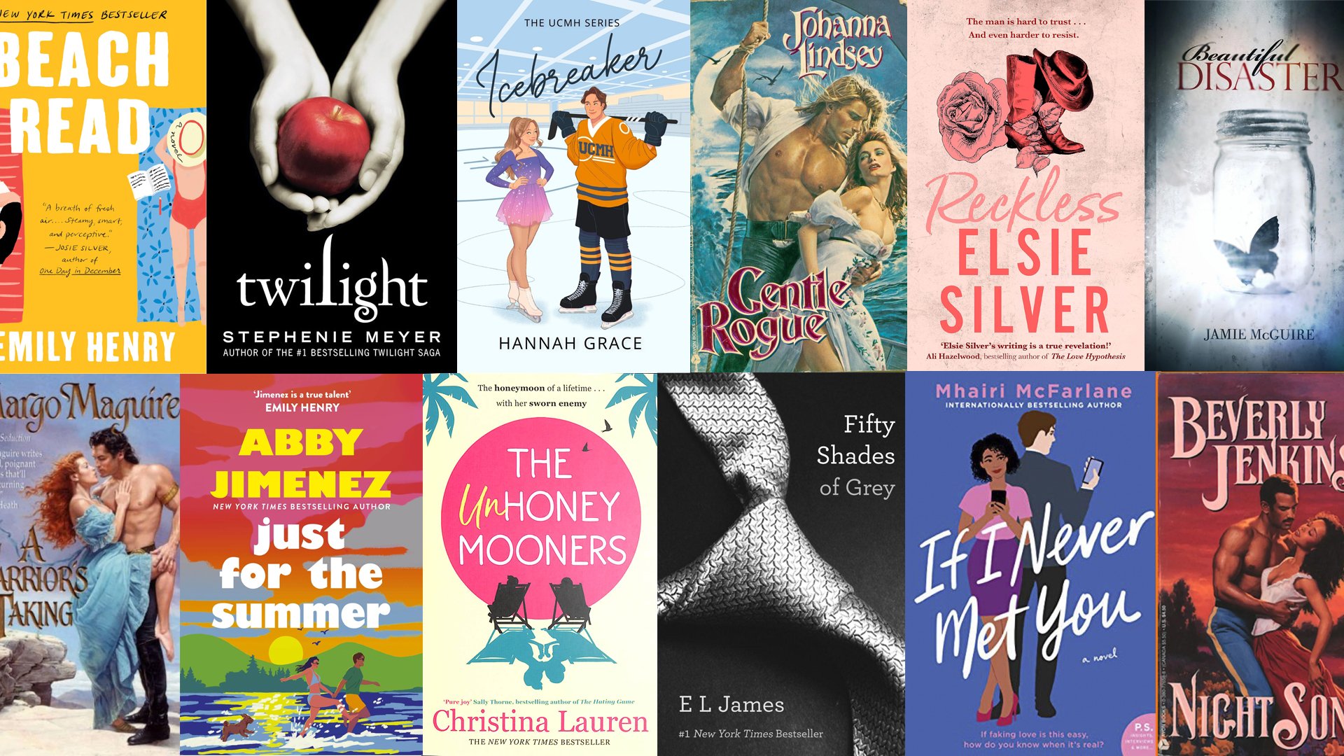
Stand in front of the romance table in any bookshop and let your eyes go slightly out of focus. If not for the titles, the covers could easily start to blend together. Vibrant pinks, corals, and teals serve as backdrops for vaguely human-shaped blobs.
Anonymous and amorphous, these silhouettes representing the romance hero and/or heroine could be any one of us. They’re both no one in particular and everyone at the same time, and help prop up one of the genre’s pillars: the implicit invitation for the reader to insert themselves into the fantasy. You too, whoever you may be, could be swept off your feet!
In this article, I’ll take a closer look at this trend in contemporary romance book covers and why it’s likely here to stay. But first, a bit of a history lesson…
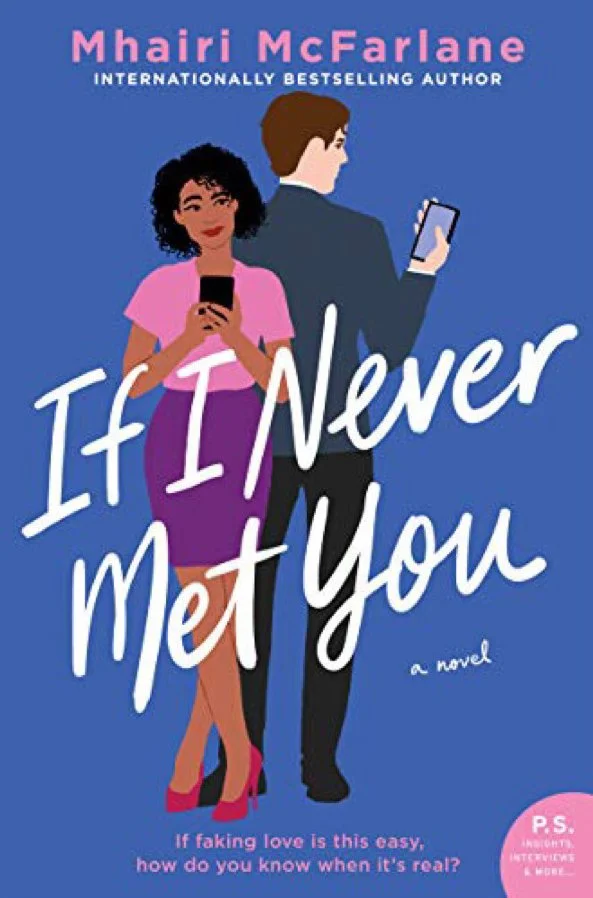
From clinch to cartoons
To appreciate how this trend came to be, it helps to remember what it replaced — or reimagined.
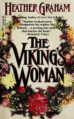
Before we got the cute covers of today’s contemporary romances, there was the “clinch” cover: windswept embraces, loosened bodices, and lion-maned Fabios with abs for days. These covers told you the time period (often historical), the setting (kilts and castles for Scotland, for instance), the body types (busty and built), and the exact flavor of fantasy on offer before you read a word. They were also, famously, the reason a generation of readers stripped the dust jackets off or hid their most scandalous books in the attic.
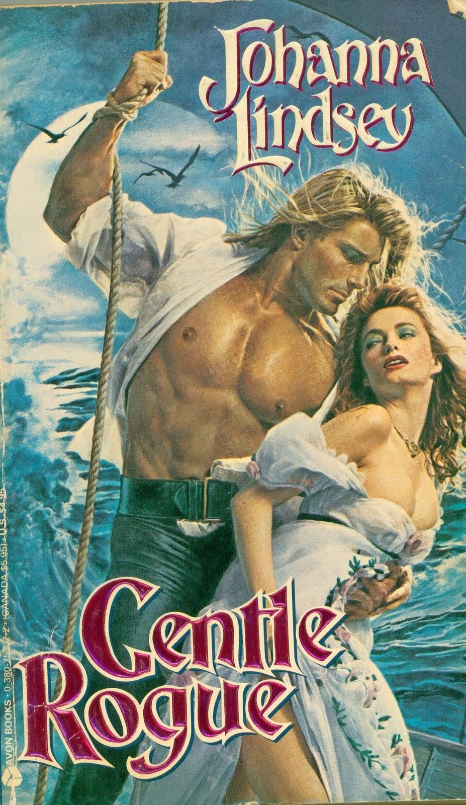
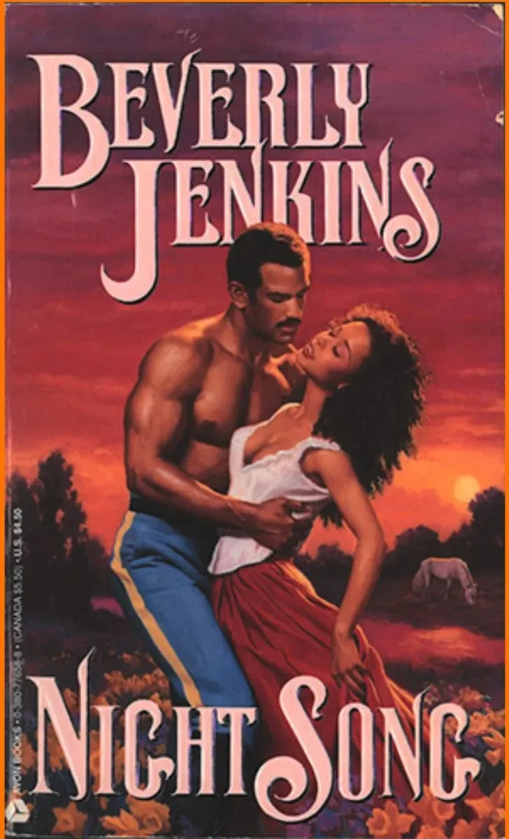
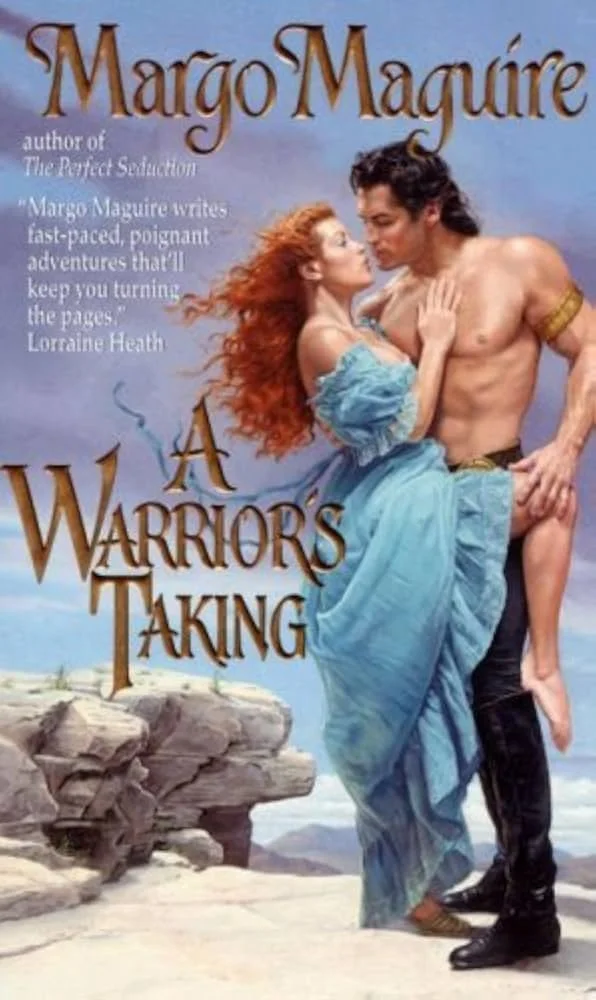
For the more demure reader, there was also something referred to as the “step-back” cover, which hinged on plausible deniability, hiding bodices behind flower arrangements and soft lace, often implementing a soft blurring effect. The more spicy cover art would be attached as an interior page instead.
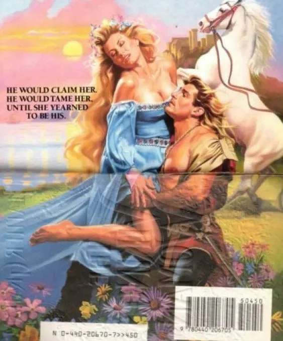
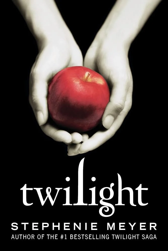
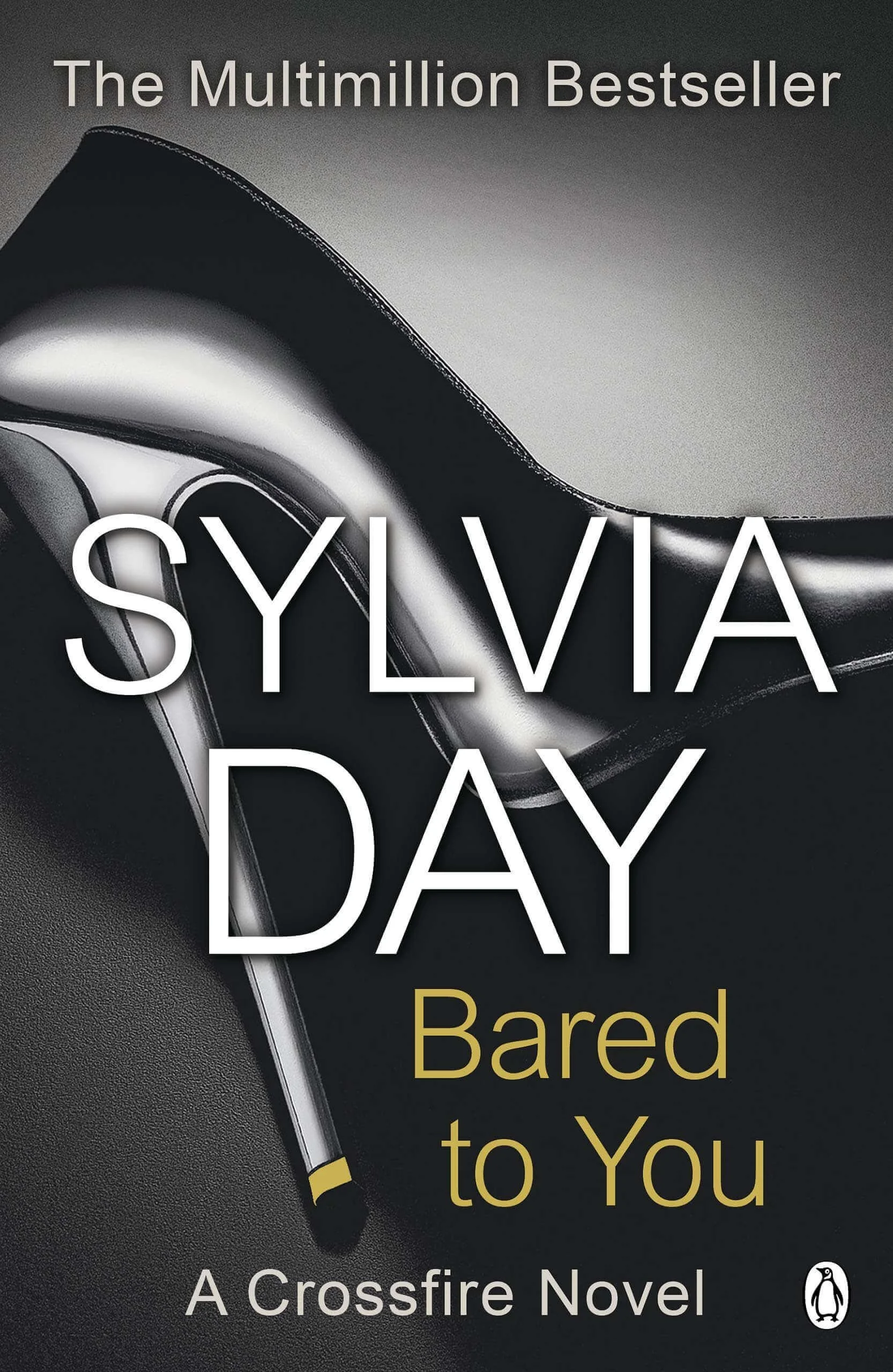
Over time, however, the photographic Fabio and long-haired heroine was almost completely replaced by more suggestive objects and illustrations — and the hidden interior page disappeared. Think of the now-iconic cover of Fifty Shades of Grey with the silk tie, the apple evoking temptation on the cover of Twilight, or the risqué stiletto on Sylvia Day’s Bared to You. Titillating yet slightly more subtle than the clinch covers, these covers were all about hinting at thrills to come.


The turn towards illustration gained traction in the late 2010s with books like The Kiss Quotient, Red, White & Royal Blue, The Unhoneymooners and Beach Read. All respect to Fifty Shades of Grey, but romance readers were starting to demand the same attention to design that you’d see on literary fiction covers, and were sick of hiding their books away.
Indeed, the illustrated covers have made romance books more “palatable” so they can sit alongside general fiction without apology — but they have also allowed romance readers to be loud and proud about their love for the genre. It doesn’t hurt that they work brilliantly for online retailers and photograph beautifully on a social grid. In both of these contexts, a flat illustration with only 2-3 dominant colors survives being shrunk to a thumbnail in a way that a moody photograph may not.
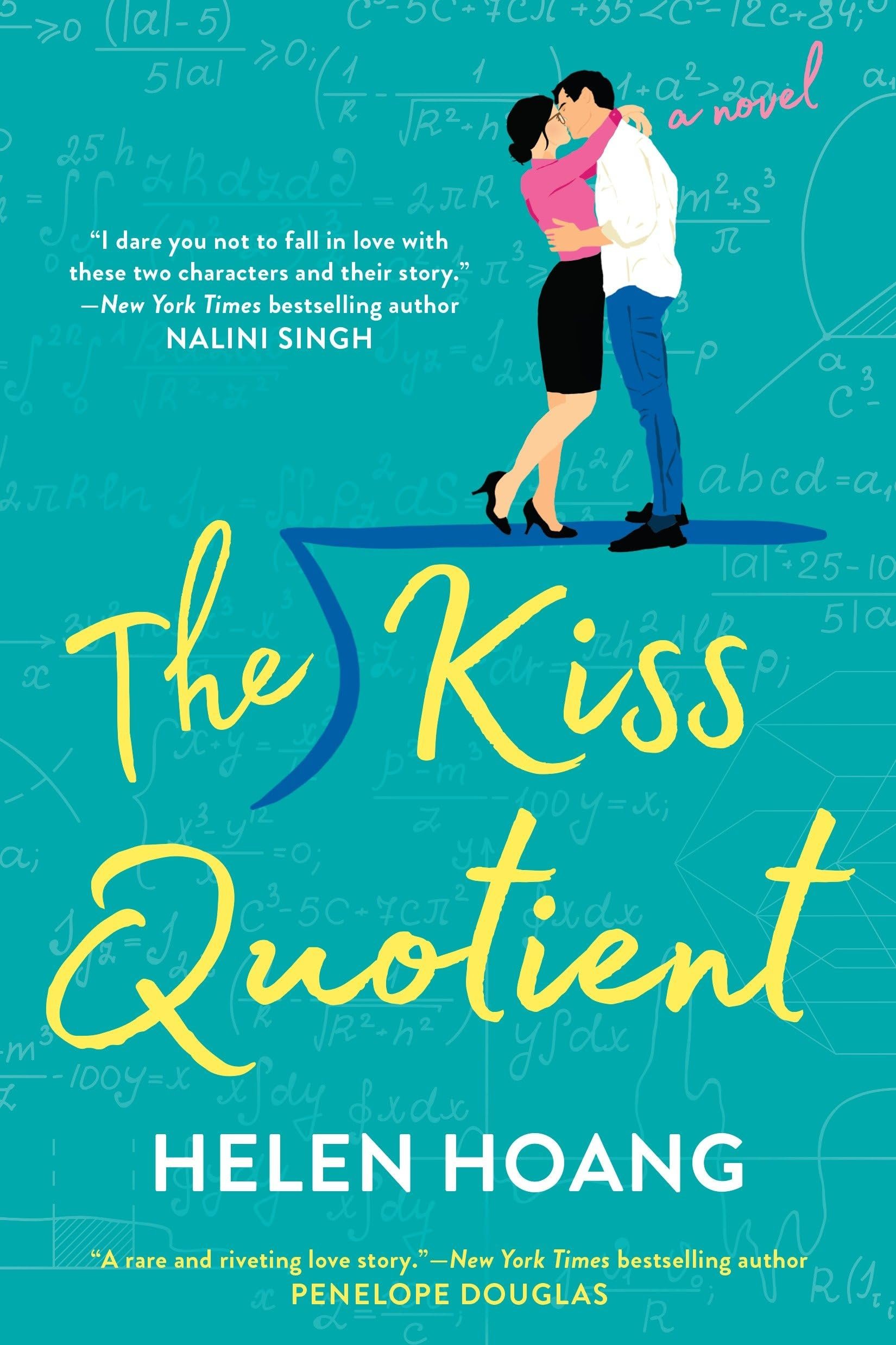
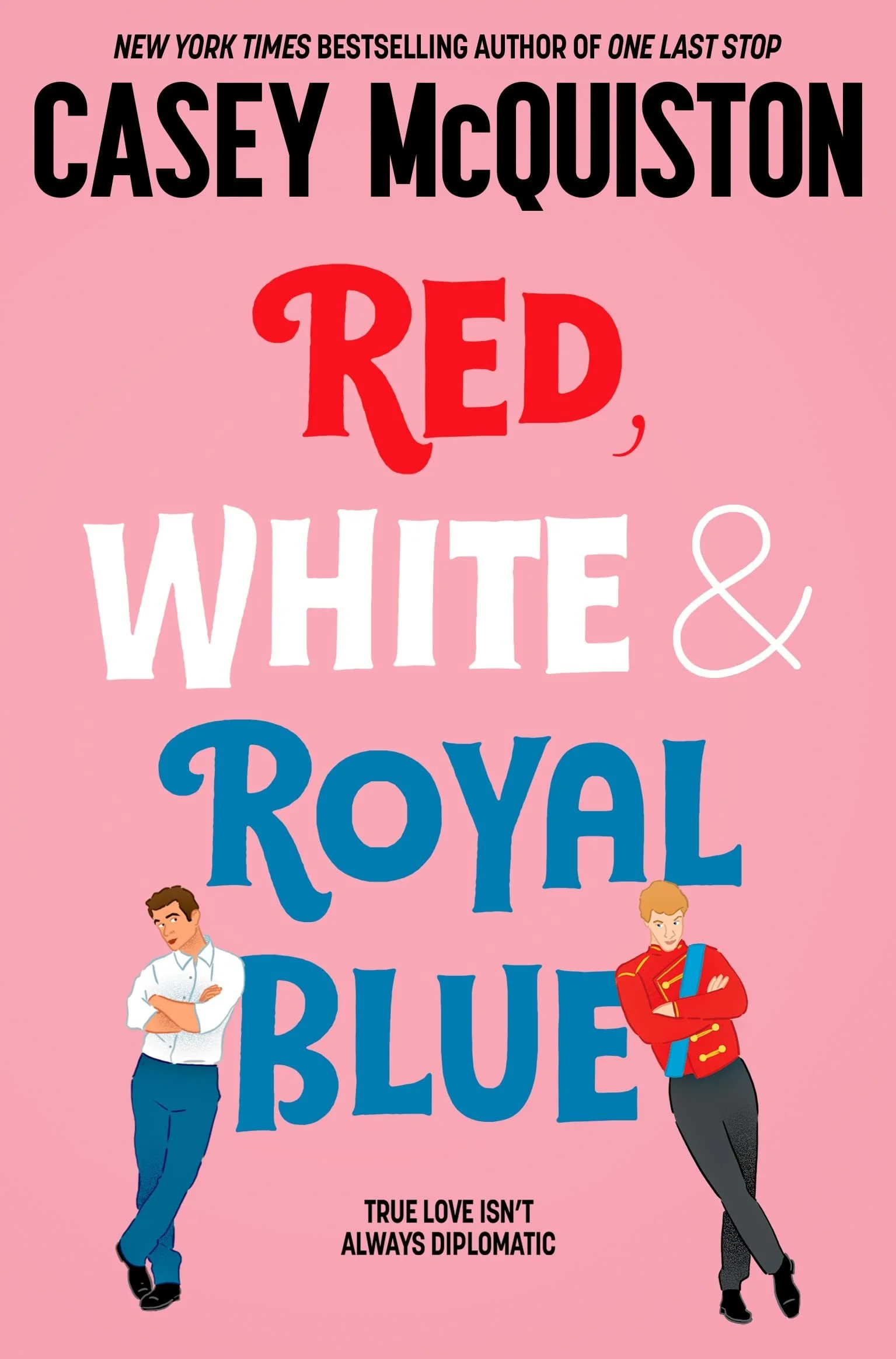
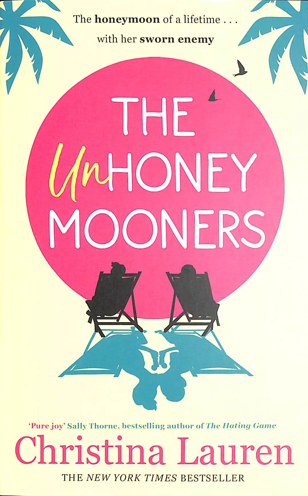
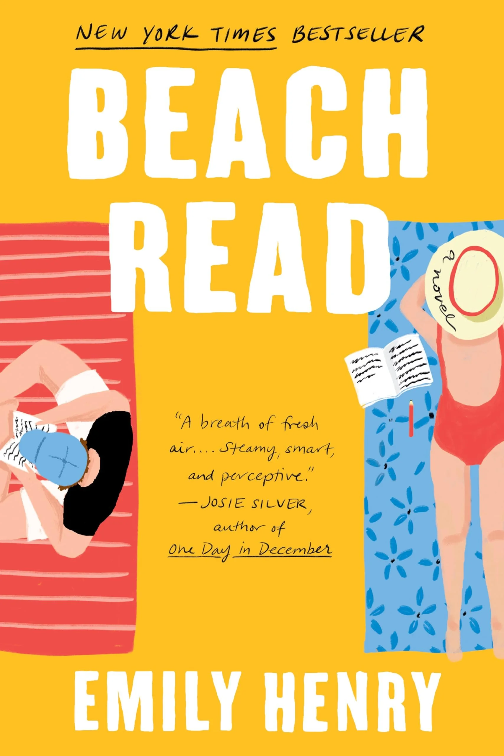
It’s hard to detangle the history of the romance cover from discussions of female sexual liberation, the status upgrade of romance as a genre, and the development of bookish social media. (Check out this Time article for a more thorough run-through.) However, the ultimate aesthetic effect is undeniable: illustration allows for abstraction in a way that photographic covers never could.
The (Y/N) effect
There’s a convention in fanfiction of writing the protagonist as a blank to be filled: (Y/N), your name here. With this convention, the reader doesn’t merely consume the story; rather, they become part of it.
Of course, there’s never anything truly new under the sun. When Janice Radway asked romance readers about why they read the genre in 1984, many said they enjoyed the predictable structure of romance novels. These structures always end in a Happily Ever After, reassuring the heroine — and, by extension, the reader — that they are desirable and worthy of love.
Illustrated contemporary romance covers work in a similar way. The readership knows it’s a fantasy and what they can expect from it, but the boundaries between reality and fiction are blurred enough to encourage a certain level of self-insertion.
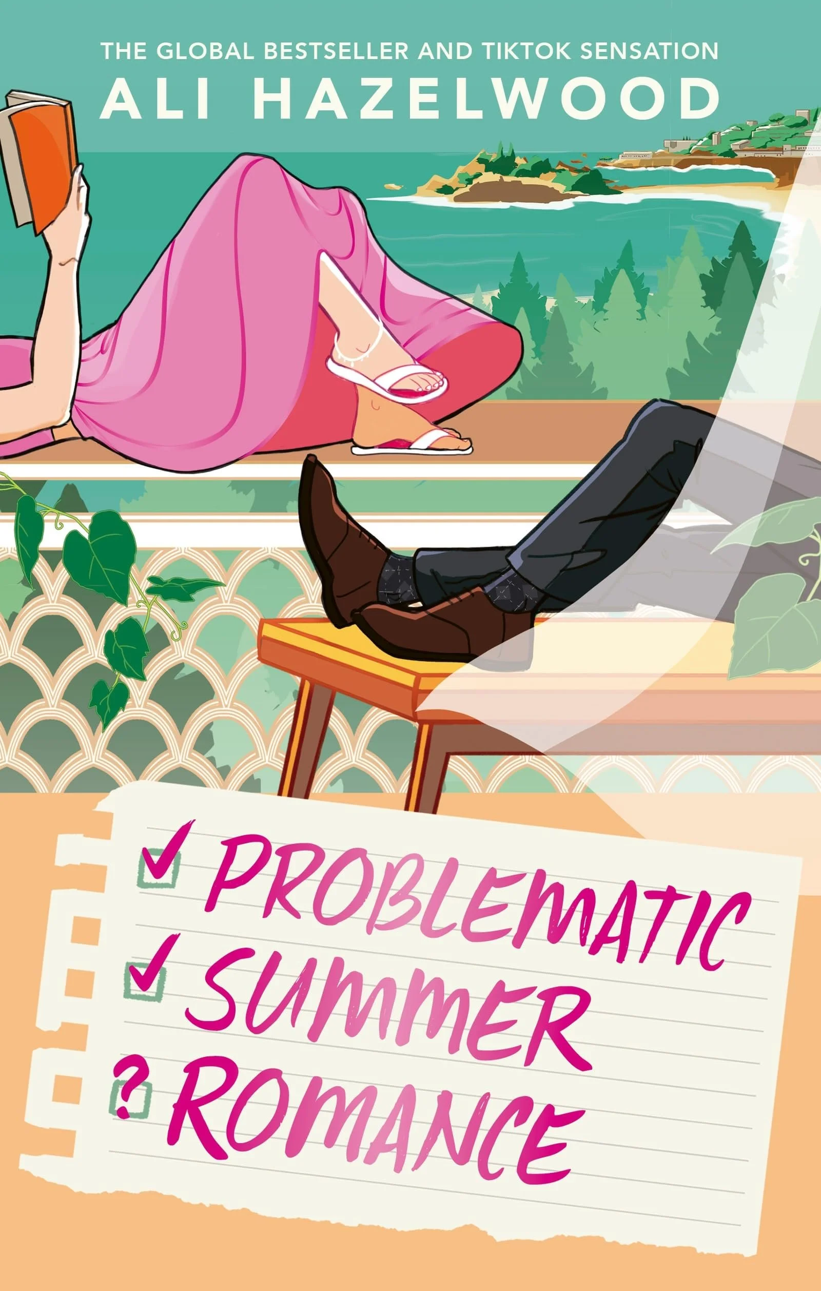
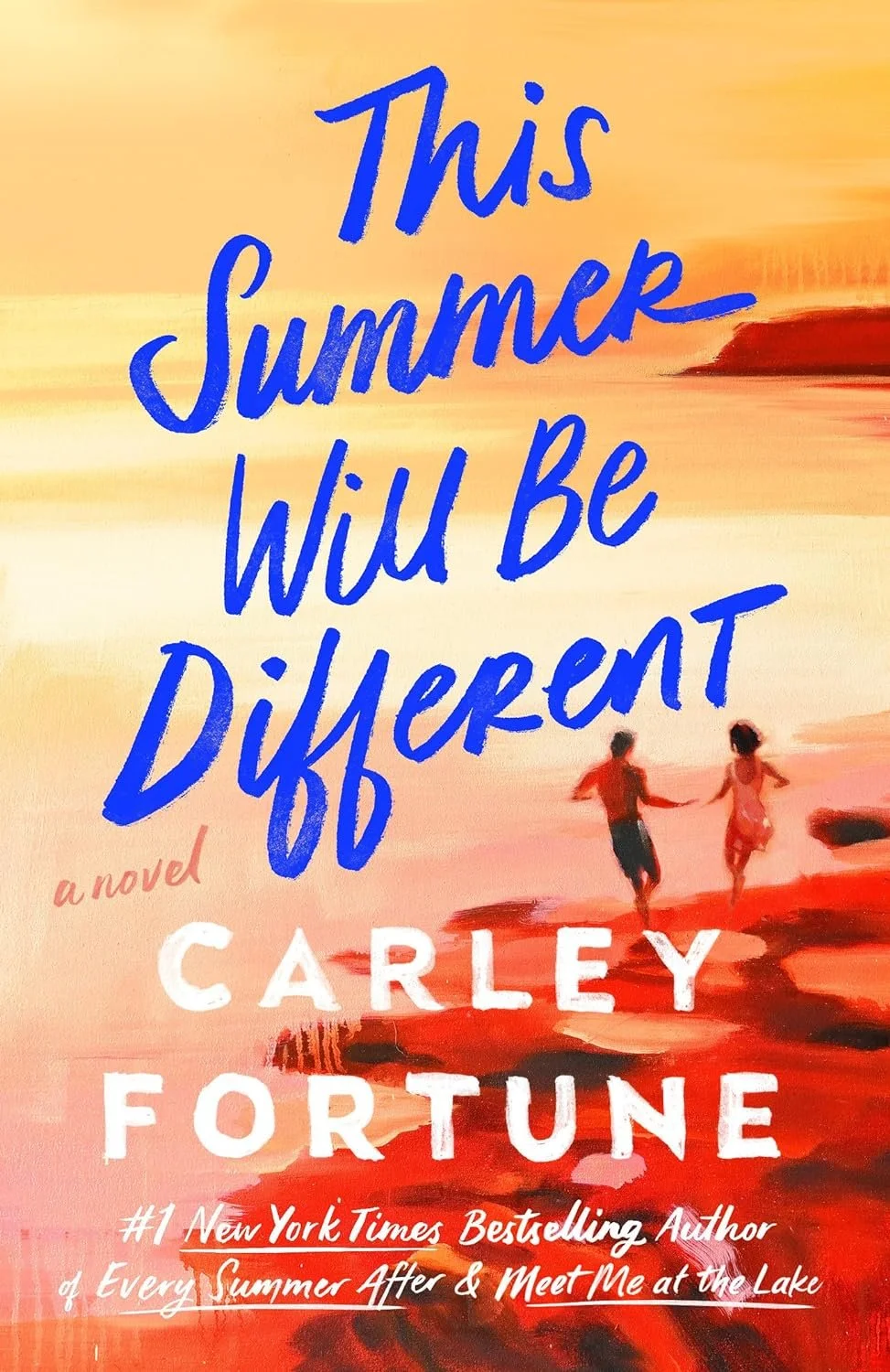
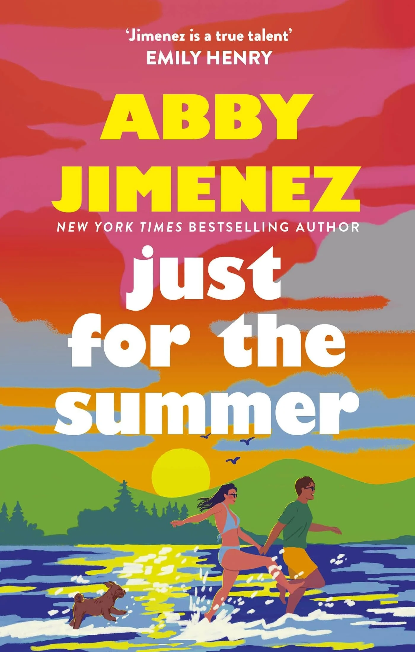
Consider how often we only see parts of limbs or figures cropped without faces, turned away, shown from behind, reduced to a silhouette against a sunset, or given features so schematic that they read as a category rather than a person. This isn't for lack of skill; it's a deliberate (and quite sophisticated) design decision. The less the figure asserts itself as a specific being, the more room the reader has to fill in the fantasy themselves.
Prop tropes
As the people on these covers become less specific, the objects around them often become more so. A hockey stick, lighthouse, cupcake, cowboy hat, or wedding cake supplies the information the anonymous figure withholds: not who this person is, but what kind of fantasy they inhabit. The human figure says this could be you, but the object says this is the particular fantasy you’re choosing — an important balance to strike for readers.
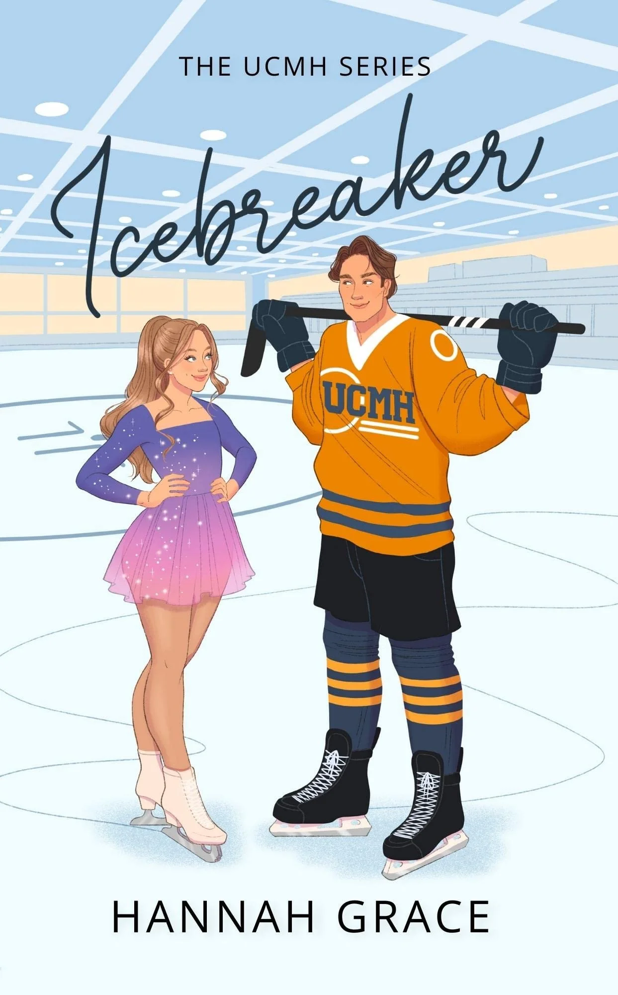
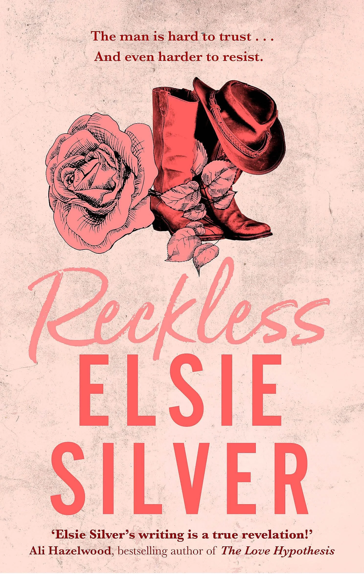
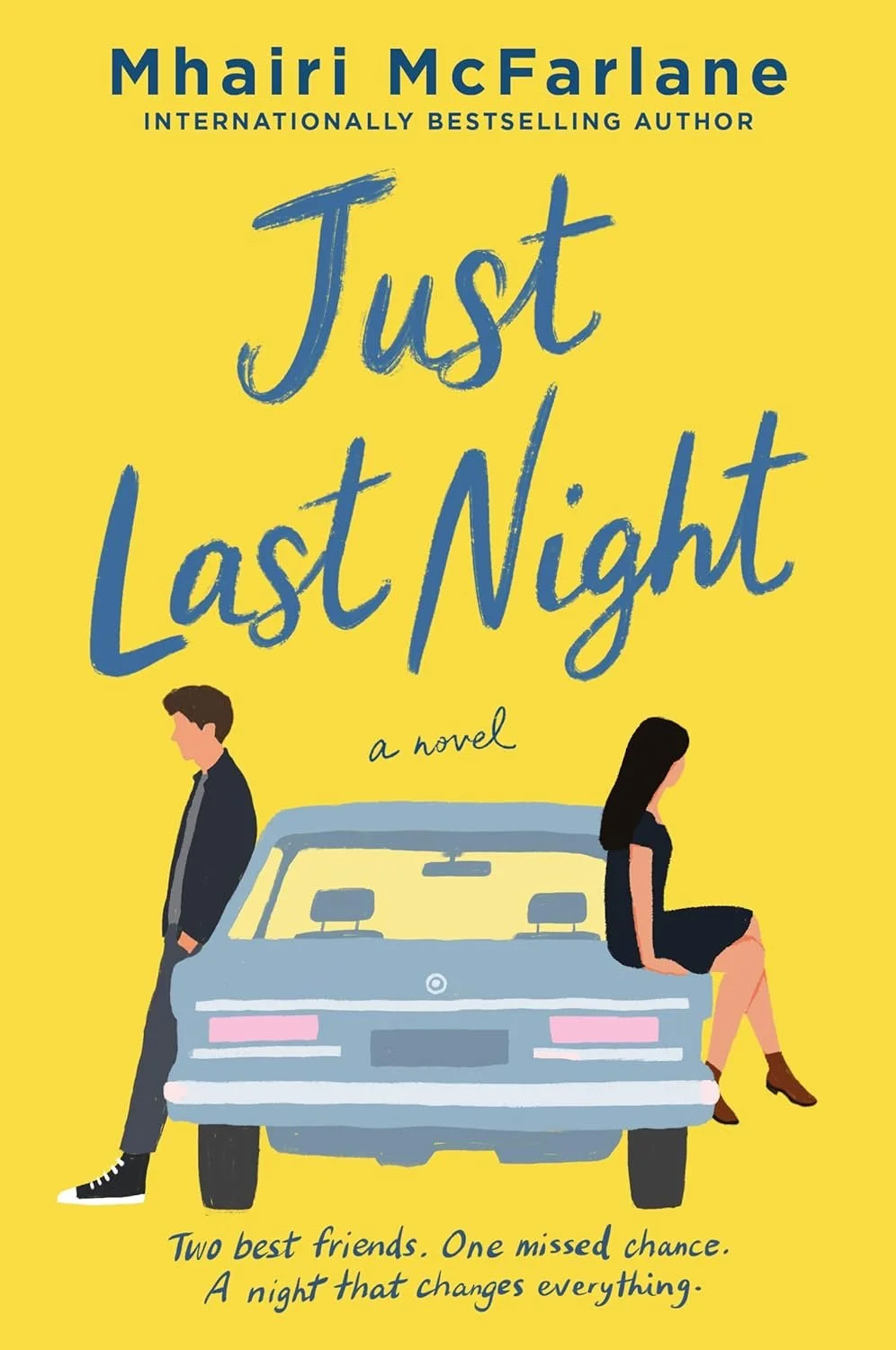
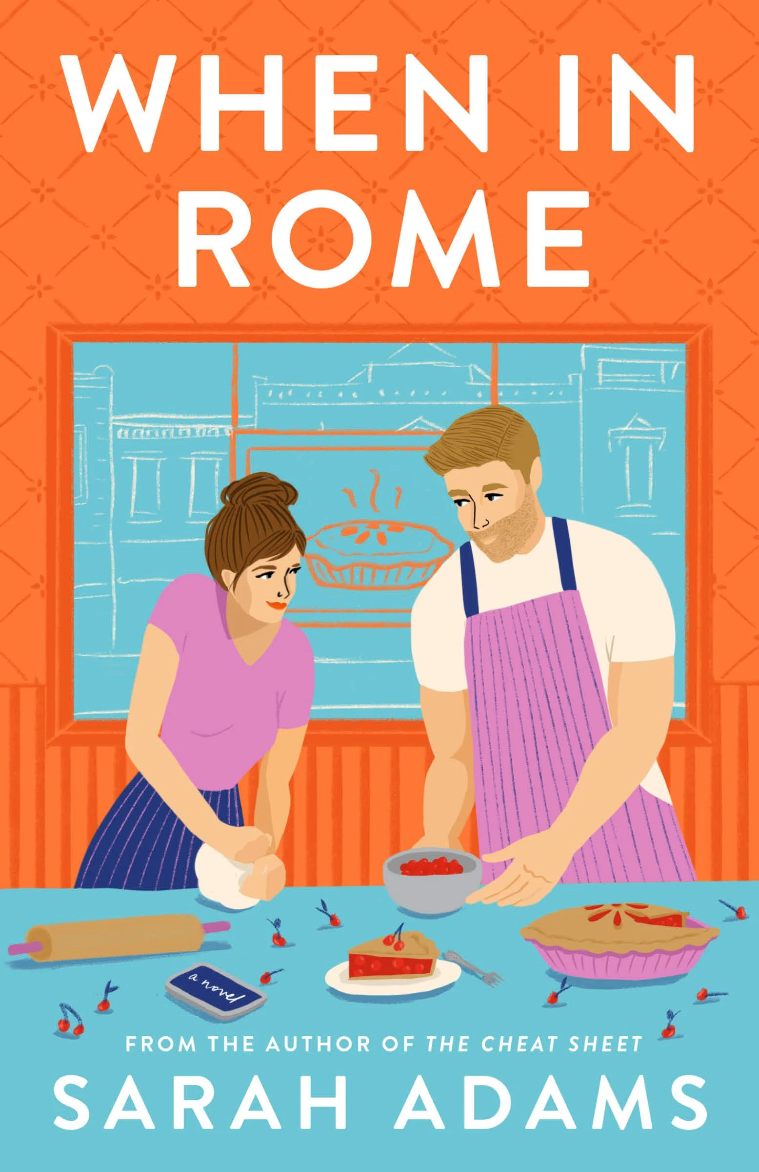
The distinction matters in a genre whose destination is largely predetermined. Romance promises a happy ending and much of the pleasure lies in discovering which route the characters will take to get there. Sports romance, small-town romance, fake dating, second chance, etc. are variations within a familiar structure. Where the stock photo cover or the minimalist literary cover often use a lone object to depict theme, the illustrated romance cover uses props to imply subgenres or essential tropes.
The objects on the cover thus work as a kind of visual shorthand, signaling which variables have been plugged into the formula.
A well-balanced modern romance cover is specific enough to promise a particular story, yet anonymous enough to leave space for the reader. They neatly solve several problems at once: they are legible at thumbnail size, respectable enough for the general-fiction table, flexible enough to signal different tropes, and abstract enough to let the reader do some of the (self-insertive) imaginative work.
But that openness is not always entirely neutral. Who can disappear into a supposedly universal silhouette — and who remains visibly marked — tells us something about which bodies we still imagine as the genre’s default. On this end, we still have more work to do, and illustrated covers may both be part of the problem and the solution.
Linnea Gradin is a writer for Reedsy — a website that connects authors with freelancing publishing professionals and gives advice on everything writing and publishing related, and how to get into the publishing industry, from how to become a book cover designer to how to set your design rates, and where to find book design jobs. When Linnea is not reading, she can be found dribbling on the football pitch, dabbling in foreign languages, or exploring the local cuisine of whatever country she happens to be in at the time.