University Press Cover Round-Up

We welcome you to another in our ongoing feature in which notable book cover designer Jordan Wannemacher periodically highlights a selection of recent university press cover designs. Please enjoy this celebration of amazing work.
This list is in no particular order. Credits are listed below.
If you are a book cover creative and want your work or the work of your department reviewed by Jordan be sure to get in touch with us!
As with any cover design we feature in our publications, we encourage you to head to your local library and/or bookstore to view the work in its full splendor when possible.

Stanford University Press
Designer/Art Director: Rob Ehle
This image is so unsettling in the best possible way. I can't stop looking at it! It reflects the subject of religious violence in the text without being gory or too sinister. The type is perfectly subtle allowing the dismembered figure to take up space.
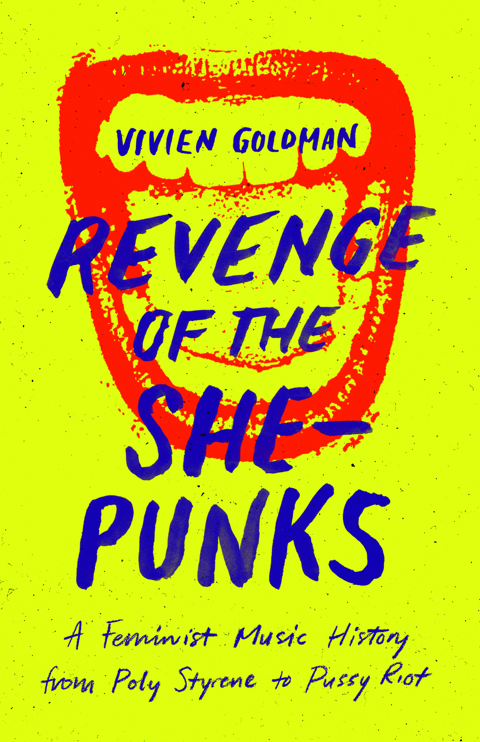
University of Texas Press
Designer: Amanda Weiss
Art Director: Dustin Kilgore
I was lucky to see a printed version of this cover on the designer's Instagram and the yellow is simply electric. The contrast among this cover makes the lovely hand lettering and graphic illustration totally vibrate.

University of Virginia Press
Designer: Kelley Galbreah
Art Director: Cecilia Sorochin
I love the classic historical design elements to this. The image choice is perfect and the soft brush strokes are mirrored elegantly in the type choices. The angles of the type and image make for such a dynamic cover. Lovely and gritty all at the same time!

University of Arizona Press
Designer/Art Director: Leigh McDonald
Ahhhh the power of negative space! The crisp gradient sky and delicate type choices let this tasteful cover design breathe. The blue color palette is also so soothing.

Oxford University Press
Designer: Caroline McDonnell
This is such an amazing image. The colors and perfect symmetry of the building are almost unreal. It's a perfect representation of the modular nature of urban housing developments. The urban planning favorite typeface choice of Helvetica is a perfect pairing.

University of Toronto Press
Designer: Elizabeth Broes at Em Dash Design
It's so difficult to make text-heavy covers work without feeling crowded or leaving the eye wondering where to settle, but the designer pulled this one off perfectly. The hierarchy is well-organized to make this feel balanced and readable, and the historical type choice is excellent.

University of Georgia Press
Designer/Art Director: Erin Kirk New
The grey background is totally unexpected and not something I am used to seeing but is a welcome surprise. It works perfectly with the design without resorting to the standard brown color palette history books often adopt. The book examines the black avenger trope from its earliest origins in the seventeenth century up to present day (Black Panther and Django Unchained) so it's appropriate that the engraving is presented in a modern way.

Cornell University Press
Designer/Art Director: Scott Levine
I am so obsessed with the 70's aesthetic making a comeback in book design these days. This cover is perfectly retro without feeling dated or stale. I also love the red saturation of this image and how it contrasts with the white italic typeface.
Jordan Wannemacher is a book designer based in the NYC area. She was born and art school educated in the Southeast at the Savannah College of Art and Design where she focused on graphic design and creative writing. Currently, she is running Studio Jordan Wannemacher, a boutique book design studio based out of her home in Montclair, New Jersey.