Q & A with Designer Yeti Lambregts

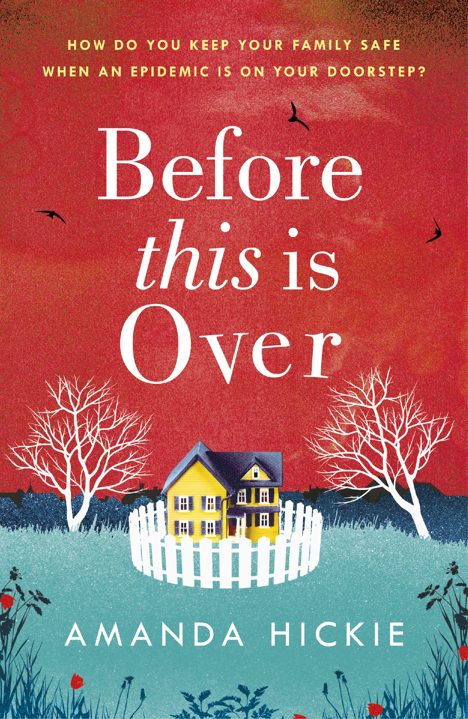
Yeti Lambregts is a book cover designer whose portfolio includes works such as Maggie O'Farrell's This Must Be the Place and Sarah Winman's upcoming title, Tin Man. She was kind enough to answer a few questions for Spine.
How did you become a book cover designer?
I studied Illustration at Kingston University a long, long, time ago, and often asked the neighbouring Graphic Designers to work on joint projects. I wasn't strictly an illustrator, or a Graphic Designer but knew there was something very exciting being stuck right in the middle of the two.
With my degree about to finish, I had a place at Central St Martins to study an MA in Visual Communication Design but thought best to get work experience under my belt. Publishing ticked both boxes, combining illustration/photography and typographic design.
I made a list of all the book covers I liked in the nearby Waterstones, researched the publishers and got very lucky with being offered work experience at Bloomsbury that summer.
From there I had my sights set on the design attic, where there were three fantastic designers Will Webb, Nathan Burton and Richard Horne. Fluke happened and they took me on as the junior. It was the most fantastic place to be, and put my illustration experience and contacts from university into place. I loved working on the children's books especially. During my time there, Jo Walker, Sarah Greeno and Katie Tooke - all enormously talented designers also joined. And that's where it all began.
Do you have a usual process when designing a cover or does it differ?
I often compare it to making a big pot of stew, gathering all the necessary ingredients, preparing them, boiling them up, then simmering them down and hoping to get something that isn't too burnt at the end.
I adore how bold and colourful your cover is for Tin Man - can you explain the ideas behind it?
Ah ha! That one makes me smile, I really loved the story and recommend it very highly. It's a very very special project for many reasons.
The editor and I worked closely on this, I showed her some visuals but kept this idea to last, keeping my fingers crossed she's go for it. Luckily she thought it was interesting and with a few tweaks, could be onto something promising. It came together quite quickly after that - I sketched the landscapes and then made my husband ride around several parks at the weekend in freezing cold conditions. He's very patient and very excited to be on a book cover (thank you very much Tom).
What is the most amount of re-designs you’ve ever had to do for a single cover?
Oh boy. That's a big question... many many trees have been wasted, and visuals binned along the way. I tend to throw stuff out as not to keep track of how many versions I've done. But it's always very reassuring there's an end result and it's usually so much better than the earlier versions, that makes it all ok.
Who or what is your biggest inspiration?
The people I've worked with at Bloomsbury and Penguin, and very much the people I work with now at Headline, their invaluable support and advice. My family for so many reasons, friends and teachers, especially Jake Abrams at Kingston. He saw there was a morsel of hope.
Book shops old and new, textile designs 1920-40s, printmaking especially silk-screen, all sorts of photography, painting, and I love children's drawings.
Kerry Squires is a nonfiction book cover designer at Macmillan Higher Education.


