Interview with Adalis Martinez
Depending on who you ask, Adalis Martinez is either the exception to a so-called rule or definitive proof that an art school education can pay off—more than pay off, really. The designer, a self-proclaimed “island girl” hailing from the Dominican Republic by way of the Bronx, graduated from SVA just three years ago and has already received accolades for her work from a little something called The New York Times.
After interning under art director Paul Buckley at Penguin during her senior year, Martinez jumped right into a position at Farrar, Straus & Giroux after graduation and eventually wound up at Harper Collins, where she is today. Her choice to pursue book cover design, in particular, was less a choice than a happy accident, she explains: “It’s one of those things that I don’t think we normally choose to do, but I really enjoyed it, and, so far, so great.” Indeed, her first serious cover design, an update to Swiss author Christian Kracht’s satiric 2012 release, Imperium, was selected as one of the twelve best book covers of 2015 by the aforementioned Grey Lady.
“At the time, I wasn’t trying to be very conceptual,” she says of the cover, which she envisioned as a simple combination of elements from the story, the tale of a man who ends up on an island and is, among other things, obsessed with coconuts. “It came together like a puzzle, with many different pieces,” she explains, noting that she created the typeface herself after struggling to find one that fit the theme.
When I point out that a lot of her work, this cover included, has an old-school vibe to it, she claims that it isn’t intentional, though she has a preference for “texture and covers with a weathered feel—[they] give the book a bit of dimension.” Her design for Back to Moscow by Guillermo Erades similarly evokes the past, looking to old Soviet propaganda posters for inspiration, per the author’s request. It’s one of her favorites, the layout depicting a pared-back setting from the book—Pushkin Square Park—and the many women the protagonist encounters there throughout the story. “I didn’t want the cover art to be louder than the type,” she tells me, so she looked to Paul Rand’s work to inspire another one-off font: stretched block letters set against a muted Soviet red.
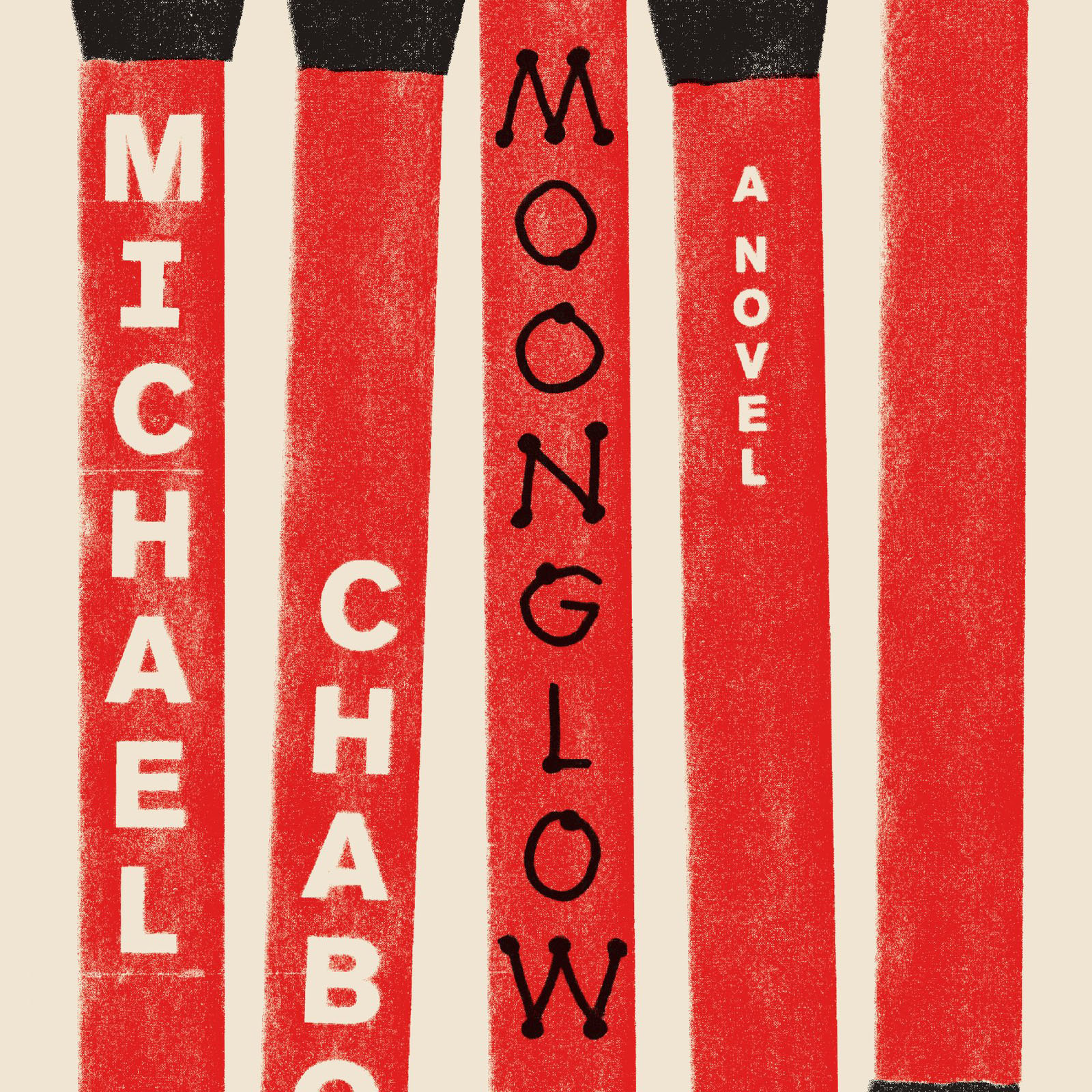
Her most recent work, for Michael Chabon’s Moonglow, is another point of particular pride, though she jokes that she “learned from school not to get very attached to [her] work and to be used to getting shut down.” Working with Chabon was especially fun, Martinez explains, citing his appreciation for good design. Indeed, his references were design pioneer Alvin Lustig’s vintage covers (are you sensing a theme here?). “It’s great to have an author who gives you input but also lets you get creative and do your thing,” she notes. The design process itself was drawn out for this one—with numerous tweaks and color corrections—but the results were worth it. Not only did Chabon love the final design, the striking matchstick-print cover was just selected by The New York Times as one of the 12 greatest covers of 2016.
The list’s description—covers that are “challenging without being impenetrable and playful without being precious”—seems to summarize the appeal of Martinez’ work alone. You can tell from speaking to her that she thoroughly loves what she does, is encouraged by her very speedy success but not bowled over by it, and has a decided lack of “airs” for any artist in today’s high-concept world. “My family pretty much comes from nothing,” she tells me, after joking that her mom (“number one fan, for sure”) is constantly sending pictures of her books in stores to family members in the DR. “I’ve always had a ton of support from her,” she confirms, “but in Hispanic culture there’s definitely pressure to pick ‘the right career’ so you can ‘bring up the family.’ Not everyone believes you can actually make a living doing something you enjoy.” Martinez, it would appear, is set to prove any of those doubters wrong.