Interview with Designer Alissa Dinallo

Today we have the pleasure of talking with Australian Book Designer Alissa Dinallo. In 2015 she won Young Designer of the Year at the Australia Book Design Awards and in 2016, she won in the Best Design Independent category. Take a look at the beautiful catalog for the Awards.
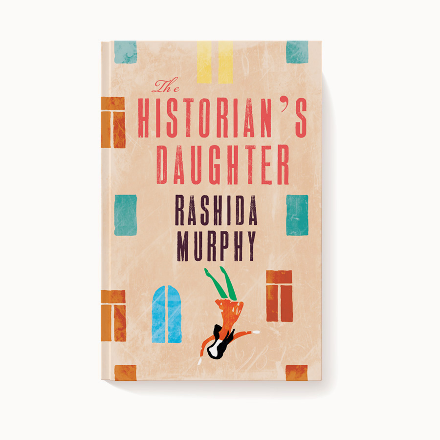
Her experience includes in-house work for Penguin Random House and Allen & Unwin, as well as working independently.
I asked this award winning designer a few questions.
Out of all the work you've done, what is your favorite book design and could you say a few words on why?
I have lots of favourite books, each of them I love for different reasons. Most recently my faves are All Is Given which is an illustrated mosaic. I loved the design from the very first cover rough I drew, and luckily so did the editor. It's always so nice to work on a book when everyone is so pleased with the design. I also loved working on La Dolce Vita, an Italian cookbook which was an excellent opportunity for me to explore my love for Italian design and culture (being Italian myself). Another all time fave is Inexperience.
What is your latest book cover design?
Yesterday I sent a book to print called Outback Elvis. A really fun book to work on about a festival in an outback Australian town called Parkes, that celebrates all things Elvis.
Also, I see listed that you have a boutique press. Is BookEating Press an active venture?
It is an active venture, but no projects running at the moment.
Are you involved in any projects you'd like us to know about?
I am on the Australian Book Design Association committee, who are constantly showcasing amazing Australian Book Design and hosting a variety of events. Everyone should definitely check out ABDA
What influences you most? Color? Line? Do you prefer working with abstract designs or figurative language?
For me, influence comes from a manuscript. The style of book will inspire what kind of approach I take for my designs (abstract, literal, figurative). I am also a typography geek so I am constantly inspired by cool and wacky letterforms.
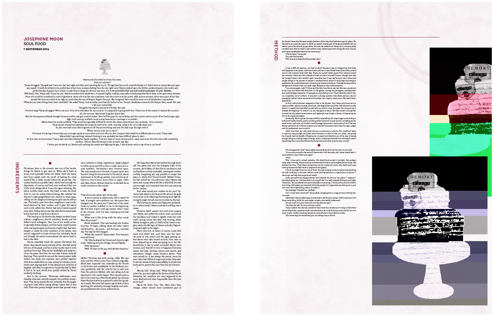
I have to say I loved the fusion of subject matter and form in the design of Memory Makes Us for which you won the 2016 Best Designed Independent Book Award with Zoe Sadokierski and Gemma Warriner. Where does your interest in typography come from? And what considerations guide your use of it?
I think an interest in type stems from having to work with it every single day. When you see someone else doing something cool or different with letterforms, it is incredibly inspiring. I'm always looking for new ways to push the boundaries with typography. There is also something quite therapeutic about hand drawing letterforms, I'm constantly drawing letters (for fun) on my desk or my hands or where ever! In terms of my guidelines, typography is always serving a purpose and as a designer you need to understand that purpose completely and serve that purpose properly.
How has your design process changed over time?
I have become a lot more methodical with my process. I have learnt the importance of visual and contextual research and will always factor in plenty of time for this.
Do you design book covers that are purely for on-line consumption? If so, do you use the same principles for that medium as for hard copies?
I rarely design purely for online consumption, but when I do I like to keep it simple. Consumption of media online is quick and instant, people have short attention spans on-screen and I like to make sure I take this into consideration.
In your opinion, what are the challenges of modern book design?
When working as a commercial book designer, the challenges you face are usually to do with printing. A lot of books I work on adhere to a strict budget, and you need to design to get the best out of that. You can't rely on embossing, gold foil or special paper stocks to lift your designs.
With respect to current trends in book cover design, what would you like to see more of? Less of?
New stuff! I love seeing designers approach book design in weird and clever ways. Its always so inspiring. Less of? I'm not sure! Movie-poster re-release covers?
Karen Faris is a Rochester, NY based writer. More about her work can be found at www.karenfaris.com


