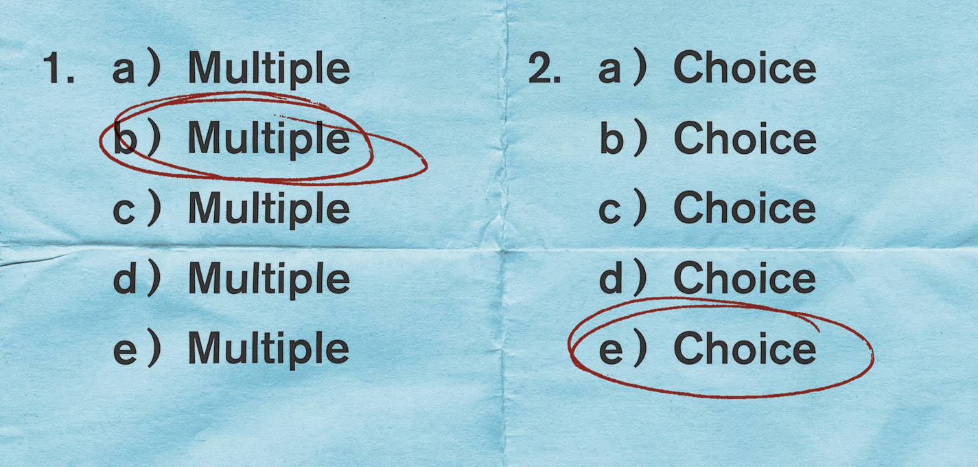
Jonathan Pelham, Designing Multiple Choice

Jonathan Pelham is a book cover designer residing in London. His work includes the recently released Multiple Choice by Alejandro Zambra. Spine contributor Vyki Hendy contacted Pelham about the design. Here is his process for creating the cover in his own words.
The concept for this cover was contained in the title itself, and also the strapline supplied with the brief: "a) Fiction b) Non-fiction c) Poetry d) All of the above e) None of the above." As I saw it, all I had to do was sort out the aesthetics. In fact, I only saw Nayon Cho’s design for the American edition very recently and I was amused at how similar it was to mine.
I produced two visuals, the first of which was developed into the final cover. The other was nixed on the grounds that it was too difficult to read. The thinking behind the second approach was that large public institutions tend to employ pastel colour schemes. I wanted to make these supposedly calming and reassuring colours vibrate against each other so as to disorientate the reader. It seemed to chime with the spirit of the text which attempts to turn the exam format against itself. Although I think it's an arresting design it doesn't have the hum-drum authority of an exam board which is ultimately what drives the tension between form and content in the final version.
Inspired by the collected fragments in Experimental Jetset’s monograph Statement and Counter Statement which I was reading at the time, I was interested in the idea of the materiality of books; how they come into existence through the reality of our world and in turn reshape our reality. I thought the text of Multiple Choice had a similar kind of shape to it, constantly problematising and remaking itself, so instead of extending the design to full bleed – implying that the book is the exam – I thought it made more sense to give exam paper its own dimensions and texture within the confines of the jacket in order to distinguish the image from the book as an object.
"Do not write in this box" was a phrase I remembered from exam papers when I was at school and I fully expected that I would be asked to remove it here, but it was universally liked. It may be the first time I have ever managed to successfully add text to a book’s jacket that wasn't included in the editor approved cover copy. The joke is appealing to me as it both offers and denies possibility and hints at the kind of playful, confusing, strangely melancholic voice within.
Editor, artworker and lifelong bibliophile.