Beci Kelly on Designing Berlin
Beci Kelly is a London-based Illustrator/Designer, currently working as Head of Design, Doubleday at Penguin Random House - Transworld. Here she takes us through her process for designing the stunning cover of Bea Setton’s Berlin.
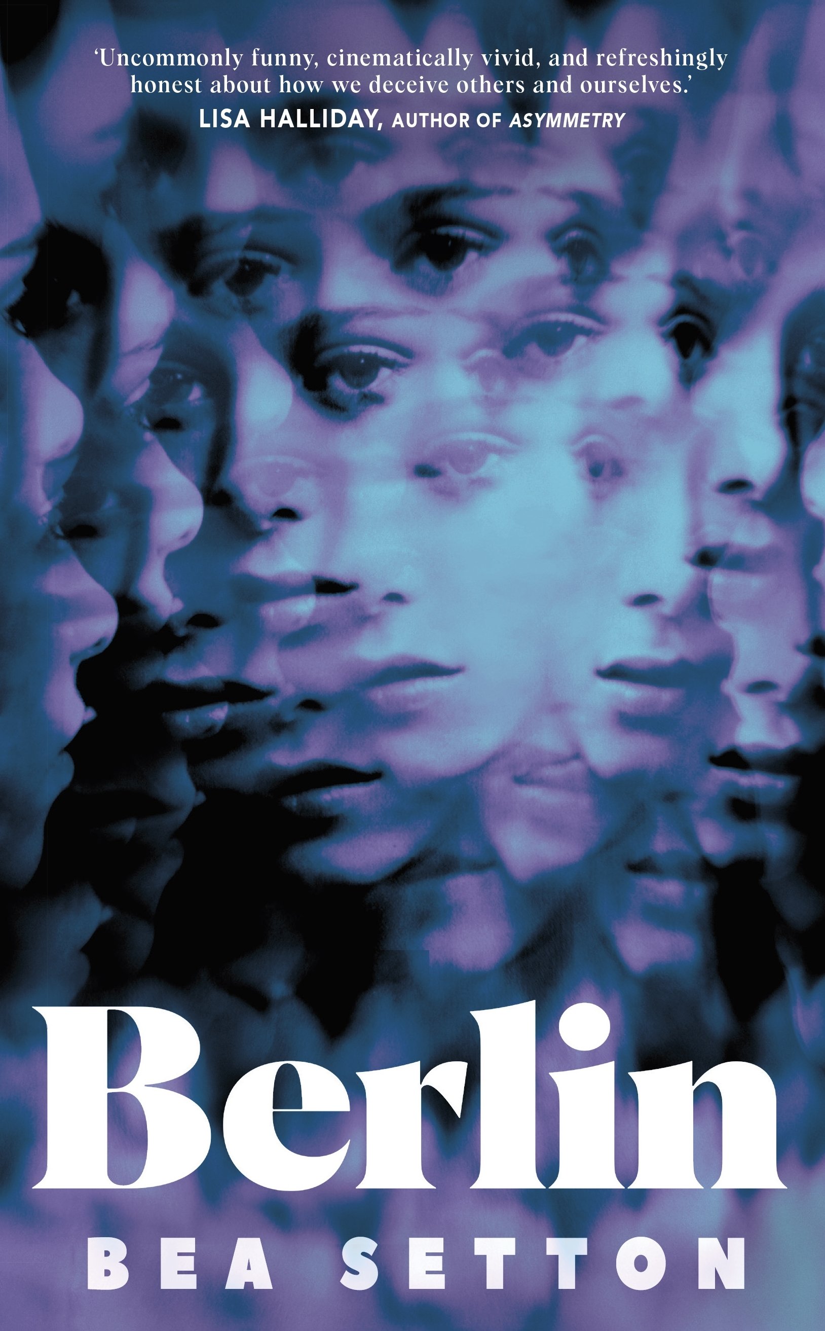
This novel is centred around Daphne, a young and confused 20-something who has just moved to Berlin, seemingly in search of herself, but we never really know if we can trust her accounts of her life or what’s happening around her. Even her thoughts are rather distorted and almost dreamlike. It felt important to focus on Daphne and not the urban city itself, as with a title such as Berlin I didn’t want it to fall into the realms of non-fiction or indeed look too literal.
I wanted to play on the multifaceted sides to this unreliable narrator whilst giving her an anonymous feel, and so I set about finding images of women who were distorted in some way.


There are also heavy themes of disillusion and at times implied drug use, which I tried to represent with slightly psychedelic imagery with lots of movement, colour, and double exposure photography.
I also gathered a mood board of imagery that helped reinforce my inspiration around the type of image I was looking for when browsing multiple image libraries:
In terms of type, I knew I wanted it to be bold, authoritative; not only to give a sense of the place but also for logistical purposes in terms of reading out from a busy image underneath. I tried some typefaces that were almost brutalist and experimented with opacity and fluorescent colour in response to the photography underneath. I also tried it in blocks covering part of the image, to help with covering up parts of the face and keeping the character ambiguous.
Here’s some of the killed covers in that vein of thought…


I eventually started thinking about kaleidoscopes and a ‘house of mirrors’ inspired image, which would play with the audiences’ perception. This also fed into the idea of falsification and not really knowing what to trust or where to look. When I found the below image, I knew I was on to something, and the cover meeting responded in kind, with the request of trying some colour washes and different fonts, which I then did, playing around also with colour washes that gave an iridescent and trancelike feel.
Final cover
Editor, artworker and lifelong bibliophile.