Jennifer Heuer Gets Creative with Analogue Techniques for Island City
Jennifer Heuer is a book cover designer, illustrator, and art director for Penguin Random House. She’s worked out of the Pencil Factory in Brooklyn NY for 10 years. Here she takes us through her fascinating process for designing Island City.
In Laura Adamczyk’s novel Island City, we meet a nameless wry and wistful woman who has basically given up. She sells all her belongings and moves back to her hometown which she claims it’s the “perfect place to give up.” She parks herself in a dark local bar and begins to tell her stories to the indifferent regulars around the bar. We only hear her voice, never any of the strangers, or bartender, only her point of view. It’s basically a booze-soaked monologue as stories and memories blur from one to the other with forgotten missing holes as she continues on to drink three, four, and so on.
My approach was to lean into her anonymity and the dark wobbly feeling that builds as she keeps talking.


Playing up the feeling of a dark bar that you can smell the spilled beer on the floorboards and the worn-down bar top. A sense of sharp blurred vision that someone is drunkenly concentrating hard to unblur. Also, a good excuse to stop off at my own local bar to take some high contrast flash photos of whiskey rings and a shot glass that you can’t quite tell how much is left or if it’s been far too over poured.


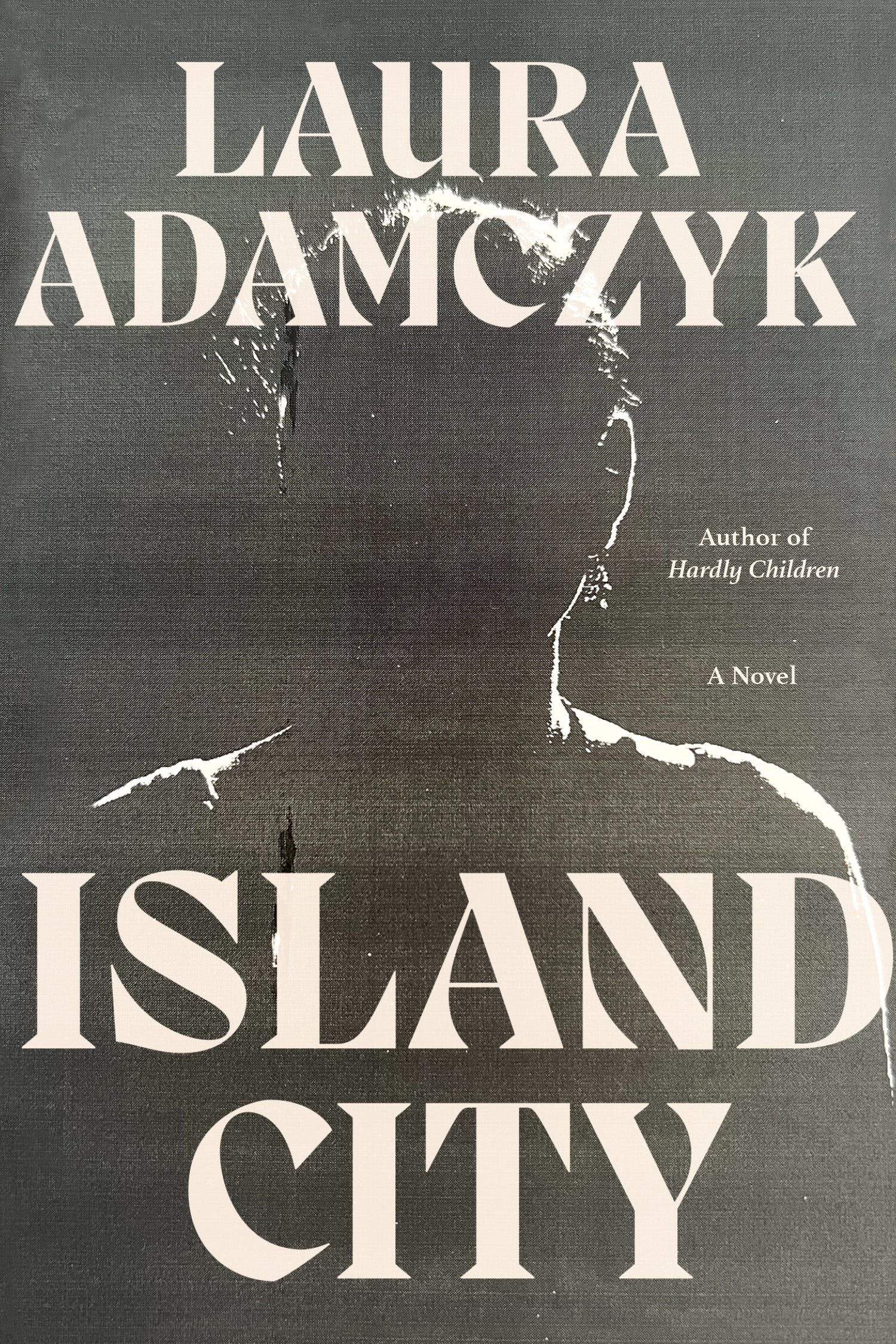
I wanted to play with type that felt like an old neon sign on the edge of flickering out as the woman seemed to be doing in her life. I loved the photo by Melissa Breyer of the woman emerging or receding into the darkness. As though she was backing out of her former life while revealing it to the strangers around her.
Photo: Melissa Breyer
I was working with Na Kim at FSG on this one and we zeroed into the first two images. We liked the destressed feeling of the images that I ran through a broken black and white printer. It's one of my favorite tools here in the studio. We also wanted to play with the bold typefaces but mess it up a bit. So, I grabbed a Pyrex jug, poured in some water and placed it over a printout of a few different typefaces to get a sloshy water feel.


I liked playing with the sense of the type pushing past the margins, like the way the woman pushes her stories onto the other customers whether they want to hear them or not. There is this very “I feel embarrassed for this woman, but I’m all in” feeling that gets more and more awkward throughout the novel.


In the end we landed on the backlit face looking out to the reader telling her stories from across the bar. This one felt sharper. A sort of in-your-face but you still can’t tell who’s face this is. I was so very excited about the watery type, but, you can’t win them all. We went back to the set typeface for the final at the very last minute. But I do still like the awkward bump against the edge just to throw it off a bit. To make the viewer feel a little off but not really know why.
It was really fun to work on Adamczyk’s second book after working on her collection of short stories Hardly Children. She has such a wonderful way of writing uncomfortable moments that pull you in as though you’ve sort of caught it in your periphery and wonder “did that just happen?”
Final cover
Editor, artworker and lifelong bibliophile.