Cover Reveal! Disbanded Kingdom by Polis Loizou
We here at Spine are delighted to reveal the cover for Disbanded Kingdom. It is the first novel by Polis Loizou, co-founder of London's Off-Off-Off Broadway Company, published by Cloud Lodge Books. The stunning cover is courtesy of design studio LaBoca.
The publisher describes the novel as focusing on 22 year old Oscar, as he “roams central London, looking for love and distraction. But this isn't quite Bright Lights, Big City: Oscar is gay but feels disconnected from London's gay scene. He is naïve and rootless, an emotionally stunted foundling who lives in upscale Kensington with his foster mother, novelist Charlotte Roux. But all of this changes when he meets Tim, Charlotte's thirty-something literary agent with whom Oscar becomes hopelessly infatuated.” This all takes place against “the emotive backdrop of the United Kingdom's breakaway from the European Union and its threatened rupture with Scotland.”
Orlando Ortega, Rights Manager at Cloud Lodge Books, sums up the books intended audience: “It's aimed at literary people who read literary fiction,” he says. “We're trying to market it broadly as opposed to niche to an LGBT crowd although the main character is LGBT. It's got high literary standards and it's a story that I think a lot of people here, especially in Britain, could connect with.”
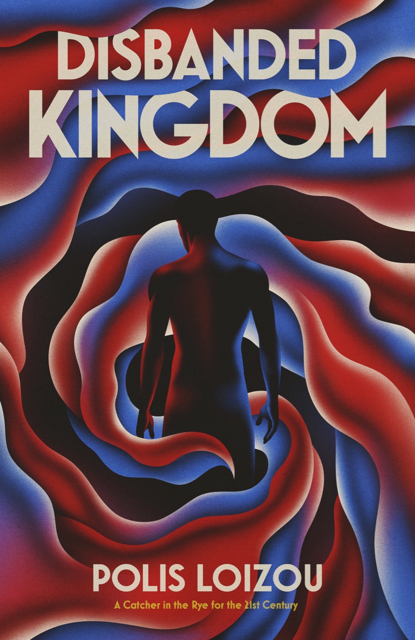
Ortega and Managing Director, William Campos, explain how the cover came to be and why they chose LaBoca to design it. “I think they are very good at LaBoca to capture the idea,” says Campos. “Because the title is Disbanded Kingdom, we had to think about what “kingdom” represents, as well as the flag and the colours. And as the book is about a young man coming of age, we also need to represent him.”
Campos also says that it was important not to mislead the audience. “We don't want the public to think they are going to be reading something about Brexit, for instance, it's a story, it's fiction that takes place around the time of the whole Brexit situation.”
“LaBoca has been from the start our preferred studio to work with on our covers,” says Ortega. “We love working with them and we hope to continue our association with them going forward, as much as possible.”
The swirls within the design lend a sense of turbulence to the cover. Campos says, “The turbulence is about the time and where the story takes place and also the turbulence of Oscar, the character, in himself, so it's a very good representation. LaBoca are very good at capturing an idea from the start and our experience has been that they usually get it by the second draft but on this particular one they got it spot on the first time.”
Ortega told Spine that past covers in the genre tended to use photos, but Cloud Lodge chose a different direction. “I think that there's a resurgence, and an interest, in good graphic design, which is what we're all about. We wanted to have something that harkens back to that time when you actually employed proper artists who did graphic design on the book covers.”
Campos believes this cover is more artistic, and that, in general, one should try to “pay attention to the cover... to appreciate the art that goes into it.” The finished cover features embossing and spot varnish on both the title and the author's name.
Scot Bendall, founder of LaBoca, comments on the cover design process for Disbanded Kingdom: “We usually receive quite informative briefs from Cloud Lodge for their covers, and it was clear they were excited to publish this book. They explained to us that it was essentially a coming-of-age story set in London against the backdrop of Brexit and the proposed split with Scotland. Being from London myself I could relate to how divisive and upsetting both of these events are. We had a starting point of visualising the main protagonist, surrounded by what we refer to as a ‘whirlwind of confusion’. We saw this as representing his emotions in the story, and also to capture the pace and atmosphere of a fast-moving city like London. Initially the first rough was an intense burning red colour, but in conversation, Cloud Lodge suggested that perhaps the colours could incorporate the red, white and blue of a Union Jack. We liked the idea of this as it could potentially add a layer of meaning to the design. We didn’t want to do it as an obvious flag reference, but something more subtle that perhaps only becomes obvious once you start reading.
After approval we extended the design to wrap around the spine and back of the book, and overall we’re pleased with the final result.”
Cloud Lodge Books releases Disbanded Kingdom on June 21, 2018.
Editor, artworker and lifelong bibliophile.