Snap, Grackle, Pop: Nicole Caputo Talks Cover Design for The Gunners

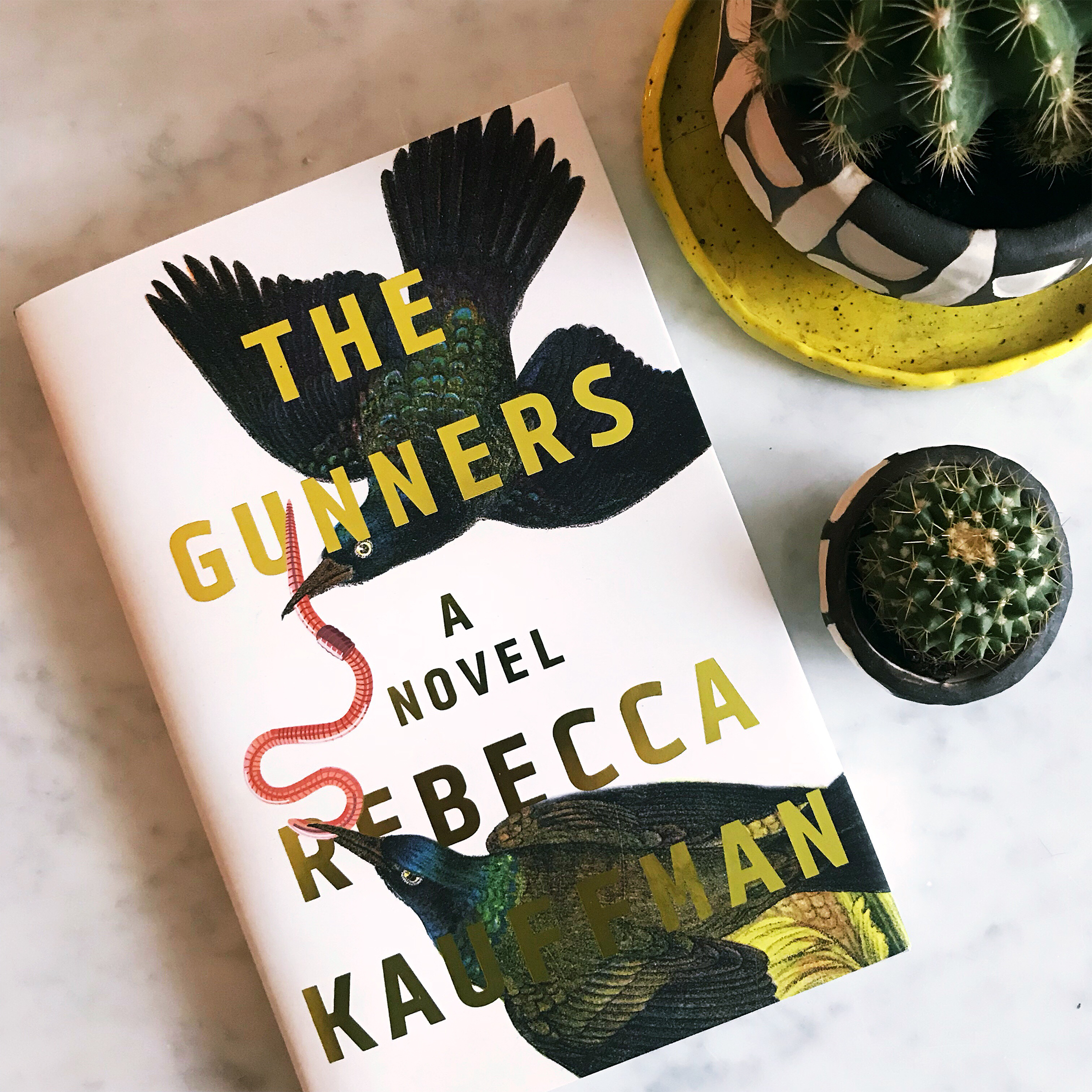
On shelves now is the beautifully jacketed novel, Rebecca Kauffman’s The Gunners. The bold, minimalist font asserts itself without descending to typographical aggression. Two grackles grapple (or perhaps share) an earthworm beneath the title and author credits. The balance between graphic and white space hovers near perfection. And how, you might ask, does a designer create such a gorgeous cover? Simple. According to Nicole Caputo, all you need is love. For the story itself, that is.

We spoke to Nicole Caputo, who also serves as Creative Director of Counterpoint Press (as well as Art Director of Catapult and Co-founder of She Designs Books) about her experience designing the cover of The Gunners, and her enthusiasm for the story—as well as her ability to translate textual meaning to visual impact—was evident in every response. “First, I will say that I loved every second reading and designing for this book. I was on a very tight deadline as the Spring list needed to be designed quickly upon my new arrival at Counterpoint Press, but I could not put this down, and read every page, some pages a few times!” Nicole said. “This is the type of project that leaves you missing the characters as if they have become old friends, the type of book you wish would not end and I am very much desiring a sequel (hint, hint, Rebecca, if you are reading this).”
Yes: this is a story about the cover of The Gunners, and that cover is remarkable. But Nicole Caputo makes a compelling case that the book’s insides are just as dynamic. After offering a brief synopsis of the book, Nicole explained how she latched on to the grackle motif in her cover design: “The Gunners follows the story of an extremely close-knit group of 6 childhood friends. Their relationships begin to fracture when one of the group dissociates from the others completely and we learn more about a long-held secret as the author moves us through their challenges of adulthood. The friends are reunited when one of the six commits suicide and they all gather to attend her funeral,” Nicole said. “As children, the 6 claimed an abandoned house for their meeting place in Lackawanna, a depressed suburb of Buffalo, NY. The children each grew up with single parents and the house was a safe place where they found comfort and connection and solidified the early foundation of their friendship. Including some aspect of this significant gathering place was meaningful and the stamped gold foil typography is representative of the mylar stickers that spelled out THE GUNNERS on the rusted mailbox mounted to the front door.” The typeface Tabular felt fresh and modern with clean edges that would contrast well with the textured artwork while also holding up well when integrated with the artwork.”
Let’s talk about birds. What’s a grackle, you ask? It’s a bird, and, in this case, it’s a bird with a whole lot of metaphorical import. “Grackles appear throughout the book and in one memorable scene after their friend has died, a magnificent ripple of them lifts off into a black spinning cone of silence or what the author calls an ‘after sound’. Prior to that silence, the air is alive with vibration from the birds, much like the times when the group of friends was together in their early days.” Nicole said.


Nicole Caputo incorporated the grackles into the cover, even though her first impulse was to amplify the metaphor of the earthworm: “One of the main characters owns a bait shop so there was a request for the cover to feature a photograph of a shop or bucket of worms to closely resemble the cover of the author's previous book Another Place You've Never Been, and I am sure to also give the book a sense of place. When I was hired as Creative Director of Counterpoint my goal was to update the overall brand and look for the imprint starting with the covers. This would help these incredible author's reach a wider audience, so I think about my choices for every project with that in mind and the use of photography didn't feel right or like it would accomplish that goal for this particular book. But I loved this metaphor of the earthworms and wondered if I could use it in a more meaningful way. I wanted to show this concept of extremely close friendship that at times almost feels like a detriment to certain characters and then the secrecy and tension which begins to pull them apart."

Early Cover Concept
"There is a scene where two of the characters are collecting earthworms for the bait shop and the bait shop owner, Sally tells the main character, Mikey, how you must tap the bucket otherwise the worms wrap up in each other and will literally squeeze the life out of one another. This inspired another direction featuring an illustration of brightly colored entangled earthworms that the publisher and I loved, but it was not for the squeamish even in vivid hues. So my other design using the two grackles and the single worm was chosen. Perhaps they are in a tug of war over the single worm or perhaps they are helping each other. They represent many dualities throughout the book including the loss of their friend on two occasions; once when she left the group and then later when she dies, each character's complex relationship with her and each thinking they were the reason she left them, and the two friends whose close connection inspired their group The Gunners.”
Nicole Caputo’s cover design of The Gunners alone warrants your purchase. You can read all about author Rebecca Kauffman’s process for writing this inspirational novel here.
All images courtesy Nicole Caputo.
Join us in celebrating the enormous talent that goes into making books. Consider a small donation to our Patreon fund. Your support helps us provide you with an in-depth look at some of the book publishing industry's most creative people.
www.patreon.com/spinemagazine
Mary Ryan Karnes is a freelance writer and a Master's candidate in fiction at the University of Southern Mississippi.