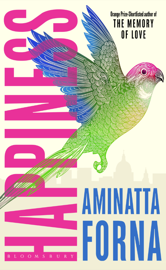
David Mann Creates Some Happiness for Aminatta Forna

David Mann is an Art Director for Bloomsbury Publishing. As well as designing covers for the likes of Margaret Atwood and William Boyd, he has created this stunning cover for Aminatta Forna. Here he walks us through his process for creating Happiness.
It was happiness indeed to receive such a great, in-depth brief for this one! From the start, we wanted to make a big literary statement, and create a special and unique package for Aminatta. Comparative titles on the brief were Hari Kunzru and Zadie Smith, who have incredibly bold, striking covers that are largely typographic. We could have gone that route, but we really wanted to get a sense of narrative and place into the cover as well as impactful typography.
Set in London, two strangers collide on Waterloo Bridge. Attila, a Ghanaian psychiatrist, and Jean, an American studying the habits of urban foxes. I’ve had a bit of a run of fox covers! We published The Trees, The Many Lives of Katherine North and more recently A Black Fox Running. Obviously, foxes are part of our everyday life and synomynous with London, however, the image that really stood out to me is that of the parakeet that is seen around London. There is also a nest of them in a tree in a graveyard where Jean runs every day, and when it is defiled the community come together. Themes of the novel include immigration and our co-existence with one another, and all living creatures, so the exotic parakeet seen in London was a great symbolic hook for the design.
I initially started with just the bird, but soon decided to introduce the sense of place, as well as playing with the disparity between urban and natural. I tried a map of South East London in the background but moved onto a graveyard, then onto Waterloo Bridge and St Pauls as both are key to the narrative. I did like the richness that the map brought to the background but eventually took an abstract route of patterning that could suggest both sky, but also the rolling Thames.
The design came together quite quickly – I love the title, and wanted it to have maximum impact. It looked tight on some designs horizontally, so rotated it up onto it’s side making it (to me) look a little like a tower block. Initially I played with contrasting the greys of London (architecture, the weather and pigeons), but with such a buoyant title it looked too ironic, which was not the look I wanted. I felt the design should be packed with uplifting colour, as well as contrasting nature with architecture. I tried several colour treatments before settling on the blue/green bird with a hint of pink to tie-in with the type colour.
Sometimes it is difficult to achieve bold colouring through the usual print process, but I was really pleased with the proofed colouring, and didn’t need to use Pantone to get a great, hot pink. Eventually, we only needed to add spot gloss to pull out the details of the patterning giving the waves/clouds a shimmer, and highlight the boldness of the type.
Join us in celebrating the enormous talent that goes into making books. Consider a small donation to our Patreon fund. Your support helps us provide you with an in-depth look at some of the book publishing industry's most creative people.
www.patreon.com/spinemagazine
Editor, artworker and lifelong bibliophile.
![TT[1].png](https://images.squarespace-cdn.com/content/v1/56cde58af699bb2bd4ea993a/1522010319696-4LPVFXSXUX0OID5ODWHF/TT%5B1%5D.png)
![KN[1].png](https://images.squarespace-cdn.com/content/v1/56cde58af699bb2bd4ea993a/1522010346406-S3LANP5M61UO4XKKEXG9/KN%5B1%5D.png)
![BFR[1].png](https://images.squarespace-cdn.com/content/v1/56cde58af699bb2bd4ea993a/1522010375691-05IZT2YMKCGMWYZMLC1K/BFR%5B1%5D.png)


