Matt Broughton on Designing Dead Men’s Trousers

Matt Broughton is a Senior Designer for Penguin Random House. Here he details the process for creating the cover for Irvine Welsh's new book, Dead Men's Trousers.
Dead Men’s Trousers is essentially the next chapter in the Trainspotting story, dragging our favourite characters into the Brexit era. Renton is the jaded manager of a number of internationally acclaimed DJs. Sick-Boy, as usual, has his hands in whatever sordid deal he can find. Spud is still Spud. And bizarrely, Begbie has reinvented himself as a celebrated artist.
Each character has an agenda – the friends stalk each other, deceive each other, use each other, corrupt each other. It’s an often hilarious, painful, yet surprisingly moving ‘dance of death’. An idea that lead us to our cover – a re-enactment of Michael Wolgemut’s 1493 woodcut Danse Macabre. With added trousers.
The skeleton marionette was originally created by artist Tony Sinnott for 2011’s Skagboys (the Trainspotting prequel) and revived for this latest episode and forced to wear tiny trousers for the benefit of the cover (the skeleton - not Tony).
Danse Macabre - Michael Wolgemut
I made the trousers at home by scaling down an existing pattern. I’ve an interest in tailoring and have taken a few sewing courses, so although I’m strictly amateur, it was a nice challenge. I began with the idea of making a mini pair of 501s, but rejected denim for being too heavy so they eventually ended up more like a pair of soulboy Oxfords, which seemed appropriate somehow. It’s definitely a first for me regarding cover design... I pinched my wife’s disco ball for the back cover, which had been hanging round our garden, and besides that, very little else was needed for the shoot.


Photographer Sam Barker did all the hard work. I’ve worked with Sam on many covers - including The Blade Artist, A Decent Ride and Sex Lives of Siamese Twins for Irvine. We always have our cover concept worked out beforehand.
Shooting an object that is suspended demands much patience - we ended up twisting our skeleton into unnatural poses to animate the scene. It’s typical to find the exact look you’re after and then watch in frustration as one tiny arm movement throws the whole shot out of kilter. Once the main shot is in the can, we work on any other poses or ideas that come to light on the day – like our skeleton lying in state which features on the case of the book (somebody dies in DMT - you’ll have to read it to find out who), plus gif ideas or any other moving image that could be useful for marketing purposes.

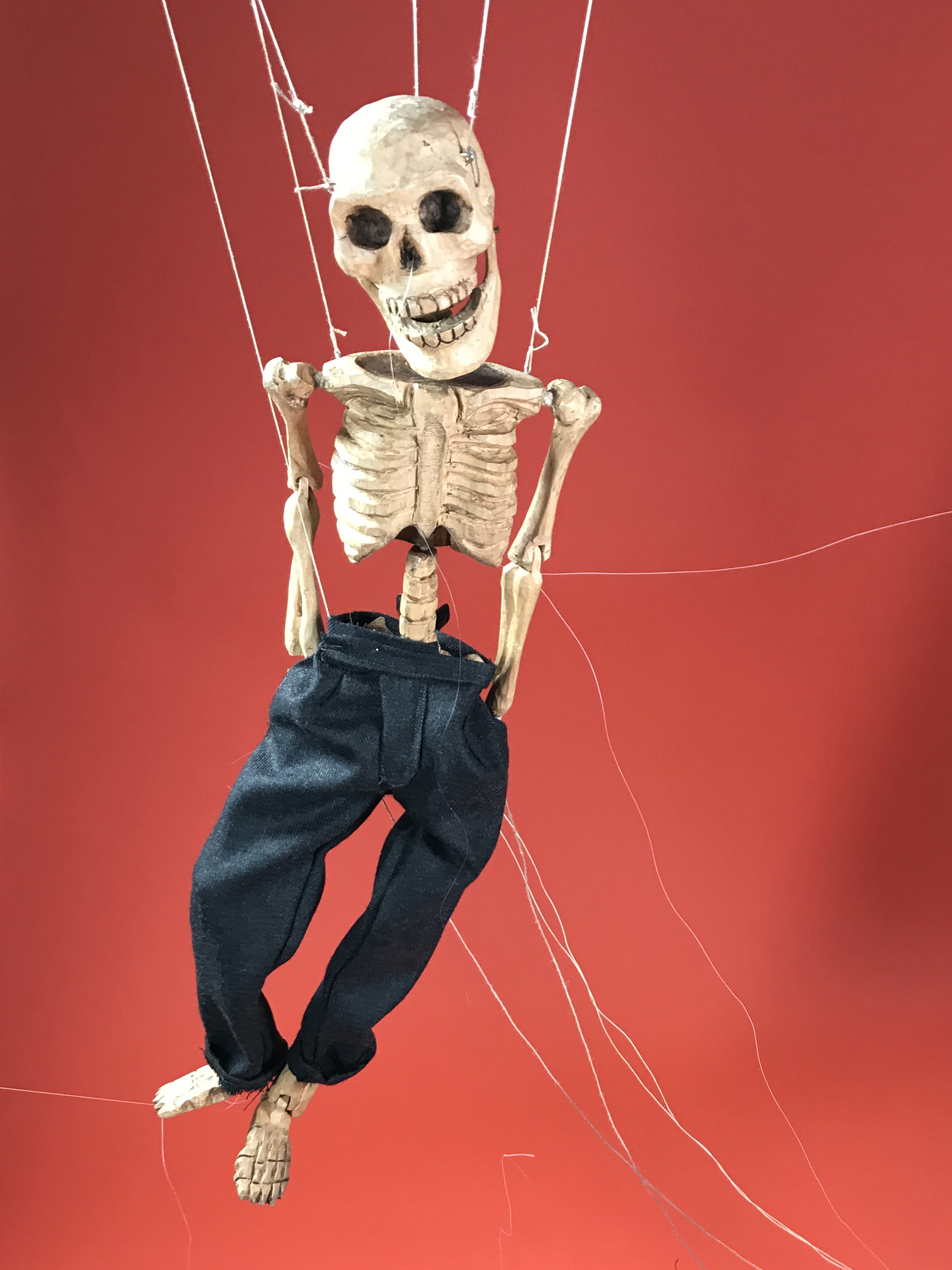

With the final design already planned out, it’s about making the pieces fit together. We shot on a strong colour background for two reasons. One is that Skagboys had a black background which made the wooden bone a deathly white - perfect for that book – but with Dead Men’s Trousers moving on from that particular addiction, we needed a brighter tone and didn’t simply want to ape what was previously successful. Secondly we needed a colour that contrasted the trousers.
Final cover
The typeface (avant garde) was chosen because it stacked particularly well - there are no odd characters screaming out at you. I’d established this layout before the shoot and it was simple a case of working into the figures once I’d got the pose in position on the cover. It was important to get the type playfully integrated with the skeletons. Like the D’s – one yanked round the neck of our gurning fellow on the left and the other socking our right figure on the chin. There’s also something distinctively creepy about the skeletal hand dipping into the ‘Men’s Trousers’!
As is always the case with Irvine, the devil’s in the detail.


Join us in celebrating the enormous talent that goes into making books. Consider a small donation to our Patreon fund. Your support helps us provide you with an in-depth look at some of the book publishing industry's most creative people.
www.patreon.com/spinemagazine
Editor, artworker and lifelong bibliophile.