A Look at International Editions

When a book originally written in English is translated for a new audience it often requires a new cover to go with it. Some of these are very similar, taking elements from the English version, while others are vastly different. It's difficult to draw any conclusions about how these markets differ from the UK or US simply by looking at these covers. That would require a lot more research, comparison and conversation with designers. (PhD thesis, anyone?) In this article, I've instead tried to focus on the objective design choices that have been made rather than judging them as better or worse. Just as with US vs UK covers, I don't think that's a useful conversation. Moreover, it's impossible with the markets being as different as they are.


There are several English language editions of Ernest Cline's Ready Player One, so I'll be comparing this Czech edition to the first edition of the book. In Jiří Mičkal's version, the 1980s gaming influence is clear. The type and illustrations give it a playful sci-fi look. The first edition is a lot simpler in many ways, foregoing illustration for bold, colourful typography. The result is a cover that is less obviously sci-fi but would certainly stand out in the sci-fi/fantasy section of a bookshop. Mičkal's also includes more colour but keeps to simple, saturated primary shades. Using yellow, the lightest and brightest of the colours, on the title ensures that it jumps out at you, along with the key and player symbols.


In this version of Tommy Orange's There There, the designer, Bryn Perrott, has adapted the Suzanne Dean cover for the Dutch market. Perrott kept a limited colour palette but used red and yellow instead of the orange and black of the original. The illustration intersects with the lettering in a similar way, except the illustration has been made transparent, so there isn't that same weaving effect as with the other. It looks more like a stamp that has been layered over the text. This results in less contrast than on the UK edition, but an equally striking design. Both covers, as well as the US edition, use bright, warm colours which are eye-catching and inviting.


There are lots of international editions of Max Porter's Grief is the Thing With Feathers and they all seem to have the common feature of the crow. This makes sense seeing as Crow is a central character, based on the Ted Hughes poem. The crow really is the only common factor between the Faber original and this Bulgarian edition. The original features cool, sombre colours one would expect to go alongside the theme of grief, with the imposing silhouette of Crow covering much of the cover. Of all the international editions listed on Porter's website, the Bulgarian one is by far the most colourful. An article run by LitHub in April suggests that the designer, Ivan Maslarov, ran through many more monochromatic versions before arriving at this one.
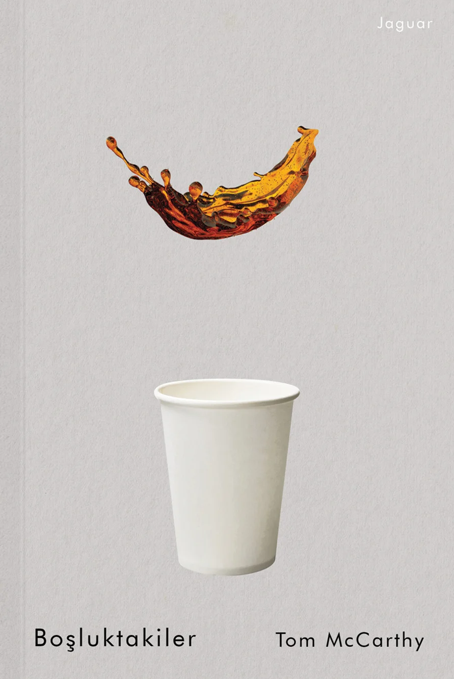
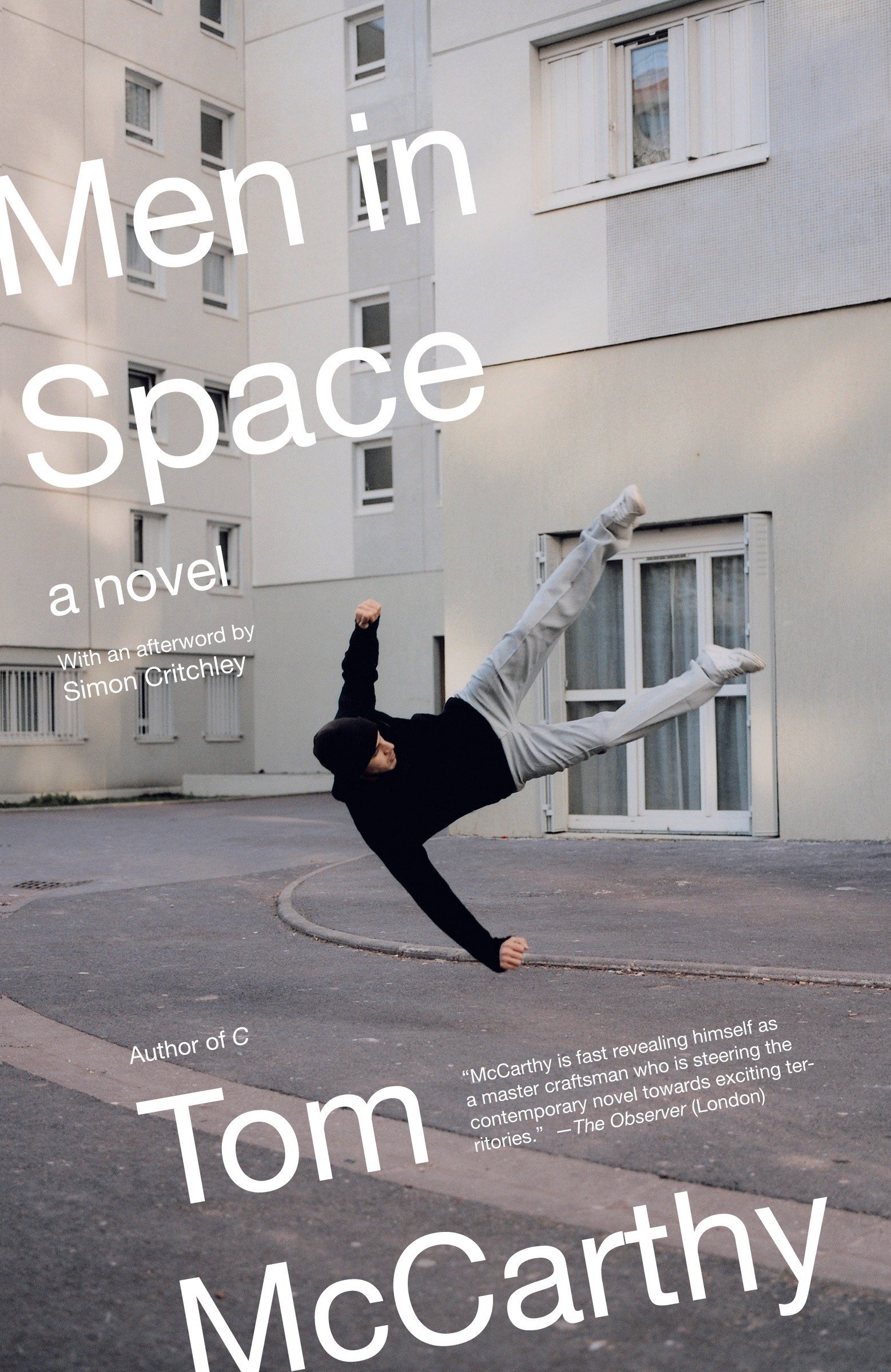

All three versions of this Men in Space cover feature photography in different ways. I haven't read this book but I gather that it's set after the fall of communism and follows an unlikely group of people on the pursuit of a stolen painting. The characters are all lost in some way, whether that be physically, spiritually or emotionally. This Turkish language edition reflects the sense of dispossession, the sense of being close to home, yet so far away. The other English language editions all express this idea in different ways, one showing a ladder casting a strong shadow across a wall, and the other depicting a man floating above a pavement.

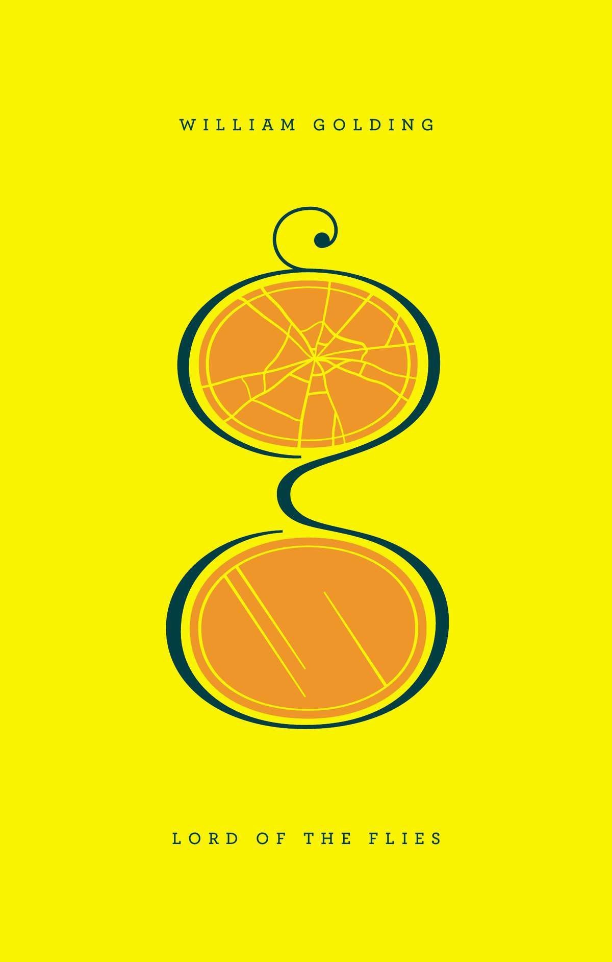
As a modern classic, Lord of the Flies has been covered and recovered many times in many languages. There's a certain visual language associated with the book and most covers include imagery such as the jungle, spectacles and a pig's head. In this version from Thailand, we see a more abstract image that plays with the tribal themes of the book. Handprints are fashioned from negative space and the whole cover has a simple, printmaking aesthetic to it. I can't claim to know anything about the bookselling market in Thailand, but this is a distinctive cover that stands out as something different amongst its international counterparts.
Book Designer and BookTuber.