Discussion with Designer Janet Hansen
By Jessica Schiffer
Janet Hansen, a designer at Alfred A. Knopf, has a slew of standout covers to her name that are not only brilliantly designed, but perfectly in tune with the stories they cover, as well. While you might expect that to be the norm, it’s not, but Hansen’s reverence for the written word and the authors she works with ensures that the content and cover are always in sync. Impressed by her breadth of work (which has been celebrated by everyone from The New York Times to Design Observer) we chatted with Hansen to find out how she got her start, what her process is usually like, and what inspired some of her most recent works, including The Bed Moved by Rebecca Schiff and Voices in the Night by Steven Millhauser.


What drew you to book cover design in the first place?
It's not something I thought about growing up. At all. I just knew that I wanted to work in a creative field and once I got to the School of Visual Arts I narrowed it down to graphic design. After graduating I designed for cultural institutions, nonprofits, artists, and education. On paper I was doing something I loved and was a part of things I felt passionate about, but it wasn't as creatively fulfilling as I had hoped. My husband (then-boyfriend) is a book cover designer, and we went to a party where I met the Creative Director of Penguin Books. He offered me a freelance illustration project and then immediately a job as a designer.
I thought about it a lot, and what's great about book cover design is that you get to dive into so many different subjects and ideas creatively. I love that my job is to give a face to ideas that are bigger than me, and that I can be a part of things I’m passionate about. Also—I’m constantly learning and contributing to the education or pleasures of others, so it feels good.


Can you walk me through how you get most of your work—do publishing houses reach out to you, or authors directly?
I work in-house at Penguin Random House for two imprints, Knopf and Pantheon Books. So most of my work is for them and it is delegated to me by the art directors here. When I get work from other publishing houses, I am usually contacted by their art director. Only in a few circumstances have I interacted directly with the author, but it's rare for me.
“My goal is always to try to design the book cover as an object rather than just a sort of advertisement for the content inside, even though it really is both of these things.”
What’s your process like with each book? How much time do you devote to planning each one out?
In almost all cases I speak to the author indirectly through the editor. My process for each book is different depending on the variables at play. Sometimes I have the liberty of working on a cover for months—sometimes less than a week. In some cases, the manuscript isn't in or there's direction from the editor or author to go a certain way, so you have to work within those confinements. I'm most excited when there's no direction at all and I can start with a clean slate.
I like to study what is out there and what will coexist with the book and try to do something that will stand apart from that, while still being appropriate for the subject matter. My goal is always to try to design the book cover as an object rather than just a sort of advertisement for the content inside, even though it really is both of these things.
Can you walk me through the design process for the following…
The Bed Moved by Rebecca Schiff
While reading these stories I thought a little about their similarities to Miranda July and Lena Dunham, so I thought about those covers.
To help minimize the themes of the book, I used a grid of boxes to write them down:
playful, funny, young, chaotic, sexual, edgy, personal, feminine, and smart. I pinned this sheet of words up and stared at it for a few days before starting, and I tried to approach the design by only thinking about these themes.
The final cover was one of my first ideas and I went to the editor with it right away. She initially loved it and so did the author, but they seemed to be uneasy about officially approving it. They asked to see revisions and a few more cover designs, and I worked on those revisions for a month, but luckily in the end they came back to this one.
Voices in the Night by Steven Millhauser
This was the first book I was assigned at Knopf. I thought a lot about the tone of Millhauser's previous covers and whether this one should tie into those. The title was very specific to the one story, so I decided to rely on the art to encompass all the stories as a whole.
Again, I filled my sheet of boxes with themes from the stories: illusions, dark humor, magical realism, fantasy, tales and death. There was a lot going on, but a common theme was a shift from the normal to the fantastical.
I thought about the idea of showing an optical illusion, and this cover came sort of coincidentally. I was at the Guggenheim when I saw an amazing illusion in the design of the building. I drew it up in Illustrator. It was the first and only cover I had showed the editor and author and it was approved enthusiastically—a rare feat!
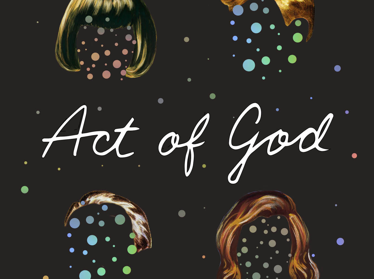
Act of God by Jill Ciment
I wanted this cover to be funny and playful. Initially it had a cream colored background with a different style typography, but tweaks were made per the editors request. This novel is sort of an existential crisis, asking “can good people do horrible things and still be considered good?” A mold infestation takes over a small Brooklyn community, and a question follows these oddball characters—is this an "Act of God" or could it have been prevented by us humans? This was the underlying theme of my design… as the mold takes over their lives and their identities.
Do you have a favorite cover so far? It's easy for me to nitpick my covers, [as I’m] chronically critical of myself, but the one I do that with the least is Voices in the Night.


Do you think there’s a through-line between all of your work? I personally love how different each cover feels. Perhaps there’s something in common that you try to achieve with each one? I try to accomplish a design that is both appropriate for the subject matter inside but also surprising and hopefully different than what you would expect. I also try to stay true to what I believe is good design. I’ve noticed that I tend to lean towards things I personally enjoy, such as patterns and simplicity.
What or who are some of your inspirations?
What: Nature, cities, animals, film, art, museums, news, people, food, architecture and fashion.
Who: My husband Christopher Brand, Peter Mendelsund, Carol Devine Carson, Paul Sahre, Leanne Shapton and Rodrigo Coral.