Q & A with Designer Jess Massabrook

Jess Massabrook is a graphic designer with Princeton University Press. There she creates promotional materials for the publisher, as well as designs covers for books such as Do Zombies Dream of Undead Sheep? and Too Hot to Handle: A Global History of Sex Education. Here Massabrook joins us to answer a few questions on process.
What was your path to becoming a book cover designer?
I never really made a decision to become a book cover designer. I went to Moore College of Art and Design in Philadelphia for a degree in Graphic Design. While there I was required to complete an internship between my junior and senior year. After some searching I found one within the design department at Princeton University Press. When I graduated the following summer I started working at the Press and have been there ever since.
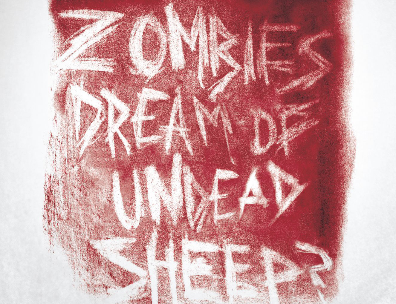
How did you create the cover for Do Zombies Dream of Undead Sheep?
This was published during a time where pretty much everything was about zombies. There were a lot of visuals around that I was kind of absorbing. And I knew I wanted the book to feel and look dirty and abused.
For the title of the book I used charcoal to coat the bristol board. Then, using an eraser, I wrote the words over and over again until I felt it had the right look. Once I felt I had it in the right place I brought the art into photoshop to give it the blood red color that you see on the cover.
The author names and subtitle were done in the opposite way, I just wrote them in charcoal. I also incorporated that look into the interior where I used charcoal tally makers for the chapter numbers.
You also create motion based advertisements for Princeton University Press. What does the process for developing those entail?
The book trailers have been a really great way for me to collaborate across departments. Generally speaking, it's the advertising department that makes the request. The advertising manager, Donna Liese, our Advertising and Social Media Design Director, usually has some kind of script ready and I will return to them either with a drawn storyboard about what kind of look I think makes sense or we'll just have a conversation about it.
That was the case when it came to the trailer for Strange Glow which was one of my designs, Where Are the Women Architects which was a design by one of our freelancers. In both cases I always strive to make the design of the motion graphic reflect the design of the book so that it feels like a complete package that goes together.
More recently I have been working on a graphic for The Great Leveler which has been an even larger group effort. The designer of that jacket is one of our in-house designers, Chris Ferrante. This time, after I received the script I asked him if he wanted to collaborate on it more closely since it was one of his design projects. He collected the illustrations that appear within the trailer and started work on the storyboard with the script in mind. Then I determined what kind of motion effects we could apply and how to transition between each part. We then passed on that information to Donna, who approves of it, and I created the project in After Effects. Once that's finished it's sent to several people throughout the press - the director of sales, publicity, and sometimes the author to approve before it's shared.
What has been the most rewarding design experience for you so far? Why?
My best work really seems to come from the times when I create a design I feel really strongly about in both concept and execution, which is then approved in-house, and when it finally gets to the author they seem genuinely surprised by how much they like the design. That has been the process with some of the books I am most proud of which include Too Hot to Handle and Strange Glow.


