Freelancer February: Jason Anscomb on Designing The Psychopath

Jason Anscomb is a graphic designer who has worked at various London-based book publishers and also spent time working with a publisher in New Zealand. He decided to go freelance in 2006 and has never looked back. Here he takes us through his process for designing the wonderfully simplistic cover for The Psychopath.
The Psychopath pitches itself somewhere between American Psycho and Dexter and is influenced by both to some small extent.
The cover brief was to find a solution that hinted at the themes of academia and murder. The main protagonist also had clear signs of having Obsessive-Compulsive Disorder which I thought could possibly play a part in the design.
An initial thought I followed for a while was to portray a murder weapon. How about a baseball bat (from P.E.) a compass or sharpened pencil?
It occurred to me the cover should probably have some blood.
Then there is always the question: how much blood?
I also considered a chalkboard as a way of creating the typography for the jacket. Could I suggest someone raking their nails down a chalk-board but do it using the type of the title alone? Probably a tall order.
I have a slightly irrational love of the graphic look of lined paper. So it was on my list of ways to suggest the academic part of the theme. This choice of image was the starting point to the design really.


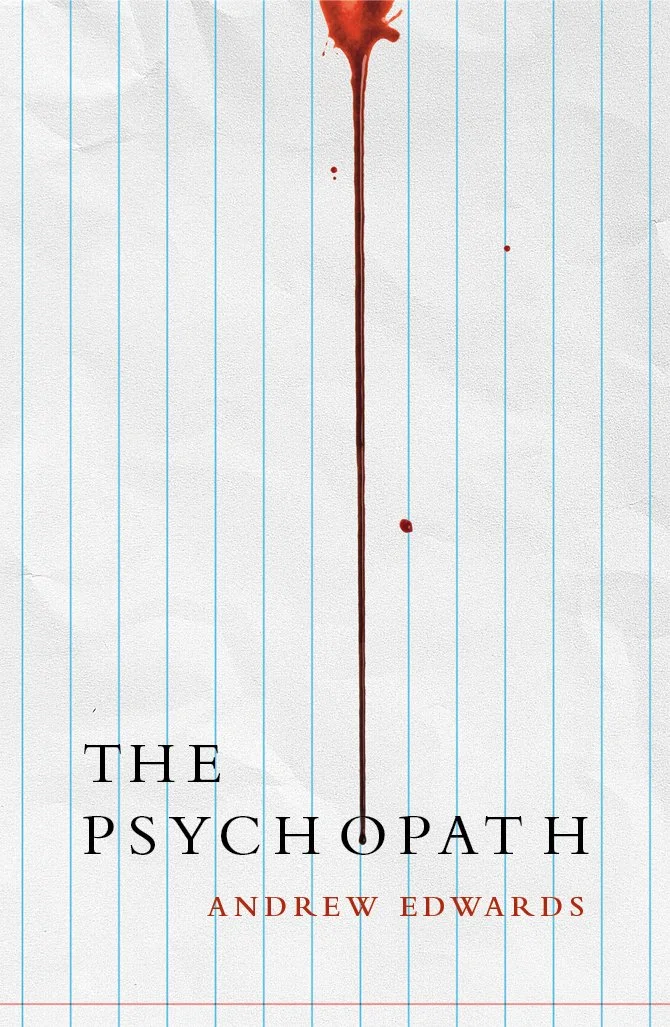
It then occurred to me that I could mess with the lined paper in some way. I quickly came to the idea that the lines of the paper could be rotated to suggest cuts. Then it was a case of adding a drip of blood to make that intention crystal clear.
I liked how the messed lines also suggested a loss of control.
How about the blood trickling down to form an eye? That’s probably reaching a bit.
I had a tiny moment of OCD of my own. Should the red line cut through the subtitle? Yes, it probably should.
In terms of typography, I followed a tried and tested route.
I often work by typing out the main title many times and setting it in different typefaces on one page.
Best design practise I think is often to just compare lots of options. See what sticks.
My thought was that a condensed sans serif would do the trick. But that felt a bit overbearing in weight compared to the fine lines in the image.
Academia is often suggested by the refined elegance of a serif font. I tried out a few and there was immediately a better balance between text and image. So it was a question of trying out a few serif faces and eventually settling on an old favourate (Bembo).
As a designer you always fear a cover design like this could get swiftly killed. The cover to The Psychopath isn’t that rich in lush imagery. There is no glimpse of the main character (like a silhouette) running down some dark alleyway.
Luckily, Clare at Red Door press could see merit in the design and the author was thankfully on-board as well. So it survived to live another day (sorry).
Final cover
Editor, artworker and lifelong bibliophile.