Sara Wood on Designing God of Mercy
Sara Wood is a freelance book cover designer currently living and working in Chester County, PA. Here she takes us through her process for designing one of my favourite covers of 2021, God of Mercy.
In October of 2020 — at a time when I was wrapping up my first year of full-time freelance work and was deeply mired in the daily stresses of pandemic life — I was lucky enough to receive an e-mail from Rodrigo Corral, in which he offered an exciting opportunity to escape into a world very different from my own, via God of Mercy by debut author, Okezie Nwoka, published by Astra House. Rodrigo explained that Astra House was a new imprint, and that this novel would feature in its inaugural season. Everything about the prospect of this work felt refreshing and new, and I couldn’t wait to get started.
The manuscript was completely engrossing and beautiful, and read like ancient folklore or a classic fable. It was clear to me that the cover would have to represent a feeling of otherworldly spirituality, while still communicating the same earthy texture of Nwoka’s prose.
To summarize and reduce the novel to only its broadest strokes, God of Mercy is a story about Ijeoma, a young Igbo girl who is blessed — or cursed — by the gods with the power of flight, and who is forced into exile by colonizing forces who deem her a witch. Ijeoma’s village is one of the last in their region to retain the traditional ways, including the traditional theologies, and threatens to buckle under the weight of encroaching Christian influence.
I often read manuscripts on my phone, which is not an ideal reading experience, I know, but it allows me to keep brief notes of imagery that feels important to me as I read.
From there I will either go straight to image research, if a photographic approach feels appropriate, or I will begin my thumbnailing process, which consists of tiny sketches of very loose cover ideas. In this case I started with some thumbnails to get some early thoughts translated into images and guide my research.
I wanted to explore the concept of flying, as well as use the symbols and graphic elements found in many pre-colonial Igbo patterns and methods of mark-making. Concentric circles, diamonds, repeating lines, dots, and intricate swirls can be found carved into doorways, painted onto skin, cast in metal, woven into textiles, and beyond. Accounts like @ukpuru on Instagram offered really rich resources on the pre-colonial traditions of southeastern Nigeria and the Igbo people. Ijeoma, being such a central figure of the narrative, seemed like a natural choice for representation. I also thought that using the culturally significant kola nut, or “Oji” — a visually stunning pink fruit of the kola tree — could look intriguing as well as connote a sense of place. My first round was executed with all of those factors in mind.


Rodrigo requested some small edits to these comps, mostly regarding balance and type size. He also asked that I incorporate more of a sense of pattern to one of the designs that previously had abstract textural components. I ended up including some “Uli” Igbo motifs, which strengthened the overall design, but our favorite continued to be option #2, which was now solidified with slightly larger type.


It was the simplest and most impactful of the bunch, and was perhaps the design most directly inspired by specific passages from the book:
“It drew her upward, raising her like smoke from a burning fire, raising her to the nests of nza birds and the first scatterings of light from Anyanwụ: the divine sun. She rested there, suspended like fruit too precious to pluck or a thought too erratic to name. She rose to the sky, and nobody was there to see it.”
“…how could it be so, working each day to love the Most Supreme, to love my mother, to love my father, then to be punished with this punishment––weeping as though dying from the fire in her tears.”
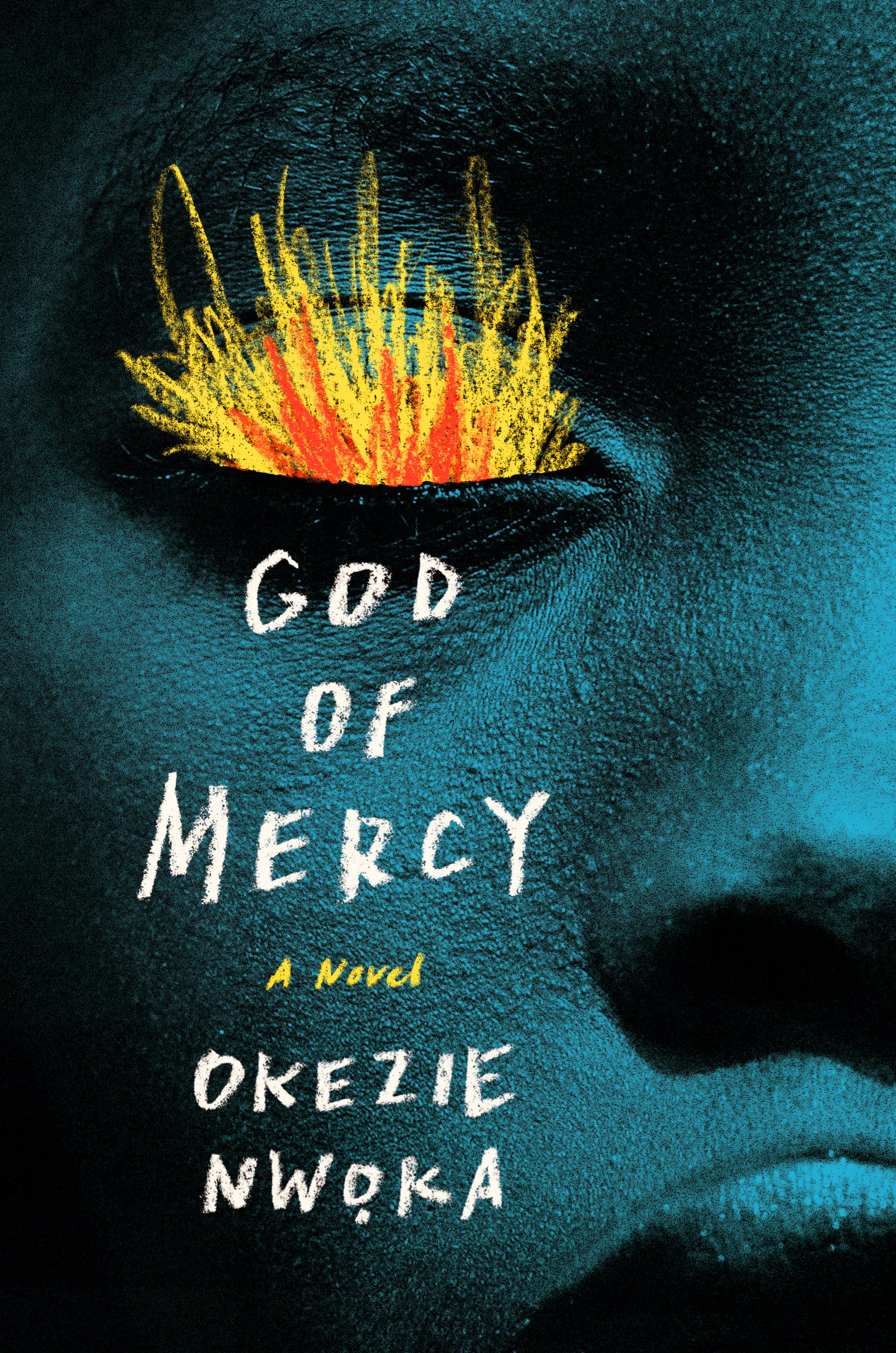
Pairing a young girl’s gently stoic expression with burning fire — the fire of Anyanwu, the pentecostal fire of the Christian holy spirit, the fire of human destruction, and of Christian hell — felt like the correct path. I kept Ijeoma’s monochromatic likeness constrained to a tight crop, to enhance the sculptural effect and make her appear more iconic and totemic.
Final cover
Editor, artworker and lifelong bibliophile.