Q & A with Jaya Miceli

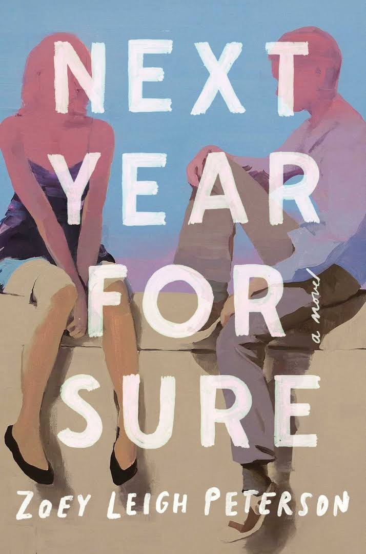
Jaya Miceli is an Art Director for Simon & Schuster imprint, Scribner. Among her designs includes the covers for Zoey Leigh Peterson's Next Year For Sure, Katie Kitamura's A Separation, and Charles Lambert's The Children's Home. Miceli was kind enough to answer a few questions for Spine.
What path lead you to becoming a book cover designer?
After graduating from Parsons School of Design with a BFA in Illustration, I was in a career derailment, working as a clothing sales clerk in the Manhattan Mall. I was so down in the dumps that I wasn't on a creative path and after struggling with this daily dilemma, one day I woke up from a nap thinking about how much I love reading books and how I have always admired the covers and jackets. I decided I should figure out how to become a book cover designer! With this goal in mind and determination, I took computer classes to learn the design applications, since I knew as little as turning on a computer at the time. I had the good fortune to have a friend in publishing who told me of an junior design position at Penguin and I was hired without any graphic design experience or knowledge in fonts and typography. So I learned the best way possible, designing on the job. It wasn't easy, but good timing and luck led me to this design path.
Have you always wanted to work in this field?
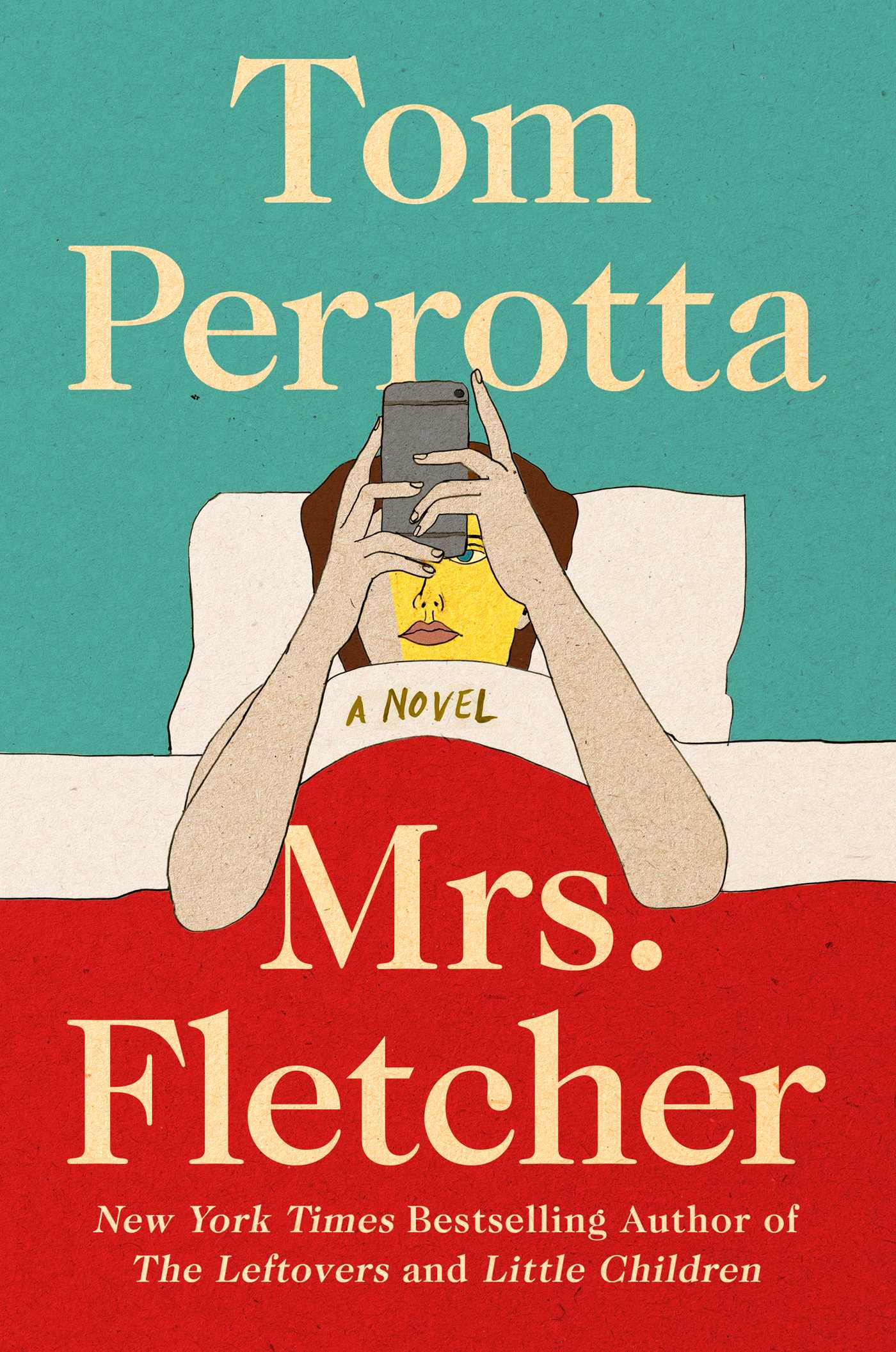
I wanted to be an illustrator, but wasn't very good at self promoting, sending out mailers and reaching out to art directors etc. I always knew I wanted to draw and create images. Since I didn't have formal graphic design training, learning how to use fonts and typography was really hard for me at first, which is when my illustration background came in handy and I would use hand-lettering or my own illustration in my cover design work. I get to "hire" myself for an illustration for a cover, for example, Tom Perrotta's new book, Mrs. Fletcher, I drew the illustration of the woman in bed.
Do you have a proven process or do you approach each project differently? Where do you look to for inspiration?
Keep it simple. I read the books. I try to get a good sense of the story or find something that stands out and also I try to visualize while I'm reading. The main key in my process is doing a lot of image research, looking at art, photography and graphics for inspiration and sometimes to use on an actual cover. Fortunately, there’s many art websites and art blogs to find inspiration, but I also have a collection of art and graphic design books, which I always turn to as well. I'm always a bit intimidated before I start designing, because I want to do justice to the book and create a distinct cover that captures the essence of the book and then I think, can I do this "design" thing again? With that anxiety, I start designing, I try to think of the cover as if it were a poster one would want to hang on their wall. I try to piece imagery or artwork, the title and author's name to all somehow come together as one striking "object."
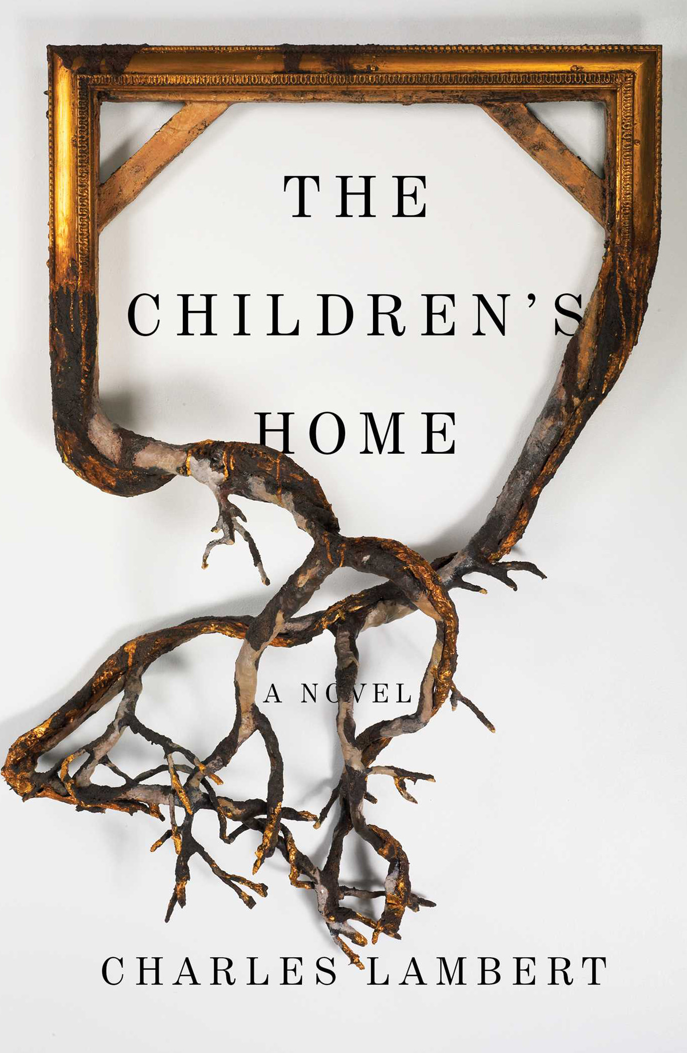
Your book cover for The Children's Home is featured on numerous Top Book Cover lists of 2016. Care to tell us a little bit about the process in designing this cover?
The Children's Home is an odd, dark story about a recluse who has visitations from lost children. I remember coming across Valerie Hegarty's hauntingly beautiful artwork and it felt right for the book. The gold guild frame gave a sense of place, of someone's home and then the frame's transformation into twisting branches reminded me of the recluse's fear of looking at his disfigured face in a mirror.
You're also an Art Director, which pants do you enjoy wearing more often and why - A.D. or designer?
I really do enjoy doing both design and art direction. I love using my imagination and coming up with an artistic expression or image for a cover, but I do like getting creative input from Art Directors, especially when they push me to explore something I started even further or in a way I wouldn’t have thought of trying. So the same goes for when I'm the Art Director, I enjoy being on the other end seeing the creative ideas and designs I didn't expect and then sharing my creative input/feedback and working somewhat collaboratively with a designer. As an Art Director, my goal is a final product that a designer can be proud as well as the author and my publisher. I think creative people can enhance each others work for the better.
What is your favourite cover you've designed?
Once a book project is over, I'm on to another project, so I kind of move on. Since I have to come up with new, unique and exciting ways of solving the same old 6 X 9 canvas, I'm constantly thinking how to keep the cover designs fresh and innovative. The covers that have some kind of illustrative quality or expressive tone I do tend to favor more only because it satisfies the illustrator in me. Recently, I like the way A Separation by Katie Kitamura turned out. I enjoyed working on, and am happy with the final jacket on The Readymade Thief by Augustus Rose, in which I wrapped a book up with twine and photographed it. In the end I just hope that I did a good job and that the book has a package everyone is happy with. But with every new project comes that same bit of anxiety in me of whether I can "do the design thing again." I think that's what keeps me from not getting too comfortable with the work I do. I probably have more favorite killed covers, because they never had a chance to become a final cover on a book. I'm keeping those in my back pocket ; )


