Melissa Four and The Age of Spectacle

Melissa Four is a very talented book cover designer whose creations include jackets for Fates and Furies, A Gentleman in Moscow, and How Not to Hate Your Husband After Kids. She also developed the cover for Tom Dyckhoff's The Age of Spectacle: Adventures in Architecture and the 21st-Century City, a project for which she had to teach herself how to draw in CAD. Four talked to Spine about the details of the design. Here is her process, in her own words.
This was first briefed as a photographic cover, so I tried some ideas using images that Heather Vickers, our picture researcher, had found for me.
The top right visual was chosen in our jackets meeting, but when we showed Tom Dyckhoff, he felt we needed something a bit more questioning and playful – which would reflect the book better. It’s a critique of the rise of ostentatious architecture rather than a celebration of it. Tom suggested photographing those little wooden cities Muji sells, a cool idea but I thought we could take it further. I wondered about making little paper models of some of the buildings featured in the book to photograph, here’s my attempt at the Gate to the East
I thought paper models might look a bit too ‘home-made’ and it occurred to me 3D printing, which I’ve always been intrigued by, could be the answer! I approached a 3D printing studio (3DPRINTUK) to check costs and submitted this rough to our jacket meeting.
I knew commissioning someone to design the buildings would be too expensive, but if I managed to design them myself and we just paid to print them, we’d be well within budget. The idea was approved and I was given the go ahead, which was very exciting… and terrifying! Now I had to work out how to use a CAD program.
I downloaded FreeCAD, an amazing open source 3D CAD modeler, and realized I was in big trouble – it’s intuitive and well designed but very different from the Adobe software I’m used to. I was saved by a nice German man on youtube and his tutorials, which taught me everything I needed to know to draw the buildings, with a lot of trial and error.
I sent the files off to be printed and nervously waited for the results - I was thrilled with how they turned out. The printers told me they’d have the texture of an extra strong mint and they really do!
To add the ‘do it yourself’ theme of this cover, both of the photographers I wanted to shoot the models weren’t available in time. So I ended up photographing them in our studio.
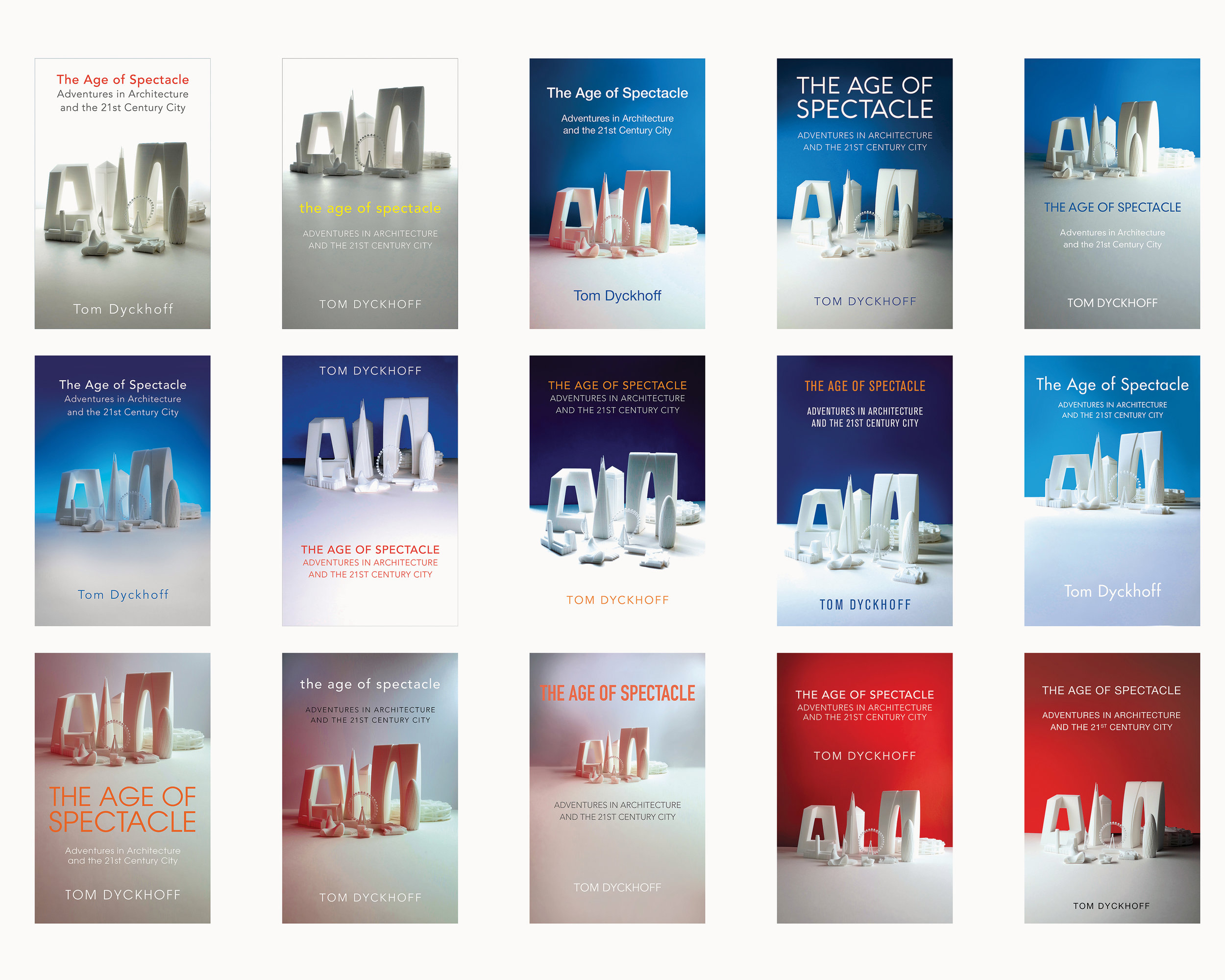
I tried lots of different background colours etc., and then it took a while to narrow down which design we wanted, but here’s the finished jacket.
I learned a lot designing this cover but the main thing was – be brave! The whole time I was working on this I was thinking ‘heeeeeelp I don’t know what I’m doing’ but I ended up with an unusual cover that the author likes (phew!) and that I’m really proud of.


