Jaya Nicely on Designing Tweakerworld
Jaya Nicely is a Los Angeles based art director, illustrator and designer. Here she takes us through her process for designing the delightfully psychedelic cover for Tweakerworld.
Before I began designing this cover, I met with author Jason Yamas to hear more about his story. Tweakerworld is a memoir documenting Jason’s plunge into the ParTy n’ ‘Play (PnP) subculture in the gay community and his subsequent rise as a meth lord in the Bay area. While this book is about heavy topics like addiction, abuse and shame, Jason covers them with humanity and humor. After another discussion with the team, I knew that this cover needed to be fun at first glance, but when you look further you notice something is “off.” There’s darkness in the Tweakerworld, but no one sees it right away. That’s how you get sucked in. Jason offered to take photos of himself so I could use his face on the cover if I wanted. While he shot them, I worked on some other options.


With such a long title I knew that I needed to use a very elongated type, so I decided on the font Balboa. I thought about how it must feel to be high on meth and have this drug control almost every choice in your life. I decided to make all the text symbolize this feeling by filling up the cover as much as possible and overwhelming the imagery. I made it slightly askew and warped, once again trying to make it look like the type itself was on drugs. I did the obvious and surrounded the title with meth paraphernalia, and while the editor didn’t feel like this approach spoke enough to the book, he did like the colors and font choice.
Luckily Jason sent over a ton of great reference photography.


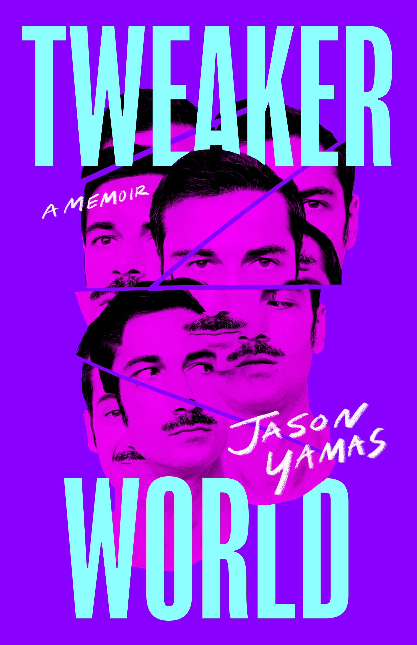
We had initially talked about using one or two for the cover, but I felt inspired and decided to collage my favorites together using photoshop. Back in my art school days I used to draw portraits of people in this style, so it almost felt like going back to my roots. I wanted this amorphous blob of Jasons to show the process of him unraveling and getting lost in the Tweakerworld.


I showed many different variations of this round which excited everyone, but it might have been too overwhelming. They all responded the most to the purple/pink combo because it had a blacklight-like effect and reminded them of clubs and late-night parties, another staple of the PnP subculture. I was told to go forward with this idea and color palette, but now I had to figure out how to simplify it.


I decided to make Jason’s face the focus and let the type be the second read. We loved that these versions looked similar to a movie poster. It felt like a reference to Jason’s meth use being “research” for a movie he is going to write, a thing he tells himself and others throughout his journey. With a few small tweaks (I’m sorry, I had to!) we had a cover that the team and Jason loved.
Final cover
Editor, artworker and lifelong bibliophile.