Kate Sinclair on Designing The Adult
Kate Sinclair is a Designer at Penguin Random House Canada. Here she takes us through her process for designing the amazing cover for The Adult.
The Adult is a gorgeously written, queer coming-of-age novel about innocence, identity, yearning, sex and poetry. It follows the story of college freshman Natalie—shy and solitary—who meets an older woman and is drawn into a relationship with her.
When I was designing the cover, I started with the title. On the surface, the word ‘adult’ has no moral or dramatic character, it is just a noun. But in the context of the novel, it is a complicated question. What is an adult? When we say that two people are ‘adults,’ are we implying that they are equal?
The more I thought about the title, the more I realised how ambiguous the word ‘adult’ actually is. The boundary between what we call an adult and what we call a child is disturbingly flimsy. Sometimes, the word ‘adult’ is an excuse, a way of justifying a relationship that is actually problematic. There is tension between the word and what it signifies. As a designer, my challenge is to represent this tension visually. To take the neutral word ‘adult,’ and to expose the uncomfortable truth it fails to express.
I played with a few ideas in the early stages. From the outset, I knew that I wanted to couple the word ‘adult’ with something unexpected and potentially dark. I downloaded several images of beds, bedrooms, bedside tables, and walls—but these all felt creepy and Lolita-esque, so I abandoned them.
At the editor’s suggestion, I moved on to fruit. I started with two peaches. Then I added a blush of hot pink over the bodies of the peaches. I liked the idea of ‘the blush’ because it struck me as innocent and embarrassed. It also obscured the fruit, almost censoring it, which felt consistent with the way the narrator censors herself in the novel (and the way people in general blush and hide when they meet the object of their desire).
After the peaches, I worked on a few other fruit concepts. I found a painting of a pear and I tried melting it. I figured: melting suggests heat and heat suggests desire. This seemed like a potentially haunting idea, but something about it did not quite work. The design was not really saying anything. I wanted the cover to expose something uncomfortable about the concept of adulthood and coming-of-age, but this design was not really having that conversation. The fruits were just erotic, they were not sad or searching.


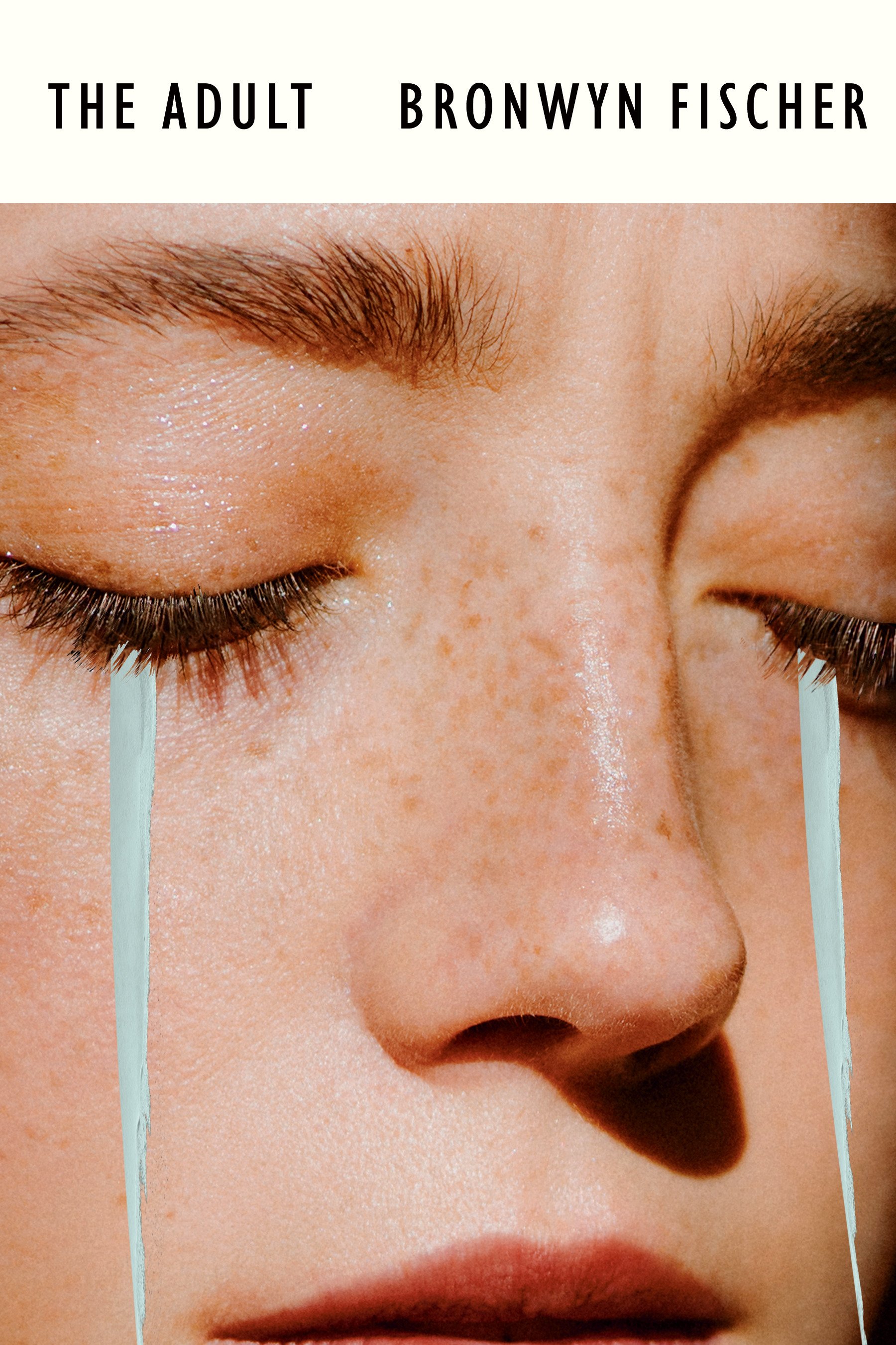
So, I returned to the title and to my original problem: how could I pair the word ‘adult’ with an image that would actually change the way the reader understood it? The idea of crying came to me. What if the adult on the cover were crying like a child? I liked the simplicity of this. I tried two different approaches, first making the tears actual rips in the paper, then representing them as streams of blue.
Ultimately, we chose the second option because that face was closer to what we imagined the main character would look like—introverted, unassuming, and full of lament.
Final cover
Editor, artworker and lifelong bibliophile.