Katya Mezhibovskaya on designing Here Is Real Magic

Katya Mezhibovskaya is Senior Designer at Bloomsbury Publishing US and teaches the History of Graphic Design at the School of Visual Arts in New York. As a book cover designer her mission is to make the familiar strange. The designs she’s most proud of invite the reader to look again, to pause, to solve a riddle she’s left for them as a gift. Here she talks us through designing the cover for Here Is Real Magic.
What happens when a magician, whose job is to elicit astonishment in others, loses his sense of wonder? Here is Real Magic is a book about celebrated professional magician, Nate Staniforth’s hero’s journey from fascination and success to disillusionment and searching and eventual rekindling of his connection with magic. After years of transforming audiences from rational, tax-paying adults into wide-eyed children, Staniforth was near burn out. He decided to seek out the source of his vocation and travel to India where magic is ever-present, acknowledged and revered.
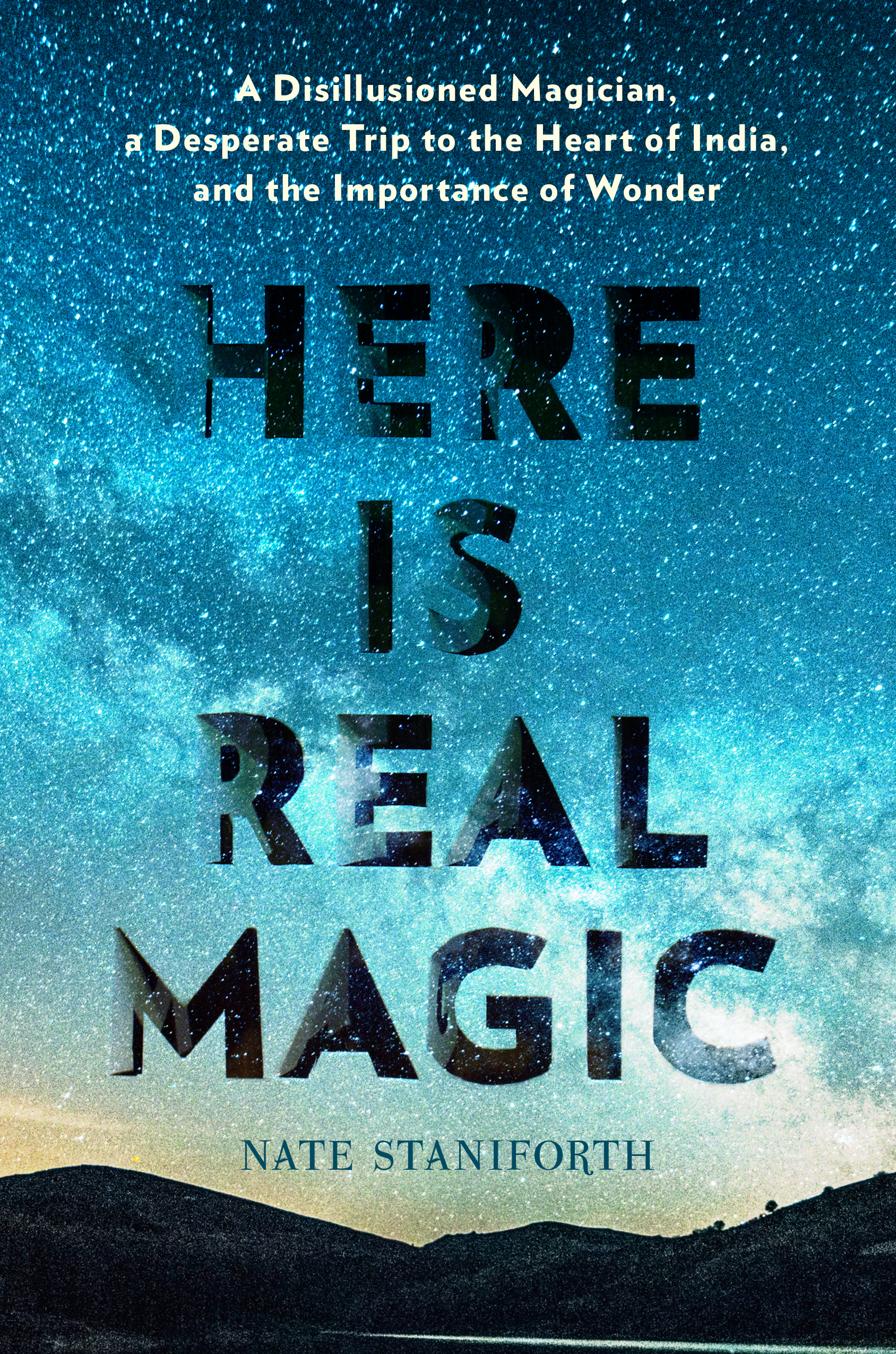
The idea for my cover came from the author’s vivid description of one of his earliest experiences of magic. He recounts being shaken awake by his parents one night as a young boy and driven inexplicably to the middle of a cornfield in his native Iowa. With the light pollution miles away, the night sky was suddenly unfamiliar and had never looked so sublime and terrifyingly infinite. I imagined the young Nate, about to see his first meteor shower, his back soggy against the earth he lay on, stupefied in delight and awe at the universe expanding above him.
This simultaneity of soil and sky reminded me of a 1952 woodcut by surrealist Dutch artist M.C. Escher. Unlike his elaborate, optical illusion work, this image is about noticing the exquisite artistry already present in the natural world. Mesmerized by the way an easily overlooked puddle holds within it the crisp silhouette of trees and moon, I began creating images of reflected grandeur in everyday spaces: puddles and paper bags.
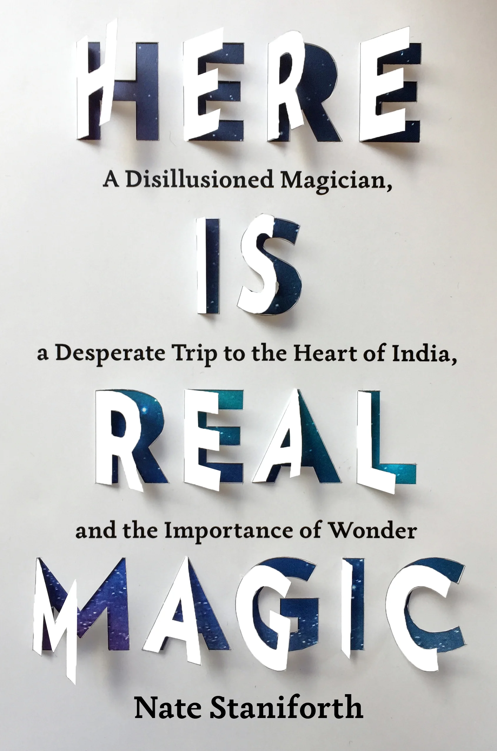
These spaces were portals whereby looking down, you could actually look up. I wanted to create an optical illusion with the title letters. Should they be three-dimensional and extrude at different depths? As I sketched a few “H”s I saw that I could cut the letter to open like a doorway (or book) and underneath I could reveal sky. I imagined the author looking down at his shoes upon arrival in India, at the warm-hued soil, while also seeing the night sky through the letters of the title. The contrast of complementary colors got me excited. (I was a painter before becoming a graphic designer.)
I knew that the challenge with this cover was to make sure it didn’t look like a typical book about card tricks and smoke machines and the belittling Western view of magic. The title helped. Here Is Real Magic is declarative and assured. I set the title in the weighty Verlag Black in all caps. The subtitle, which had originally been much longer, snaked in between each of these words, set in Tactile (just as sturdy as the Verlag, but with more calligraphic contrast of thick and thin strokes hinting at Indian scripts).
I sliced and bent the letters open, slid a printout of a stock photo underneath and photographed the two-ply image. The white paper felt too stark, so I gave it an orange cast in Photoshop. I showed my art director, Patti Ratchford, and she was just as excited as I was by the shadows the letters cast and the magical effect. The editor, Lea Beresford, was also surprised by this abstract direction but saw how the mundane paper revealed a deeper wonder when looked at in a specific light, just like the themes in the book. The author liked this concept, but wanted his Indian journey represented somehow and recommended a map of the places he’d travelled. I tried this and a photograph of the Ganges river, but in the end, the beautiful sky from the author’s childhood worked better as a simple visual metaphor for the author’s journey. I played with light and shadow variations by trying different paper weights and bends. Having an image on the letters was too distracting and was replaced with blank paper.
Finally, I got rid of the Indian decorative elements after the subtitle changed, and I returned to my initial concept: warm letters opening up into a night sky.
I hired the photographer Tamara Staples, known for her beautiful work on covers, to photograph my cut letters in her studio with proper lighting, minimal shadows, and the letters opened at the optimal angles for ease of reading. She was able to highlight the toothy texture of the paper, underscoring the everyday (but magical) material books are made out of and the cover (and author’s writing) became a set of lenses into the faraway sky and realms beyond. On the printed jacket, the sky elements are laminated in a high gloss, while the rest of the cover is matte, creating a visual and tactile contrast to the two worlds of Here is Real Magic: mundane and magical, but inextricably linked.
Editor, artworker and lifelong bibliophile.


