Words from the Weiss: Amanda Weiss Talks Cover Design, Part 2

The following is the second in a two part discussion on book cover design with Amanda Weiss. Here she talks about the making of the cover for Woke Gaming: Digital Challenges to Oppression and Social Injustice. Check out part one in which Weiss details what went into developing her cover for Omise’eke Tinsley’s Beyoncé in Formation.
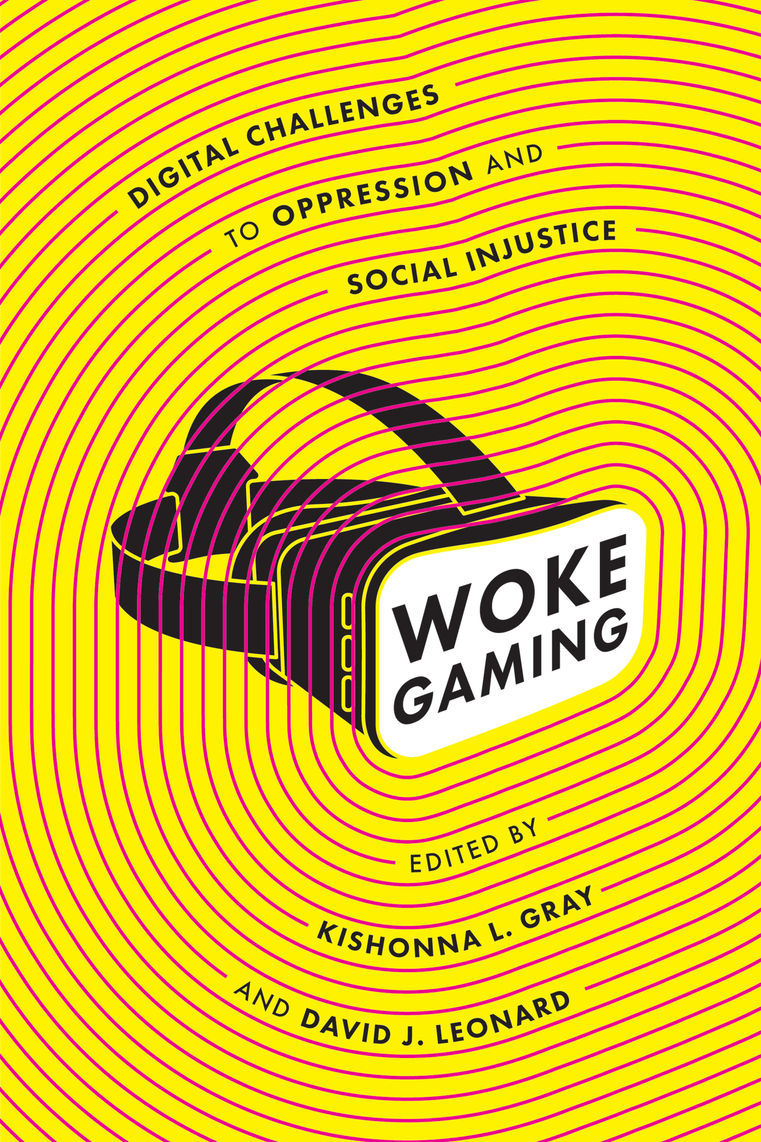
I was recently approached by Katrina Noble, art director at the University of Washington Press, to work on an upcoming book cover called Woke Gaming: Digital Challenges to Oppression and Social Injustice. Edited by Kishonna L. Gray and David J. Leonard, Woke Gaming consists of essays exploring the ways gamers are using current technologies to challenge inequities within and beyond virtual reality. Not just focusing on #Gamergate and the common discussion of violence within video games, Woke Gaming discusses the future of gaming, identifying strategies for detoxing video game culture and turning it into a positive catalyst for social justice. The book discusses a broad range of social issues from gender dynamics and misogyny to racial and queer positions in gaming practices.
One of the main points to keep in mind was to make sure the cover conveyed a sense of optimism and shy away from the look that gaming is wrong or the gamer themselves are toxic. Katrina mentioned the online game Hair Nah, one of the video games discussed in the book. Its bright, colorful 8-bit game style was perfect inspiration for the cover.
In any project, before I begin sketching, I start by researching books in the same genre or about a similar topic. Collecting these covers gives me the confidence of knowing the competition and designing something different (but not too far outside of the genre so it alienates the target audience). Books relating to video games often circled around the trend of pixilated or “futuristic” typography, bright colors or distorted, glitchy imagery. While I normally try to pinpoint a common trend in the genre and steer clear of it to avoid clichés, I was confident I’d be able to use pixilated typography and bright colors but also stand out from the competition.
Covers:
Concept 1
I was drawn to a line from the book about “spaces of play” (virtual) converging with the “everyday” (the lived or reality) and the opportunity for video games to present an alternative narrative or world to the gamer, similar to a VR experience. Gamers could experience an alternative world or viewpoint in which they experience the lives of those they may not look like or relate to. This is where the VR headset came in, which you can see I struggled to draw in my sketches but came together for the final cover. The pink and yellow colors vibrate even more so with the repeating lines, creating a mesmerizing pattern.
Concept 2
For the second concept I focused on crafting pixilated typography with a bright color palette. The color palette was specifically inspired by the saturated, blocky 8-bit video game mentioned in the book, Dys4ia by Anna Anthropy. The game recounted her experiences of hormone replacement therapy and overall gender dysphoria. I layered the pixilated typography to give it extra dimension and legibility, with the subtitle enclosed in a speech bubble to focus on the idea of fostering a dialogue and opening up conversations on social justice in video games. At the time I was on a T26 Carbon kick (it has not ended) and it proved to pair well with the pixilated title.
Concept 3
For the last concept, which you can see in the sketches, I tried to merge the buttons of a video game controller with the title, replacing the button’s letters with common symbols related to social media (the @ symbol, the hashtag, the “like” heart, and the retweet or reblog arrows). This proved to be extremely tricky and was the one I spent the most time on, even though it was the least strong of the concepts (it’s funny how it tends to work out that way). The first attempt at this concept was a maze of busy lines and it was difficult to pick out the individual controller shapes. I tried to solve this by filling in the shapes and scaling them back with a light gray. Unfortunately, I realize it now looks more like TSA’s x-ray machine, which was unintentional. Nevertheless this only proved that concepts #1 and #2 were stronger, with #1 being selected by the authors and UWP team.
Approved Cover
Mary Ryan Karnes is a freelance writer and a Master's candidate in fiction at the University of Southern Mississippi.