Myunghee Kwon on Designing Survival is a Style
Myunghee Kwon is a New York based designer/animator. Here she talks us through her process for designing Survival is a Style, a book of poetry by Christian Wiman.
Survival Is A Style is the first collection of poems by Christian Wiman in six years. After I started my career in the publishing industry as a designer, I was lucky enough to design a few covers for FSG and I was honored to design a cover for this book.
My usual process of designing a cover starts with setting a concept behind it. In the beginning of developing ideas for the design, I was confused about what to show on the cover because first, poems aren't my strong point since English is my second language and second, this book was one of the first covers I designed, so I was new to the design process. But soon enough I found some help from briefs. From the author questionnaire, Wiman suggested two poems as a conceptual guideline for the cover: Survival Is A Style and Poem Ending with a Line from Jacques Maritain. When I first read these two poems, I was unsure about the “meaning behind them”. But I read them repeatedly until I memorized them, and finally came to a conclusion with one idea—interruption. Normally I don’t design covers that share one theme, but I set this idea as a main concept for this cover because there were so many different ways to explore it visually.
First, I thought about ways to show “interruption”—what kind of interruption would communicate about these poems the best? Then I realized it was too broad because there were too many ways to indicate this idea, so I narrowed it down to a relationship between stable and unstable—how unstableness interrupts stableness—based on those two guideline poems.
After I was satisfied with a concept, I sketched out the design in my sketchbook by hand, using a pencil—for the pencil sketches I usually draw the image for the cover (detailed if possible), where the type would go, what kinds of typeface I would use (usually I write down either serif or sans serif) and the colors. They change as I make them digitally, but they are my visual guidelines for me to refer to when developed sketches get sidetracked. After I sketched out several compositions in my sketchbook, I picked three of them to make up digitally.
And here are three initial sketches:


These all explore the idea of interruption in different ways. The first one shows it with the shape difference, the second one shows it with the mistake in typewriting, and the third one shows it with the different thickness of the hand-drawn line.
For the first sketch, Art Director Na Kim suggested I put more room around the title and the author name since they looked too crammed from top and bottom. She also asked me to try different typefaces, like serif, to match with other books by Christian Wiman.
So here they are with three different serifs:


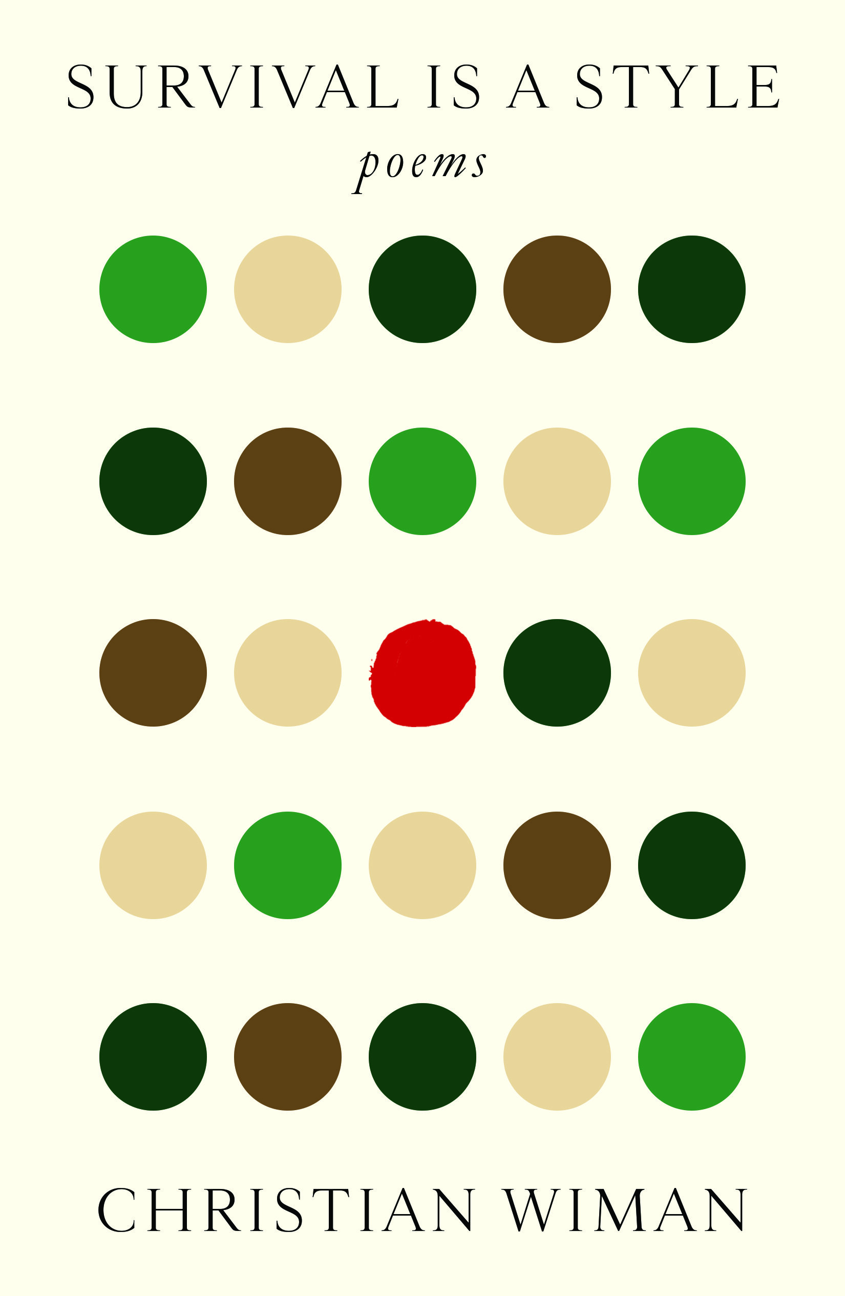
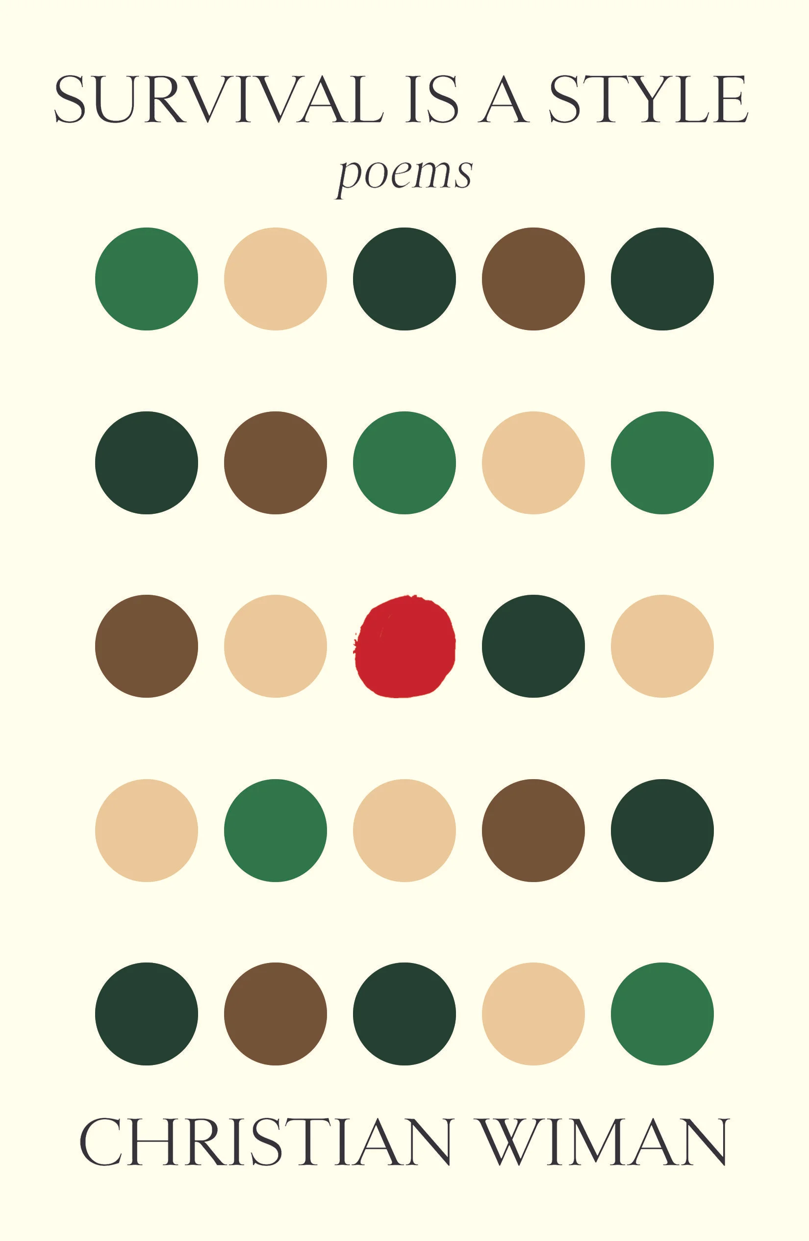
For this cover, I used circles as the idea of “stable” and the deformed circle as “unstable”. I also placed the red-colored deformed circle in the middle to emphasize the interruption of stableness. Greens and browns for the circles are from part of the poem, Survival Is A Style.
When the final cover got approved, I couldn’t wait until I received a hardcopy of it since this was the first book to be published out of the other book covers I had designed. I was full of joy when I finally saw it in person!
Final Cover
Editor, artworker and lifelong bibliophile.