University Press Cover Round-Up
We welcome you to another in our ongoing feature in which notable book cover designer Jordan Wannemacher periodically highlights a selection of recent university press cover designs. Please enjoy this celebration of amazing work.
This list is in no particular order. Credits are listed below.
If you are a book cover creative and want your work or the work of your department reviewed by Jordan be sure to get in touch with us!
As with any cover design we feature in our publications, we encourage you to head to your local library and/or bookstore to view the work in its full splendor when possible.

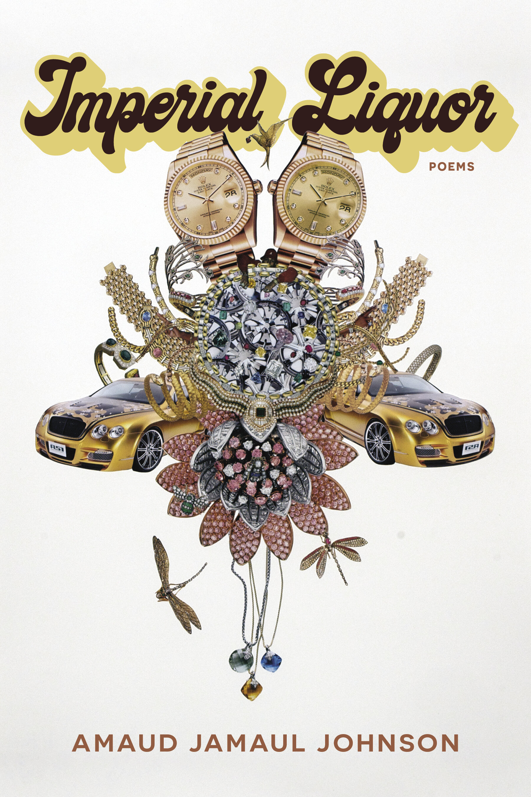
University of Pittsburgh Press
Designer: Joel W. Coggins
Art: Status Symbols #20 by Rashaad Newsome
The type + image pairing for this is so psychedelic and dynamic with the perfect symmetry of the art, I LOVE it! Poetry covers have so much heavy lifting to do to tell us the tone of the poetry inside and this one makes me want to dive right into something that feels so alive.

Oxford University Press/Hurst
Designer: Steve Leard
I love when a cover uses negative space in a way that is as jaw-dropping as this cover. It looks just like a classic political poster you'd see in a History of Graphic Design class, my highest compliments Steve.
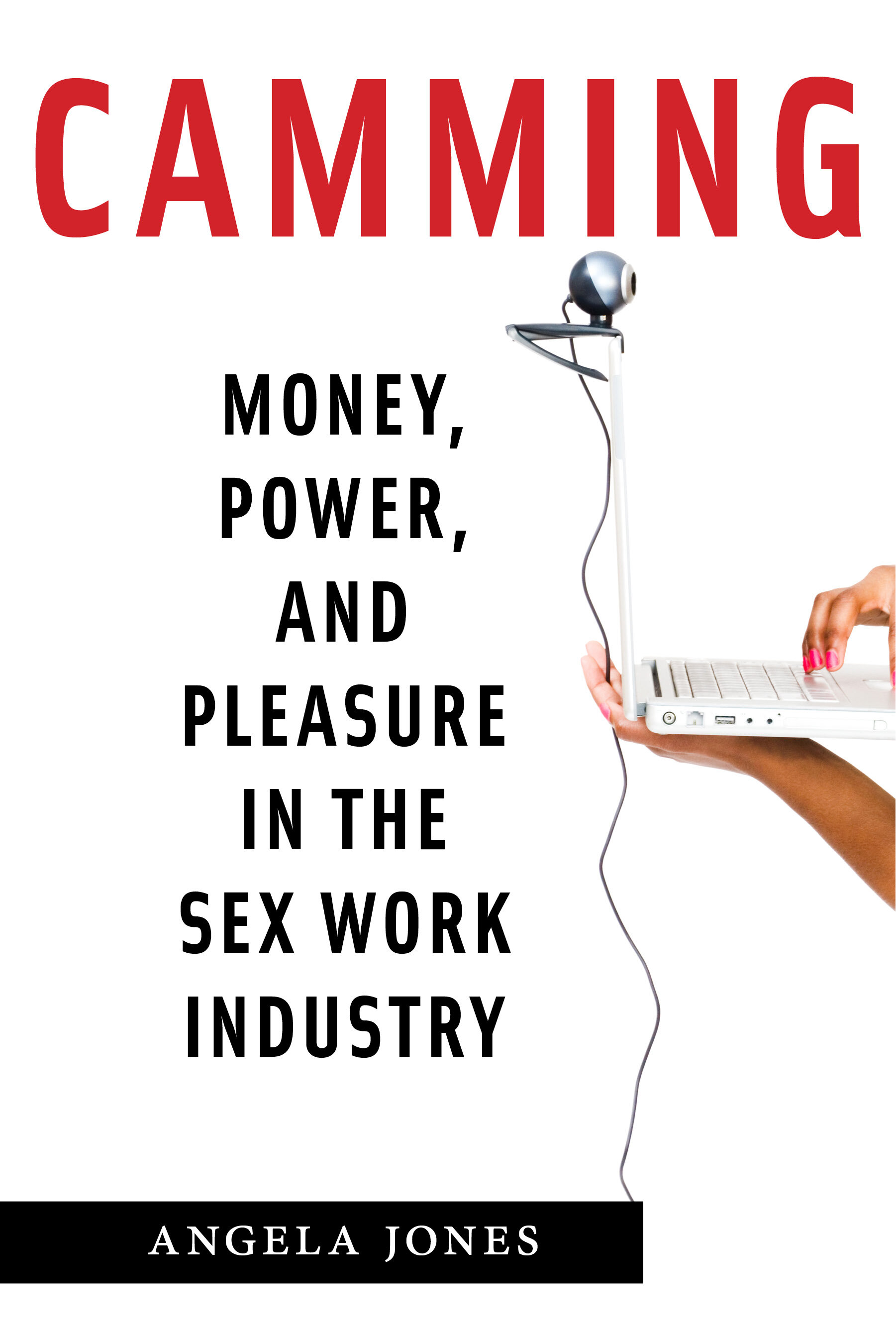
NYU Press
Designer/Art Director: Adam Bohannon
I love the vertical movement this cover has with the long cord hanging down tying all of the elements together. It's a perfect visual for a subject that I am sure was VERY tricky to illustrate for a book while keeping things "NSFW."

Ohio State University Press
Art Director: Juliet Williams
Designer: Nathan Putens
This image is so compelling and haunting. The type is perfect in its simplicity against this image that I can't get out of my head. Just stunning!

Duke University Press
Design: Aimee Harrison
Art Director: Amy Ruth Buchanan
What a lovely collage! Sometimes it's hard to find just one image that conveys all the layers of complexity in an academic text so finding a way to marry different elements in an elegant way is the perfect solution. I also love that teal, an unexpected color that makes the orange in the type pop even more.

Arizona University Press
Design: Leigh McDonald
Art: Essence by Venaya Yazzie
I absolutely love this vibrant contemporary Navajo art and how the type is interwoven. The tone and the vibrancy fit perfectly with the topic of the book without resorting to stereotype or overused imagery for this topic. A uniquely refreshing take.

Harvard University Press
Designer/Art Director: Tim Jones
After mentioning books that look like perfect posters, this is another one I'd print and hang on my wall. The color palette is spot on for this era and the bold type contrasts flawlessly. Beautiful work.

Princeton University Press
Designer: Matt Avery
Art Director: Maria Lindenfeldar
Illustrator: Lauren Nassef
This is such a lovely ink drawing that pairs perfectly with the classic understated sans serif. I also love the red-orange color choice with the subtle brush stroke in the bottom right. Such a handsome cover!
Jordan Wannemacher is a book designer based in the NYC area. She was born and art school educated in the Southeast at the Savannah College of Art and Design where she focused on graphic design and creative writing. Currently, she is running Studio Jordan Wannemacher, a boutique book design studio based out of her home in Montclair, New Jersey.