Q & A with Illustrator Sara Mulvanny

Sara Mulvanny is a freelance illustrator based in North Hampshire, England. Her illustrations and hand-drawn typographic elements are reminiscent of the beautiful Art Deco style. Mulvanny has worked with Random House, Harper Collins and Sinsbury’s Magazine since 2010. We caught up with her to discuss how she came into the industry, her typical process, and her creative contributions for Summer at Hope Meadows and Chasing the Dram: Finding the Spirit of Whisky.
How did you end up working for the book industry?
I graduated from Kingston University with a BA (Hons) in Illustration in 2010, after which I moved back to my Hampshire studio to pursue a career as a freelance illustrator. I was thrilled to receive my first commission a few days after I graduated, it was a book cover for Random House. Since then I’ve illustrated the covers, chapter openers and incidental illustrations for countless books as well as fully illustrated children’s non-fiction titles and recipe books. I get the opportunity to work on a wide range of projects including editorial, packaging and posters, and although I love this variation, books are still one of my favourite commissions to receive. This is probably due to my passion for hand-drawn type which I love to combine with illustrated elements, plus my love for reading, books and book shops in general. Book shops are a constant draw for me and I always make a beeline for them: something about the beautiful covers, immersive stories, and their treasure trove of knowledge make them irresistible.


Can you explain in detail your creative design process?
After receiving a new brief, I start by scribbling down initial ideas in a sketch book. I use this initial sketching stage to work out the composition of different elements and I will rework ideas again and again until I’m happy with them. Sometimes I will pull different sketches together on Photoshop, print them faintly and re-draw over them in pencil. When I am happy with the rough I will effectively pull it apart again so that I can re-draw each element separately using pen and ink. Those separate line drawings are then scanned in and the final illustration is digitally composed on Photoshop using colour and texture. My final illustrations exist as digital files and are composed of sometimes hundreds of layers which gives me freedom to adjust colours and layout easily.

What is your most favourite part of your work? The handmade typography, the carefully crafted illustrations or mixing both like you did on the Summer at Hope Meadows?
The great thing about books is they allow me to combine my love of hand-drawn typography with illustrated elements. Although I work on commissions which are just typography based, as well as illustrations which don’t have any typography elements, there’s something exciting and playful about combining the two. In particular, I think that book covers are more cohesive as a whole design if they are treated in their entirety rather than if the type and illustration are given separate treatment.


Summer at Hope Meadows is a recent example of combining typography and illustration; I wanted the typography to be feminine, sinuous and work within the uplifting, countryside illustration on the cover. The book is also part of a new series of books which meant that I needed to design a layout formula that would work across the series. I wanted to combine the typography and illustration in a way that would enable the books to work together as a set but which also enabled adjustments in terms of subject matter and colour so that there was enough variation between the different books.
Can you elaborate on how you created the amazingly beautiful (typography and illustration) for the cover of Chasing the Dram: Finding the Spirit of Whisky?
I was asked to create a book cover for Chasing the Dram by Rachel McCormack, a humorous and engaging travelogue following the author to her homeland of Scotland, exploring and celebrating all things whisky. The brief itself was quite open: the publisher wanted the cover to feel ‘really fun’ and if I made sure the whisky and travelogue aspects were clear, I had a free reign so to speak.
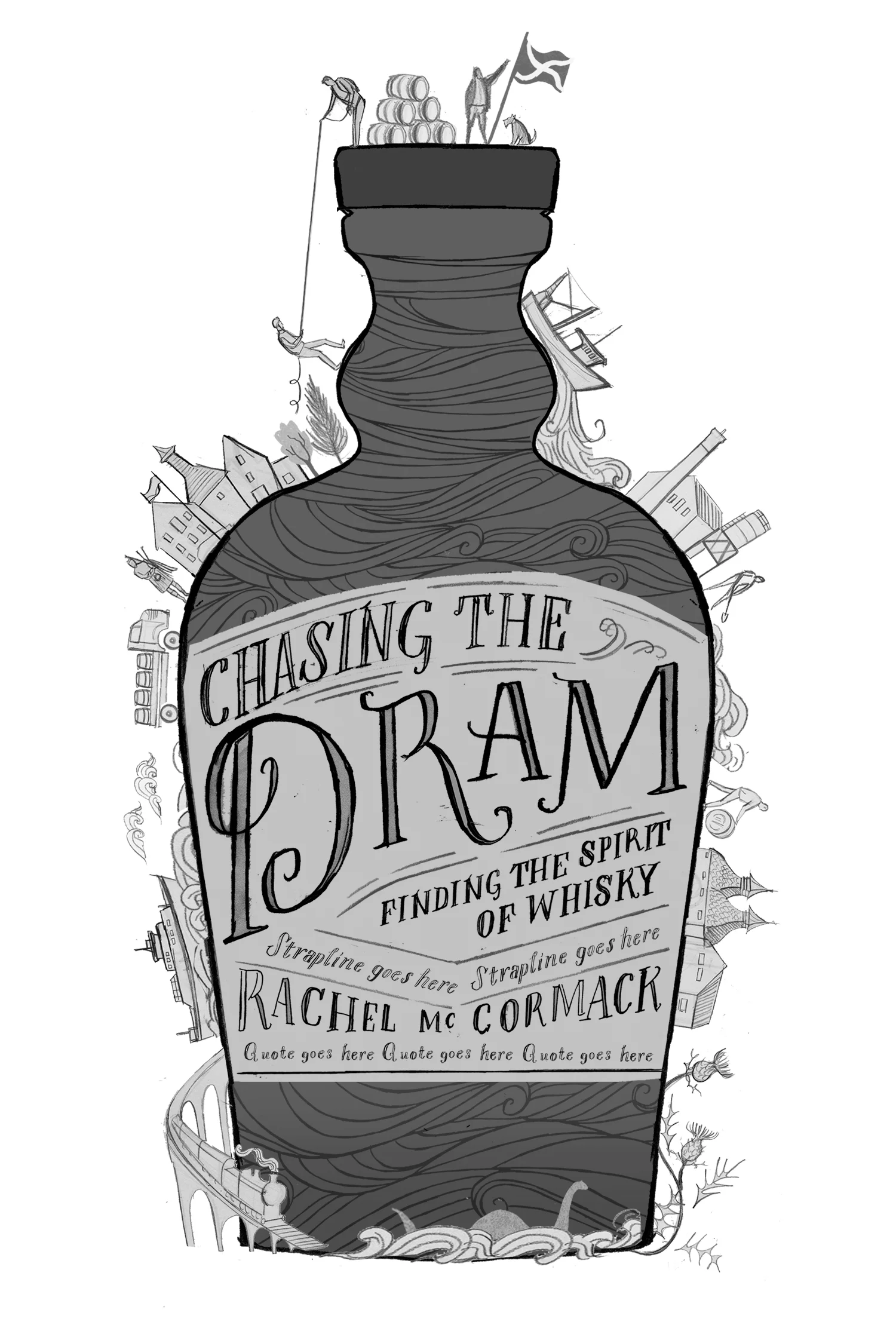


After roughing out some initial ideas, I decided that whisky should be the most prominent component of the cover and the subject that the viewer identified first, with the Scottish travelogue elements coming second. I utilised the strong shape of a whisky bottle as the focal point, with the hand-drawn typography in the whisky label. The humour and fun are told through the details, in the narrative elements going around the whisky bottle. They allude to stories from within the book and represent Rachel’s journey around Scotland, with whisky at the centre of the world. I kept the colour palette limited, featuring the different blue hues to keep the strong Scottish connection and pairing it with the golden tones of whisky. The colours keep the bottle shape and the narrative elements distinct from each other.
I also created a map of Scotland for the end pages, utilising the colour palette from the cover and featuring some of the places from within the book. The publisher and author were so pleased with the map that it was also used on the back cover.

Do you have any piece that didn’t make it to the printer but you still love?
Anyone who works in the book industry knows that there are often several people that need to agree on a cover and plenty of hurdles to jump before a book makes its way onto the shelves. This means that sometimes covers don’t always get the approval of the art department, editorial team and the authors in unison. One such book cover was English Animals. The publisher wanted my design to be ‘witty, quirky with a hint of darkness’, and both publisher and I were very happy with the result. The cover I created was predominantly typographic and featured an owl swooping down on a mouse and a fox pursuing a rabbit. I was reasonably happy that I had captured the ‘dark and sinister’ qualities the publisher wanted and there was plenty of movement and drama within the design. Unfortunately, this wasn’t the direction that the author had envisioned so my design wasn’t used, a photographic cover was used instead much to mine and the publisher’s dismay. However, I have kept the design within my portfolio because I loved working on the brief and I’m still pleased with the result. I learn something new from every project and commission that I undertake and I have found that it’s not just the successful projects that develop your career. In fact, it’s often the less–successful ones from which we learn the most.

Designer and book lover with a passion for food. Working for the portuguese publishing industry (books, newspapers and magazines) for the last 20 years.