Interview with Designer Sarah J. Coleman

Designer Sarah J. Coleman has worked on a diverse assortment of projects throughout her career including advertisements, editorial work, and packaging as well as book cover design. She was kind enough to take a moment out of her busy life to answer a few questions for Spine describing her experiences and design process.
Can you give us some of your career background?
I drew and drew as a little girl and have never stopped - at school I would trade little drawings of pretty ladies for 50p pieces, or sweets, and then would sew or paint different logos onto people’s bags and jackets in exchange for cassette tapes or coins, so the art of commerce (or the commerce of art) was installed in me early on!
I did an Art Foundation, then a degree and got a first from Birmingham Institute of Art & Design. I started working commercially while still a student and crammed in as many experiences as possible while getting off the ground - I was a props maker at the Royal Shakespeare Company, I started and later sold a wedding stationery company with ‘celebrity’ clients, and with my partner in crime of 20+ years, Leigh, ran a small record and distribution label, made T shirts, started a 45rpm record adapter business, put on club nights and elaborate exhibitions, and worked at a pirate radio station, while all the time doing my illustration work.
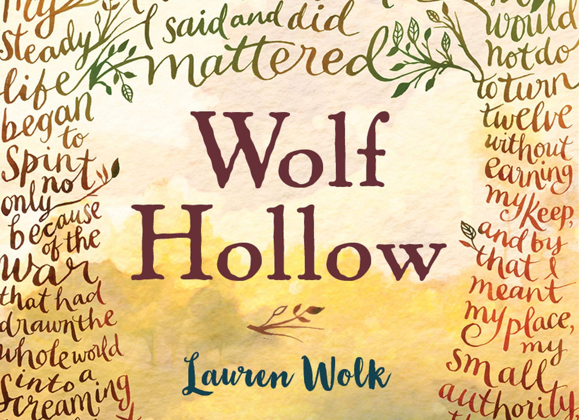
The book covers for Wolf Hollow and The Gallery are prime examples of your sublime illustration skills. How were you approached to create each of these covers and what were some of the challenges you encountered in developing them?
Thank you for the compliment. I was approached by the art directors on both of these via my agency in New York, Bernstein Andriulli. Wolf Hollow was difficult in that the subject matter was sensitive, exploring as it does bullying, and a period of unsettlement in America just after the second world war. It couldn’t bee too specific though as a cover, this was more about communicating an atmosphere. Technically it was tricky too because of the amount of words that had to fit into the tree surround and remain readable.
The Gallery was an absolute joy to do, and I honestly can’t say that anything about it was challenging! Some jobs just go really smoothly from the outset. Line art, little details, lots of flourishes - I worked at A3 size, in pen and ink, so roughly 4 times bigger than the size of the book itself. And to learn they were going to use foil on it was tremendous.
You designed the South Korean editions of To Kill a Mockingbird and Go Set a Watchmen. Were there cultural considerations to take into account when designing these covers?
The TKAM edition was release at the same time I did the cover for GSAW, and was a straight copy of my 50th US Anniversary Edition from 2010; all that changed was the title which was translated and redrawn in house by the Korean publisher.
The GSAW cover was developed quite quickly. I did a large amount of ideas as rough sketches in colour and pencil, and right until the last moment - hours away from going to press - we were receiving requests for tweaks from the Harper estate; these were all about getting Scout/Jean-Louise’s silhouette right, she was originally in trousers, with different hair and stance.
Your portfolio includes a rich diversity of projects, including packaging, advertising, editorial, and even tattoo art as well as design for books. What are the challenges of applying your skill set to different forms of media?
I don’t really feel that there are any as it seems to have always come naturally! My degree ended up being built structures and theatrical work, when I’ve done shows they’ve contained installation and built pieces, and I did have a period where my commissioned work was low-relief, collage and 3D too. The only thing I don’t really feel I’ve had the chance to get to grips with is on-screen - animation completely passed me by at college, and while my work’s been animated for TV ads, online campaigns and more, I’ve personally never delved into much more than a complex-ish animated GIF!
What influences your current work and what types of projects do you hope to develop going forward?
At the moment my work’s going through an evolving stage. This seems to happen roughly every ten years, if I look all the way back, and I always find it quite a challenge. The styles of lettering and lettering-based work I was doing 10-15 years ago have since become ubiquitous in the creative marketplace and I see them everywhere; I still enjoy this kind of work and am happy producing it for clients but will try to nudge them towards something a little different and new where I can! It’s not often I see lettering-based work that really stops me in my tracks, but when it does it’s because it’s very different and experimental - not necessarily because it’s good or technically brilliant, though there is a lot of it to be found.
“[I]t’s important to keep moving forward and trying things, whether they work out commercially or not!”
So there are things in the pipeline that are being developed; my partner and I are interested in large scale work, work that does not include type or words (but continues to take inspiration from the written word), installation, experimental ideas, more products, interior design and direction; we have made a film that’s touring and are expanding on the role of creative directors at a new flagship chocolate boutique. I’ll always be an illustrator, but it’s important to keep moving forward and trying things, whether they work out commercially or not!


