Erin Fitzsimmons on Replica, Process & Typography

Erin Fitzsimmons is a book cover designer for Harper Collins residing in Brooklyn, NY. Here she shares how she came into the industry, selections from her portfolio, and aspects of her design process.
Can you tell us how you came to be a book cover designer?
While in school I had dreams of being an artist or a photographer, but I didn’t quite have the skill or talent to make those dreams a reality. I did love photo editing, however, and my first couple jobs out of school involved photo editing and research. One day, my art director asked if I wanted to try designing a book cover and I figured I’d give it a try. I was instantly hooked. I had always loved finding and sourcing imagery, but combining type and imagery was something entirely new and exciting, and combined my passions perfectly. I started designing covers and interiors for a fashion and interior design textbook publisher, and then after a few years I made the leap to children’s trade design, and I’ve loved every minute of it since!
The cover you designed for Replica by Lauren Oliver is quite unusual. The jacket itself is of a transparent material, and the book has no apparent back cover. Please explain your process for creating the piece. What was your motivation for creating a jacket that serves as “front” on either side of the book?
Replica was a challenging and engaging design process from start to finish. All of the credit for the unusual design goes to the author for her unusual concept for a book! I knew from the beginning that it was a flip book: two stories in one book, which you could read front to back, back to front, or in alternating chapters. As such, there was never a back cover, but rather two front covers. It was important to myself and the editor that the design of the book as object reflect the nature and function of the book as narrative. The story focuses on replicas (clones), and I wanted to play with the idea of two things being nearly but not quite entirely identical. The butterflies underneath the covers might look identical, but they are in fact two halves of the same butterfly, so there are subtle differences. I am thrilled that we were able to use the acetate jacket stock for the jacket material. Printing solid colors on the acetate allows the pink butterfly to transform into a purple butterfly on the front, and an orange butterfly on the back, furthering the idea from the story that not all is as it seems.
I really enjoyed playing with the tiny details of the Replica design as well: the folios center on the interior pages and flip halfway through the book, but the running copy aligns throughout, and we used two headband colors, so the blue headband aligns with the blue cover of Lyra, and the yellow headband aligns with the yellow cover of Gemma. Overall, it was a wonderful experience, and I’m so thankful to have the support of Harper to be able to push the specs on the design of a high-concept book at this level.
You have also designed a series of other books for author Lauren Oliver with the Delirium Trilogy. Do you create series covers in tandem? What are some challenges with creating covers for a series as a whole?
Most of the time we’re trying to conceive of a series design as a whole set. We’re looking at book titles for the whole series, if we have them, and we’re trying to come up with a concept that will work across three or four covers. There’s nothing worse than coming up with a great idea for book one, and then having to change courses for book two, so we try to avoid that whenever possible. The Snow Like Ashes series is a good example of one where I knew exactly what I wanted to do for the covers, and I mocked up all three covers from the beginning, hiring an artist to execute my ideas and develop the concept across three books.
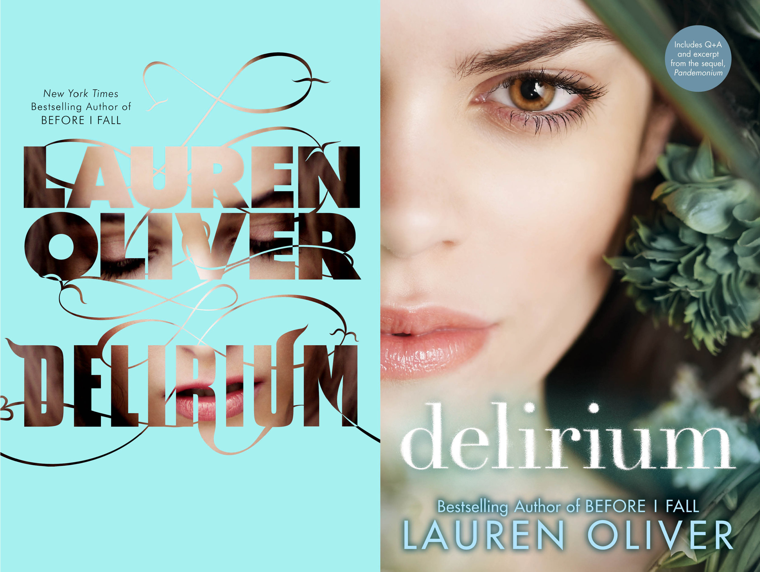
In the strange case of Delirium, however, we had a concept for the original hardcover that did not work for the second book, partially because the title Pandemonium was too long. We switched gears for the second hardcover, and went with a photographic, figurative cover approach. A few years later, we decided to revisit the entire series for a paperback repackage, which was a very interesting experience! Here was a series I had designed only a few years ago, that had gone through a couple covers already, but now we were able to go through the process thinking of the entire covers as one set, and of course it helped that we already knew how long the second title was. It was a totally different approach from the previous covers, and I actually think the latest paperback covers are the best covers we’ve ever had for this series!

Your portfolio suggests that you have a reverence for type. You are very skilled at hand lettering, and you have developed your own typefaces. One of which was featured in a Communications Arts Typography Annual. Can you discuss this?
Thanks! I think good type is underrated, especially now that hand lettering has come to dominate cover design. Since I never went to art or design school, I spent my first few years in publishing taking Continuing Education classes at SVA. I took a typography class, that furthered solidified my love for type, and it was around that time that Type@Cooper began. I was fascinated by the process of designing a typeface, so I took a type design class to see how I felt about type design. I loved it, so I applied for the Extended program at Type@Cooper. I was so lucky to be accepted, and it was an incredibly challenging and rewarding experience. I only wish I had the energy to focus on type design as much as I do on book design. Maybe in the future I’ll return to it, but for now I think the education really helped my understanding of type, and my skills in hand lettering, so I can apply those skills to book design.

What book cover design would you describe as your greatest triumph to date? Why?
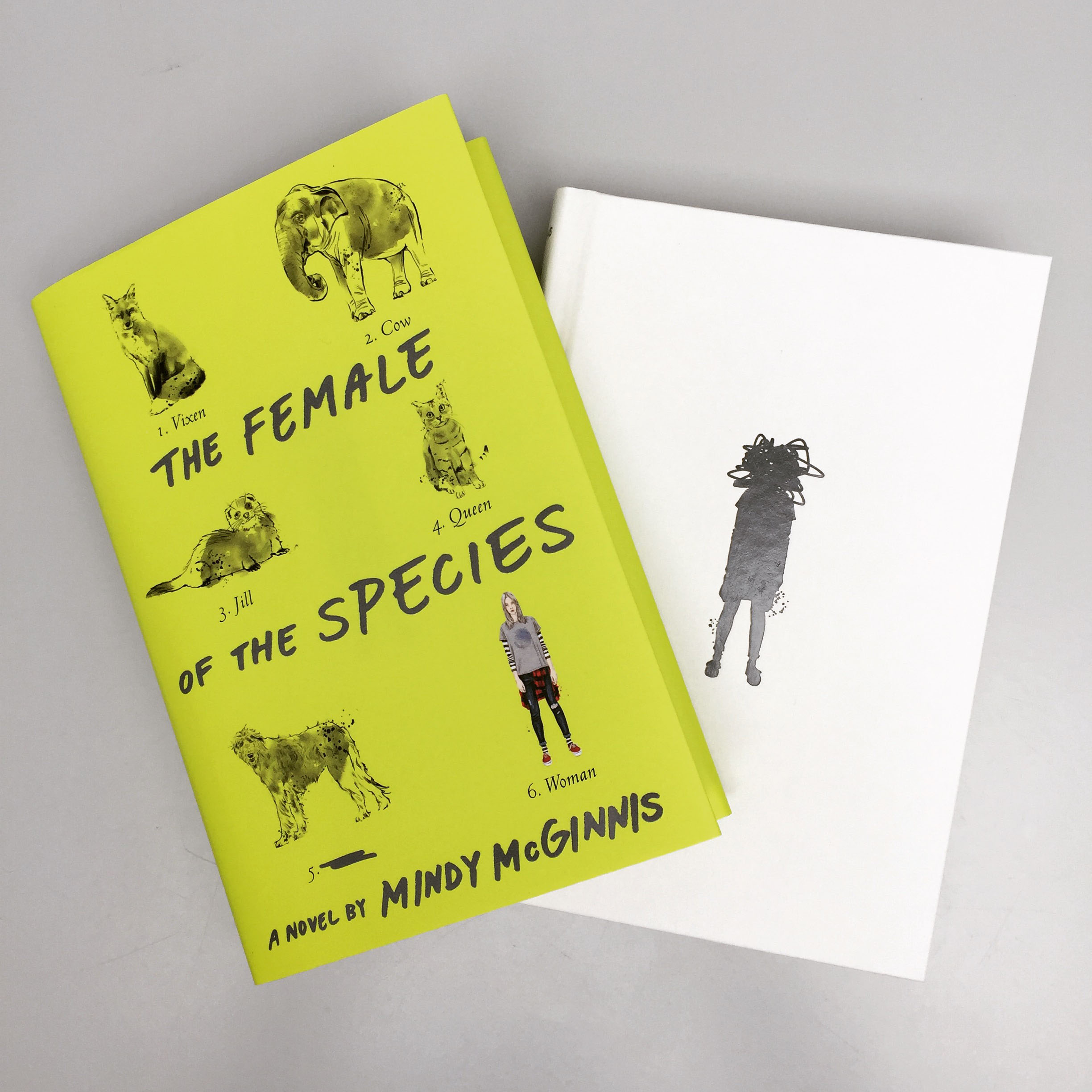
Ooh, tough one! The one that comes to mind first is The Female of the Species, by Mindy McGinnis. I cannot express how much I love that book, and I feel it’s an incredibly important book for young people to read at this time in our culture. I wanted the cover to be subversive and in your face at the same time, much like the story is. The neon green color is impossible to miss in a store or on a shelf, but the illustration style is subdued and refined, like women are expected to be. But as you read the labels, you realize that the scientific names of animals have double meanings, and we have censored the most offensive of the labels, another comment on society’s treatment of women and words that describe them. Even the case cover design addresses the violent nature of the story and the title reference. I think it all came together really well, and I’m pretty thrilled that we got even a hint of the word “bitch” on a teen cover. If you’re familiar with YA covers, you’ll know how big of a battle that was, but it was absolutely one worth fighting.