Some Things Covered: Why Purple?
On a hot July afternoon Eric C. Wilder the editor of Spine Magazine emailed me with a question, “What’s up with Purple this week?”
Eric is the editor of the first online magazine focused on cover design, so he spends a great deal of time looking at seemingly every cover that gets printed.
He's on the frontline of what’s out there and sees covers of every make and for every market. That's really different than what I do. I'm more of a picky collector, who becomes enamored by a few coveted covers and can't help wax poetic about them. His breadth of exposure to all kinds and styles makes my head spin. Naturally, this also makes Eric an ultimate trend tracker.
Yes, of course I’m interested in the market, but as a designer I have to select favorite covers to write about, because with them I champion both great design thinking, and the thinkers themselves. But it's Eric’s overview of cover design that makes me interested in what he sees, and notices. Even if it comes in a weird observation… like the color purple? And let me say, purple is neither my favorite nor least favorite color. Sorry if you love purple, but I don't think you are in the majority.
Eric and I have been talking about collaborating for a while. My interest was piqued when a few months ago he sent me an email asking me if I would write semi-regularly for Spine. But I can't tell you the immediate panic that came over me. I mean yes, I’ve been writing my blog for a while. Yes, I wanted to write different kinds of things for different kinds of audiences. But how would it work? So it's funny that when I finally committed to writing something, Eric decides that purple covers were interesting in that week. Because it's a color I literally feel nothing about.
It's not showy like yellow, or as soulful as blue, and won't scream passion like red. It’s well … more a mix of all these qualities and at the same time not committed to any of them. Neither youthful nor high energy, purple is more inky, mysterious and definitely sophisticated, right? As someone who finds sophistication nice on other people, but a bit restrictive personally, purple isn’t usually my first choice when designing. So is there a lesson here? Had I got purple all wrong all along?
The examples Eric sent me were in a broad swath of styles, subjects, ages, and sophistication levels.

Cover Design: Alan Dingman
The first jacket is The Library of Light and Shadow. Alan Dingman has designed another very attractive M.J. Rose cover, the 3rd book in a series. I think the purple is really a team player on this jacket for The Library of Light and Shadow. Letting the orange on the cover take the spotlight, but ultimately it’s purple that makes this book about glamour, magic, and love. It’s well … glamorous and magical. This jacket uses purple in exactly the sophisticated tone that plays to its natural strengths.

Cover Design: Spencer Kimble
The second cover is for The Stars in Our Eyes. This is not your standard purple cover. Spencer Kimble’s design take on purple is subtle and clean. This is definitely an intriguing cover that seems right up there with some of my minimalist favorites. Spencer says he started off with a pink book and changed it to purple for legibility (better contrast with the white type etc.) But I’d like to point out two things here that together are inadvertently great. This book is a fun read about obsession with celebrity. And celebrities are and want to be our version of royalty in the U.S. So I think that ROYAL purple is exactly the right color for this book. But I had to add the insecure anxious searching eyeballs are definitely my favorite part of this jacket, so funny!

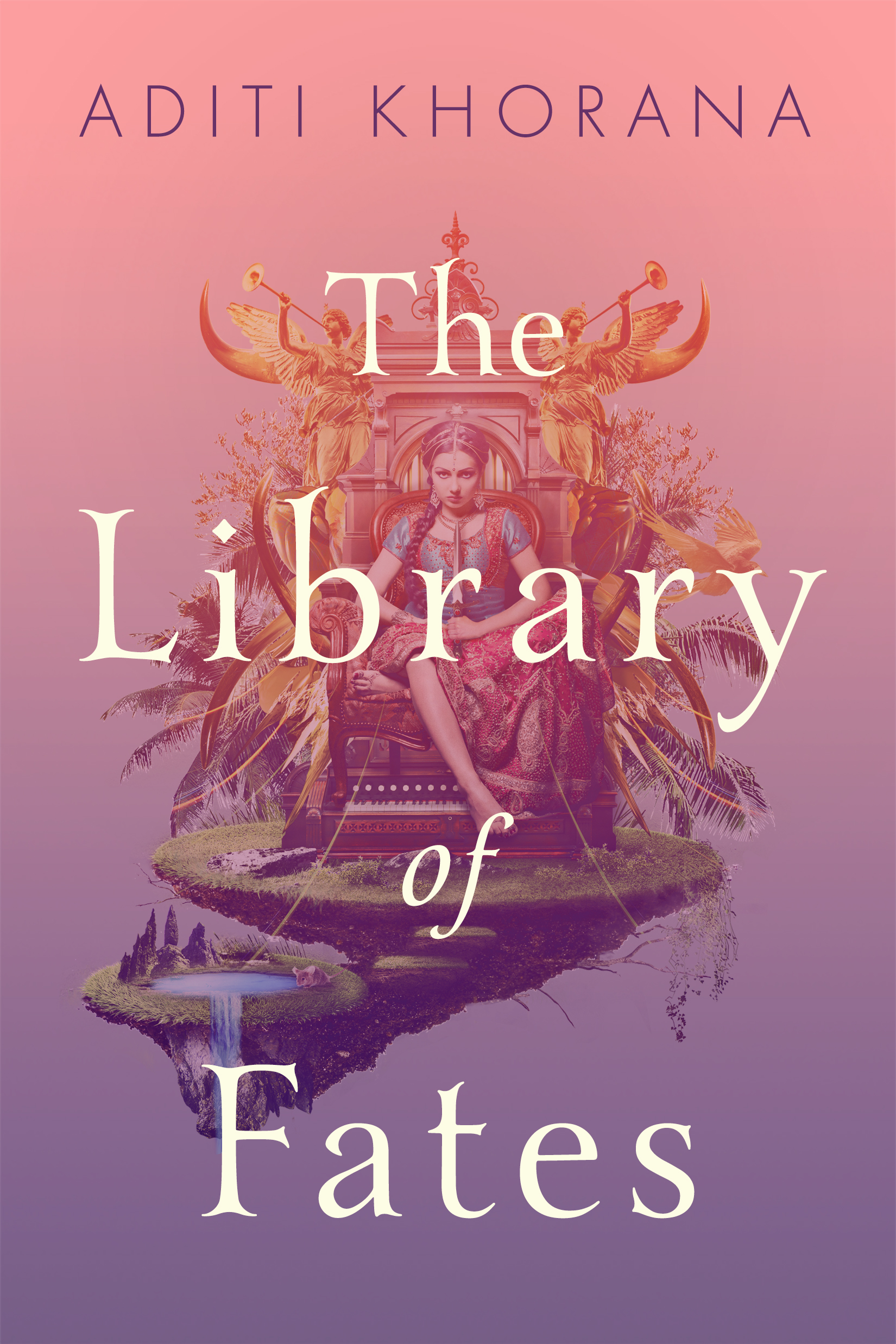
Cover Design: Theresa Evangelista
The last and my favorite of Eric’s suggestions, is the design of The Library of Fates. This ombré pink to purple cover, this is a fantasy tale of a girl and an oracle looking for a way back to a prewar happiness. My assumption is that it is what designer Theresa Evangelista is implying here with the transition of color. Is happiness searched for a pleasant memory (a pink blush)? Or is it after you have tasted a bitter deeper shade of life (purple?) that you find real happiness? Can you let go of naïve pink innocence and sink into a deeper, if murkier, happiness? This is a really successful and risk-taking jacket. I'll be looking out for unexpected solutions from Theresa in the future.
In the end, it could be that purple’s real strength is its indefinability. It can be bold, simple, royal, classic, mysterious, and my favorite of its newfound qualities, really unexpected.
Join us in celebrating the enormous talent that goes into book cover design. Consider a small donation to our Patreon fund. Your support helps us provide you with an in-depth look at some of the book publishing industry's most creative people.
www.patreon.com/spinemagazine
Maria Elias lives and works in New York City. Before falling in love with book design she worked in news and magazine. Her work has been recognized by AIGA 50 Books/50Covers, the Type Directors Club, and the New York Book Show. You can read more by Maria Elias on her blog Book Design Heroines.