Stuart Bache, Books Covered

Stuart Bache is the creative mind behind Birmingham based Books Covered, a book cover design agency for independent authors, literary agents and publishers. Here he discusses the impetus for the agency, its challenges within its first year of operation, and its successes.
What is the origin of Books Covered?
Way back when, in the wilderness years of freelance, I had an ember of an idea which sort of took the shape of what Books Covered is today: mainly a book cover design agency which leant towards independent authors (and was therefore more affordable). At the time I would occasionally receive emails from indy authors who had spotted my website and would ask for a quote, inevitably I was more than their budget could cover and that was that. But I would think 'What kind of cover design are they going to get for their budget?' (and then I would shudder and think of the Tumblrs dedicated to bad cover design).
But cheap doesn't have to mean bad and many authors don't deserve such crimes against design (well, some do obviously). And that was the initial spark for the company... but then I was offered a position at HarperCollins and the idea got locked up in a box and set aside.
A few years later, and after HarperCollins, I had reached Art Director in what was meant to be my perfect job – but it was in fact a little known circle of Hell – and so I decided to pack it all in and, with the help of Natasha Hughes and Ipso Books, Books Covered was finally a real thing!
What are the biggest challenges you’ve encountered so far from a business perspective?
The biggest challenge has been convincing the industry that what we do is relevant and important. There's an underlying (and sometimes obvious) snobbery towards independent authors, commercial fiction and the whole digital vs print nonsense (it really doesn't matter anymore – we can have both, you know?). It's a great shame as there is so much to learn and sometimes I feel the industry isn't willing to listen. The noticeable outliers are imprints such as Harper Impulse (run by Charlotte Ledger) and Ipso Books (run by Kate Evans and Faye Johnson) who are embracing both digital, print and all kinds of marketing.
What are the biggest challenges you’ve encountered so far from a design perspective?
Opinion polls: They are the biggest pain in the arse I've ever encountered. I completely understand the logic: you're unsure, you don't have enough experience, you can't choose between three concepts, 'I know people will buy the one they like the most' – lets ask Facebook.
Don't ask Facebook (or any social media site for that matter).
It doesn't work, people do not buy like that. I have never bought a book by asking myself first 'I must spend at least two minutes deciding if I like the author name in uppercase or not'. In reality, people tend to spend nano-seconds on the front cover and much longer reading the blurb before making a decision to buy... though they need to be attracted to the book in the first place [he adds hastily].
I often ask clients to remember: If you ask a person their opinion, they will find one (even if they didn't have one to begin with). So why trust it?
If you're stuck, chat with your designer or editor. Or head into town with a print out and compare your designs to covers within your genre and those which are doing well in the charts and ask yourself 'Does my cover stand out from the crowd? Does it fit into the genre? Would it look out of place here?'
Please explain the creative process behind the cover for Before You Leap.
The novel takes place in Florida, around the interstate bridge in Bonita Springs to be exact. The bridge plays a significant part, I won't spoil the story but the title says it all. My initial concepts relied heavily on the bridge, known as the 'Sunshine Skyway' to many, and the female character. I also used different perspectives and POV – underneath, looking up at the cables holding it all together etc – which allowed for interesting typographic layouts. Another route was feet standing close the edge with the idea you were the character peering into the rough sea below.


Our final route was something much more True Detective (in particular the opening credits) meets Florida green (that swamp-like blue-green), using a man's face to frame the bridge – which gave a sense of foreboding and fear. And this was the direction they decided to go with.
After a series of versions with a different bloke's head on each – none of them quite right – and running out of stock imagery options, I had Natasha take a few pics of me as that way we could control the lighting and positioning.
And that pretty much brought us to final cover.

Which project has been the most rewarding experience for you thus far? Why?
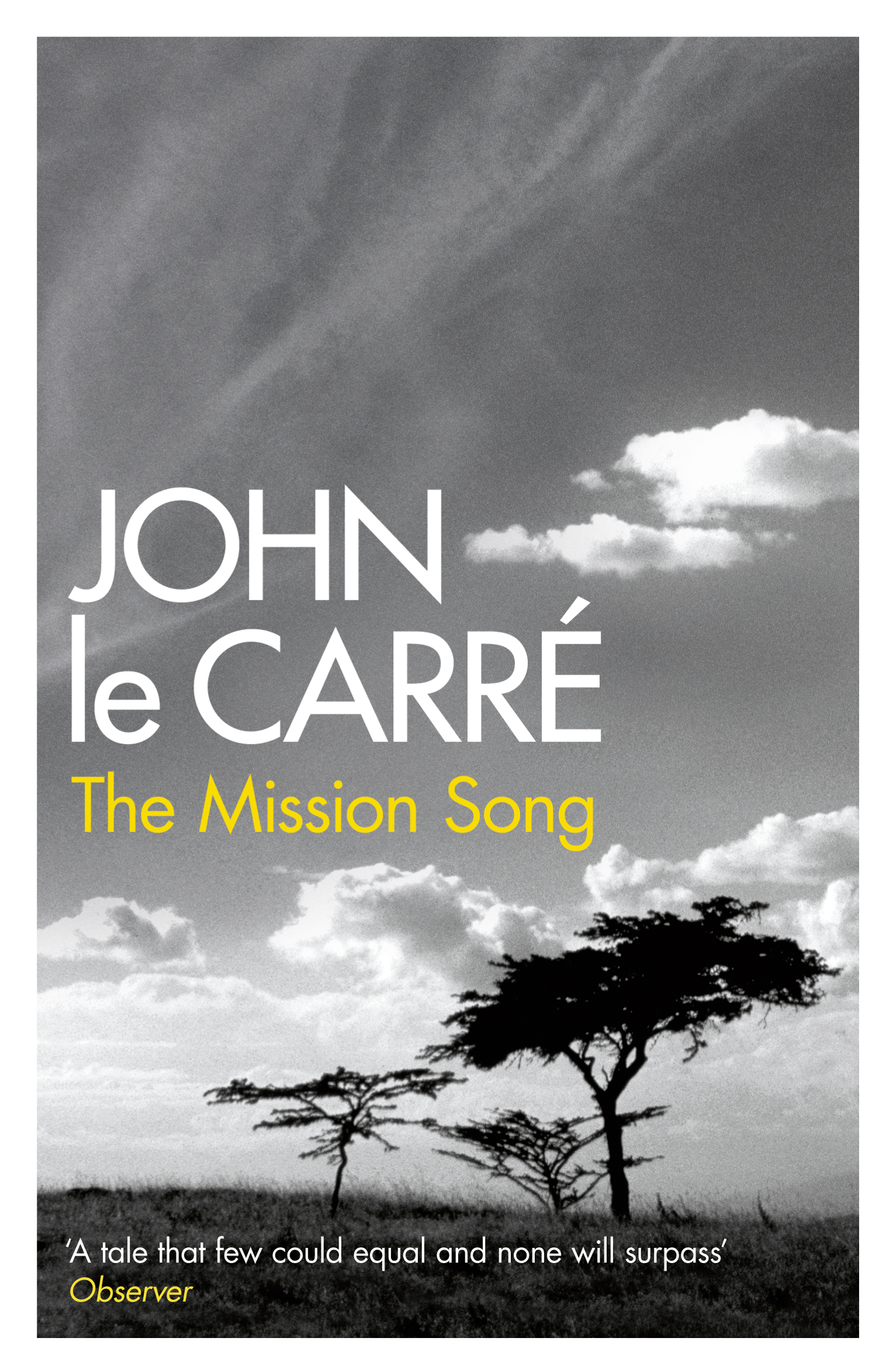
In my career: my John le Carré series (which I'm sure people are sick of seeing, but they were my first 'big name author' covers and helped kickstart my career).


As part of Books Covered: Most likely Crooked Daylight by Helen Slavin (for Ipso Books), I just loved working on that concept; playing with layers, images and colours was a lot of fun. And I was happy it was chosen as the final design.

Where do you see Books Covered in year two?
More of the same, I hope. We've had a pretty successful year and it would be great to continue that success. We already have a few secret projects on the horizon which will keep us busy early next year, which is great. I would also like to make more of Ready-to-Publish (our even more affordable pre-made cover design option for authors on a budget) as we've neglected it a little of late due our busy schedule. However, most of all, I want to enjoy my first year of marriage as much as possible. So working from early morning to late at night will, thankfully, have to go.