Sara Wood, 'Multitudes' and 'Undermajordomo'

Sara Wood is a book cover designer residing in New York City. Her portfolio includes covers for Ed Yong's I Contain Multitudes: The Microbes Within Us and a Grander View of Life and Patrick deWitt's Undermajordomo Minor. Here she discusses the creation of both, as well as her creative process as a whole.
Can you walk us through your general design process?
My design process always begins quite naturally with the text. I usually read manuscripts or proposals on my phone, which is probably not ideal for most people, but I toggle between the Pages and Notes apps to make a list of ideas as I read. The ideas might be objects, moods, textures, etc. Anything that might help to keep me focused on the basic essence of the book when I sit down to sketch out some thumbnails. Before sketching, I usually cleanse my visual palette by looking through Tumblr, which has always been a reliable source of diverse and visually compelling content for me. To research the book's intended audience, I often poke around for specific cover inspiration at a bookstore or by clicking through Amazon's "Customers Also Bought" function. I find that that always offers helpful insight into how comparative books are currently being positioned, and helps me to identify which cover trends are worth being acknowledged or (hopefully) defied. Then I'm ready for the thumbnails! This is my most important step, as I sketch out covers in pencil, using only simple shapes and lines to hammer out the broad mechanics of my compositions. When I have at least 3-5 strong contenders, I proceed with the image research, hand-lettering, illustrative elements, or all of the above. By the time I open InDesign, I'm just following the alchemical process of piecing everything together until I have some cover designs that feel right to me.
Your portfolio of work features a use of rich colors. Is that a quality of your personal style?
I've always loved incorporating lots of color whenever and wherever I can, and sometimes, even when I try to rein it in, the saturated colors find a way to make an appearance. It definitely doesn't hurt that bright colors look better both online and in-store, so I like to think that there's also a practical side to my color addiction.
Could you explain the imagery featured on the cover of I Contain Multitudes?
The editor felt rather strongly that this cover needed a representational approach, since microbes are often fantastical-looking enough to preclude the need for abstraction or embellishment. With this direction, the final design for I Contain Multitudes came rather quickly, in a single round:
The main idea that we wanted to express was that this book offers an up-close glimpse into the diverse world of microbes, and that the read is fun, fresh, and engrossing. Of course bright colors were a must, and while we definitely wanted to show microbes, they couldn't look too gross or off-putting. Ironically, some of the most beautiful micrographs and 3D renderings were of nasty viruses like herpes (that's actually what the orange prickly balls are—pretty but gross!). The final cover features microscopic imagery of a type of flu virus and the scales of a butterfly wing, and the concentric circles provide a nice zoom effect into all of the layers of life's existence.
Of your designs, which have you considered the most interesting challenge? Why?
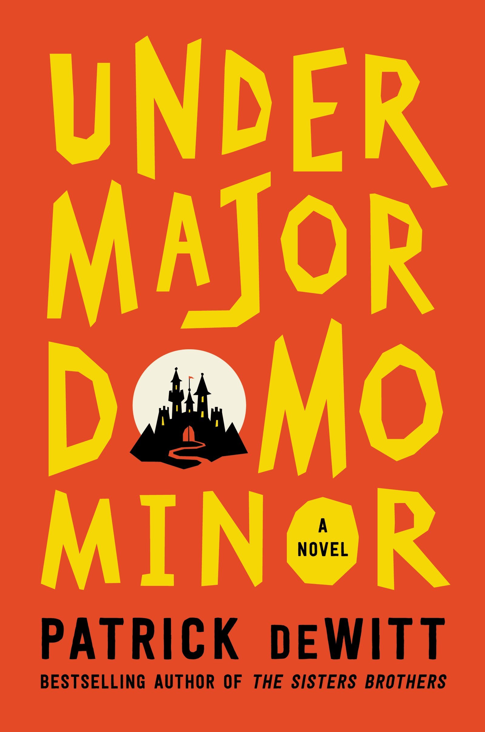
The most interesting challenge in recent memory was that of Undermajordomo Minor. We knew that it would be a difficult nut to crack from the start, especially since we had to live up to the success of The Sisters Brothers, Patrick deWitt's second novel. We also had to coordinate with the simultaneous British and Canadian publications, which added even more pressure to the situation. And both of those factors notwithstanding, the story is absolutely bonkers—in the best of ways. Since we knew that we wanted the cover to focus on the story's setting, a vaguely European castle in an unidentified century of yore, I first started with a moody, photographic approach. All of the fun of my initial comps were in the sketched hand-lettering, and while we all loved the castle imagery, it was decided that it might be a bit too moody and serious for this very funny story:
The logical next step was a bright, graphic treatment, so I pursued that direction while incorporating the main character, Undermajordomo Minor:
It still wasn't quite right—perhaps it felt too static? As a very last minute idea, and in an effort to create a more cohesive design, I whipped up the following type-driven cover:
Finally, we were done! It's funny how long the journey can seem with some covers, especially when the end result comes in the spur of a moment.


