Colin Webber on Designing The Lemon

Colin Webber is an Associate Art Director at Penguin Random House. Here he gives us a peek into his process for designing The Lemon.
The Lemon’s unique story is the product of Kevin Alexander, Joe Keohane, and Alessandra Lusardi collaborating under the Pen Name: S.E. Boyd. From a design perspective this was of course a major relief – Other writing trios take note! Each one brought their own experience and background together to craft an uncanny story that effortlessly blends the worlds of food, media, and celebrity into a darkly hilarious, high-stakes adventure.
A crucial theme from the editor that really helped shape my design process was his summation of the book as: “What happens to the solar system when the sun goes away? (The answer: The solar system loses its mind.)” I felt this was the perfect way to distill all the shenanigans that unfold following the unexpected death of a universally adored food/travel host named John Doe. There’s an ornery Irishman blackmailing a celebrity chef into jumpstarting his dream of fronting the best ska band of all time (despite having no band and no talent). A bored young journalist who rides her 15 minutes of fame all the way to the top (through sheer dumb luck of course). Meanwhile, John’s agent calling in every favor she can to make sense of it all and ensure his Legacy remains intact.
Some of the directions I explored played with incorporating John’s presence in some way as well as the specific bar knife he was described to always travel with. One design featured an illustration of the knife with a cast shadow revealing his silhouette. The intense imagery and bold red background were contrasted by a bright yellow font pairing that spoke to the comedic aspect of book. Another design showcased a cryptic portrait where his collar doubles as the knife handle.

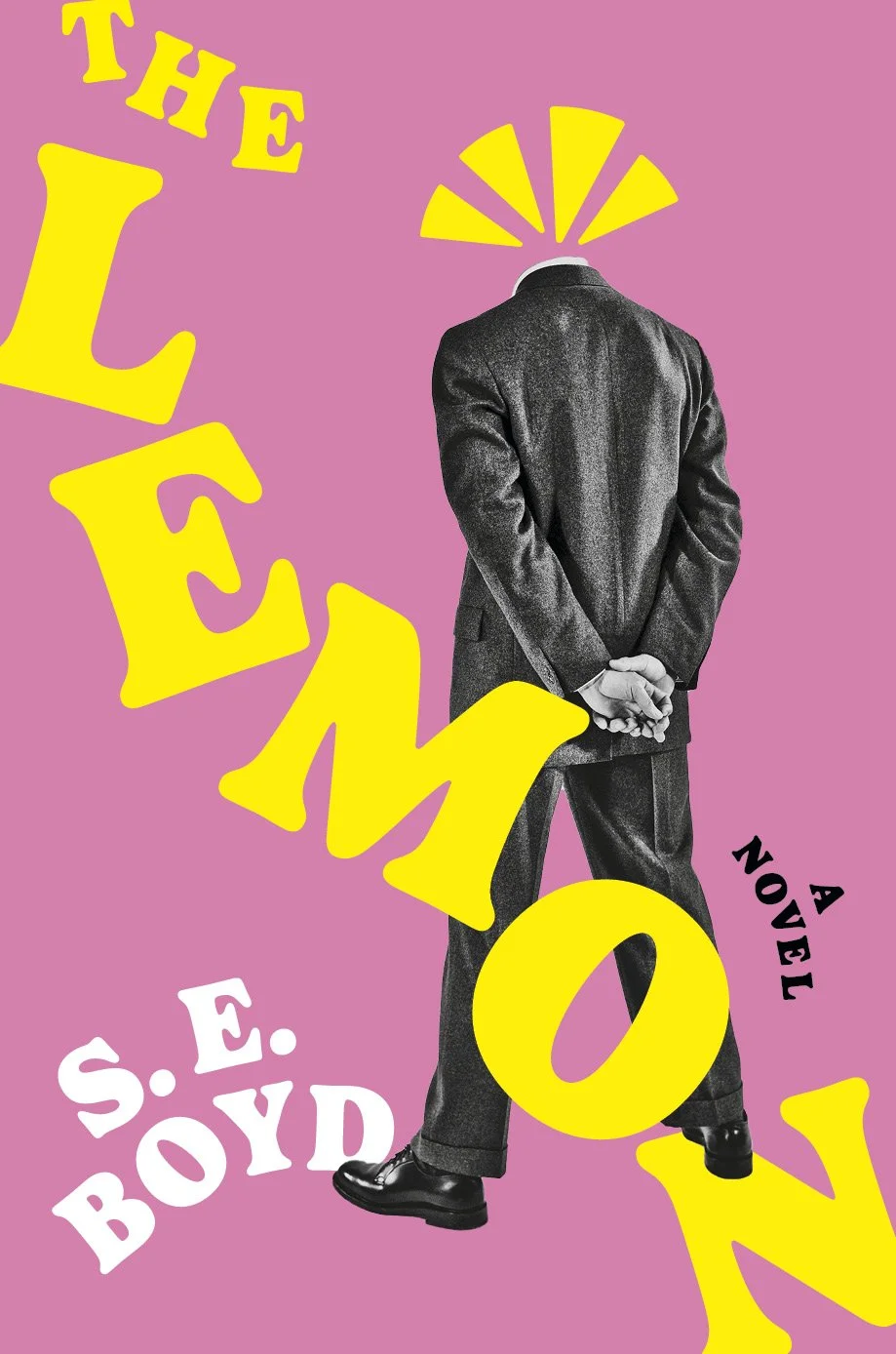

I wanted the design to reflect the frenetic energy that drives the action of the book. The type is all broken up and reassembled manually around the enigmatic silhouette at the center. The figure is set against a lemon shaped vignette which has been sliced in half. This moment directly nods to title while foreshadowing the character’s demise. My original design featured the lemon shape fully intact, but this was modified at the author’s request to give the design a bit more menace. A handful of dots accent the jacket to represent lemon seeds bursting forth and symbolize all the characters who seemingly come out of the woodwork. Overall, I liked the idea of a cover that feels somewhat collaged/hand crafted to reflect the multifaceted approach the authors took in building out this novel.
Ultimately, it was a clear path to the winning cover both in house and with the authors and I’m thrilled with where we ended up. It’s an outrageous read and I highly recommend it.
Final cover
Editor, artworker and lifelong bibliophile.