University Press Coverage, March 2026
Welcome to our University Press Coverage — known as the Uni-Press Round-Up on the right side of the Pond — a ongoing feature in which we highlight, with commentary, a selection of university and academic cover designs published this month. Please enjoy this celebration of amazing work.
The selections are in alphabetical order by press. Where possible, credits are listed in the captions (often with links to the designers’ other work), and each cover includes a link to the university’s official page for that title.
As with all cover designs we feature, we encourage you to head to your local library, college or university library, or bookstore to view the works in their full splendor.
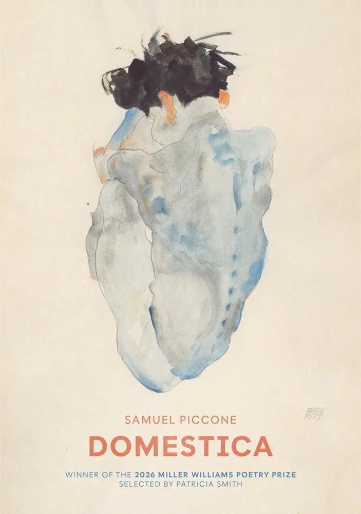
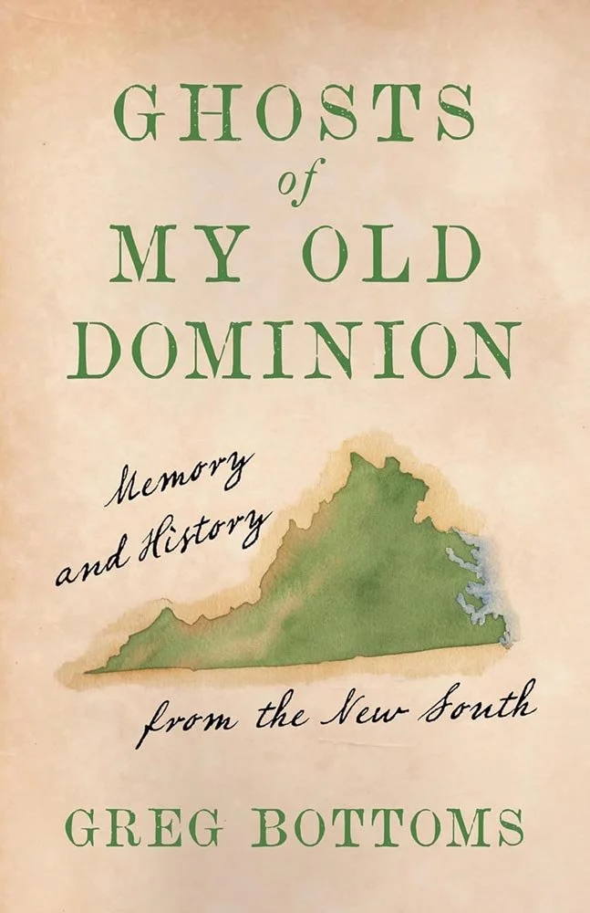
University of Arkansas Press. Cover design by William Clift. Art by Egon Schiele.
One of those covers where the image steals the show: in this case, Kauernder by Egon Schiele, an artist mentored by Gustav Klimt. Indeed, “the work is a striking example of Schiele's exploration of human vulnerability and emotional intensity, marked by his distinctive use of distorted forms and muted colors. Schiele's intense psychological insight into his subjects is evident in this powerful composition, emphasizing isolation and introspection,” a great choice for a title from the “intersection of inheritance and the escape from it.”
It’s complimented perfectly by the title treatment … and the callout, as well — an all-too-rare occurrence.
The artwork is from 1912 and in the public domain, which is important: this is a superlative image, freely available to use, and used well. I call this out because first quote in the paragraph above is from Alamy’s page, wherein they ask $39 for usage rights. (Sometimes, intersections are funny.)
How do you illustrate a “transnational construction of Chineseness,” “an identity constantly under renovation”? Well, interweaving the title with what defines (to Westerners, at least) the most Chinese of symbols seems appropriate, “deftly follow[ing] the many historical twists, turns, and official manipulations that have shaped the historical evolution of the elusive notion of ‘being Chinese.’”
The last quote was written about the contents, not the cover. That it still works so very well is … perfect.
Side note: If you’re not familiar, Joan Wong’s talents aren’t just in book design — her illustration/editorial stuff is fab, too.
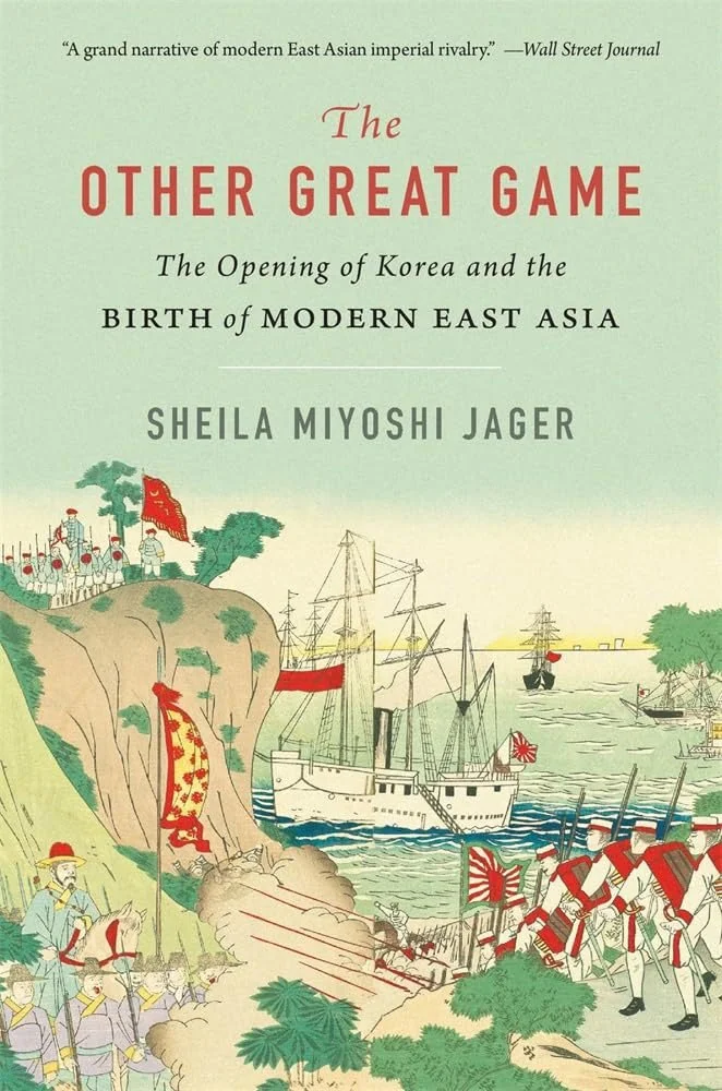
Harvard University Press. Cover design by Graciela Galup.
“In the nineteenth century,” the description reads, “Russia participated in two ‘great games.’ One, well known, pitted the tsar’s empire against Britain in Central Asia. The other, hitherto unrecognized, saw Russia, China, and Japan vying for domination of Korea. This eye-opening account argues that the contest over Korea set the course for the future of the global order.
“After centuries of isolation, Korea became a prize in the Sino-Japanese War at the close of the nineteenth century and the Russo-Japanese War at the beginning of the twentieth.”
The prize for us is the cover: a classic, busy illustration with all of the elements mentioned above, complimented by a sky filled with type. Some might call it old-school — but for this title, it works very well indeed.
“Simply, elevated” is definitely an undersell for this cover — between the watercolor treatment and superlative typography, it’d definitely need to shelf up. A classic example of turning a few ingredients into flavorful serving.
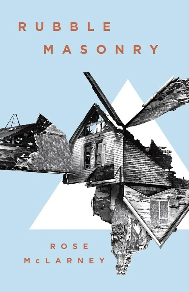
Louisiana State University Press. Cover design by Michelle A. Neustrom; art director, Barbara Neely Bourgoyne. Image: On One Hand the Other, 2016, by David Trautrimas. Courtesy of the artist.
“Rubble masonry,” for those not familiar, is using found objects — often from the building site — for construction of a wall or foundation. It’s also a great description of the striking collage used on this cover, with a complimentary holding shape and a stay-out-of-the-way type treatment.
This “powerful interplay of striking descriptions with tender intimations” gets a cover to match: simple, memorable, and subtly potent at the same time.
Awesome.

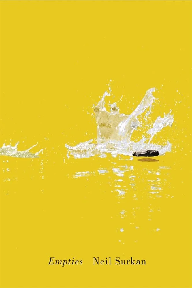
When looking for “the soundscape of these poems,” you’re looking for chamber music more than opera: “the blue-river thread in the warp and weft of the collection” replete with “goldfinches, blue-winged teals, waterthrushes, blue herons, and flickers.”
Another where the description and cover interweave in a way that delights.
Side note: It’s been a little while, but enjoy this behind-the-scenes look with designer David Drummond on his process for another poetry book for McGill-Queen’s, Rushes from the River Disappointment.
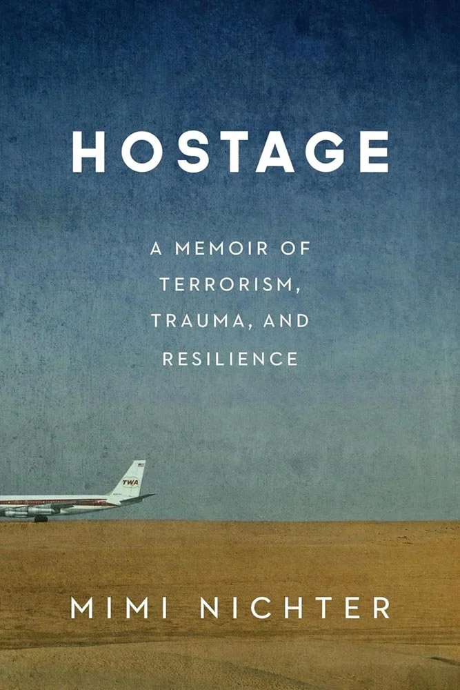
University of Nebraska Press / Potomac Books.
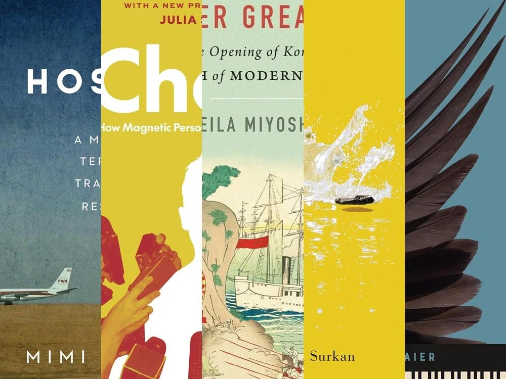
In September, 1970, in one of the most significant events in aviation history, the Popular Front for the Liberation of Palestine hijacked Trans World Airlines Flight 741 en route from Israel to New York. On board was Mimi Nichter, who, along with thirty-one others, were separated from the other passengers — accused of being Israeli soldiers — and held hostage in Amman, fearing for their lives as a violent civil war erupted around them.
To suggest that it changed her life is the very definition of understatement.
As we do in this column, the question arises: how do you illustrate such an event for the cover of a memoir? Very successfully, as it turns out.
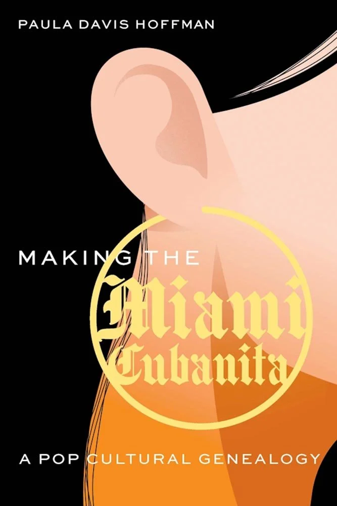
University of Nebraska Press.
An examination of “stigmatized ethnic signifiers” could not be better depicted; it’s become a label some proudly own — or worn, as in this close-up illustration that’s different from and better than what you might expect given a discussion of “historical forces that molded vacillating constructions of Miami Cuban women.”
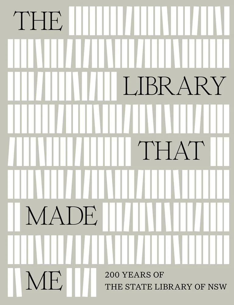
This title, produced in conjunction with the State Library of New South Wales, traces the history of — you guessed it — one of the oldest libraries in Australia, established in 1826. “In the early days members were vetted, women weren’t welcome and having fiction on the shelves raised eyebrows,” but its original subscription-only model has evolved into a huge, hugely significant, and hugely beautiful institution situated at the intersection of Sydney’s Central Business District and two parks.
Bestowed with that — all the photographic and illustrative options available (there are over 5 million items in the Library) — the cover looks like this. Why?
Because it doesn’t celebrate the answer, it celebrates the question: What’s a library to you? A book? A title? Location? Concept? With options this vast, all these things are what you bring to them. Rather than show you, this cover asks you.
Just right.
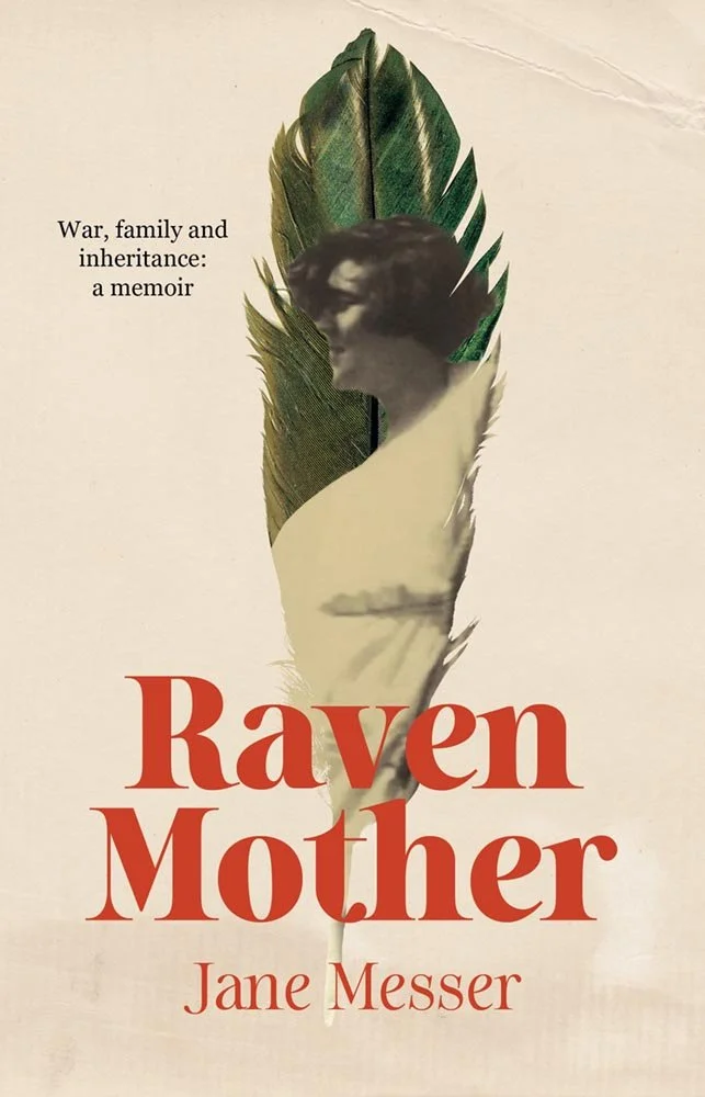
The image-in-feather maybe having a moment, but it’s done really well here, with the book’s subject, Bella, pictured circa 1930, against desaturated colors and aged background. When combined with the wonderful title/author type treatment, it becomes something that stands out from — stands above — the crowd.
I have to say: this early version of the cover is superior to the current one, unfortunately festooned with praisequotes. (Sometimes the give-and-take between design and marketing gets slightly out of control.) I’m glad we could highlight the one closer to the original vision.

Oxford University Press.
“Use images of Soviet leaders,” could result in something that edges towards boring, but this design not only makes sure it isn’t — and it ticks several of the design trend boxes in the process: halftones, Xerox-style illustrations, speckled paper, and perhaps appropriately, rules.
Another where some simple ingredients have been tastefully seasoned.
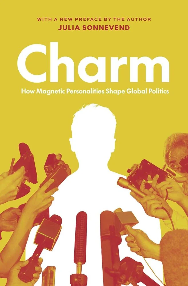
Princeton University Press. Cover design by Ben Higgins; art director, Jess Massabrook.
With respect to the folks that produced it, the hardcover version of this title wasn’t a success. The new paperback cover fixes that with style and, frankly, exactly the sort of charm the author strives to describe within.
As covers go, this is the post-primary pivot — and it’s better for it.
(Extra votes for the economical two-color production, too. Certain constituencies really appreciated the move.)

Rutgers University Press. Cover design by Ashley Muehlbauer; production editor, Vincent Nordhaus.
“Our initial direction for [the designer] was to create a clean, simple text design that conveyed crisis, dread, or the element of threat,” this title’s production editor writes.
To say that someone lit a fire under those directions is an understatement. In today’s American academic reality, where every day could indeed be … shall we say, fraught, this cover takes the brief and runs straight onto the dean’s list.
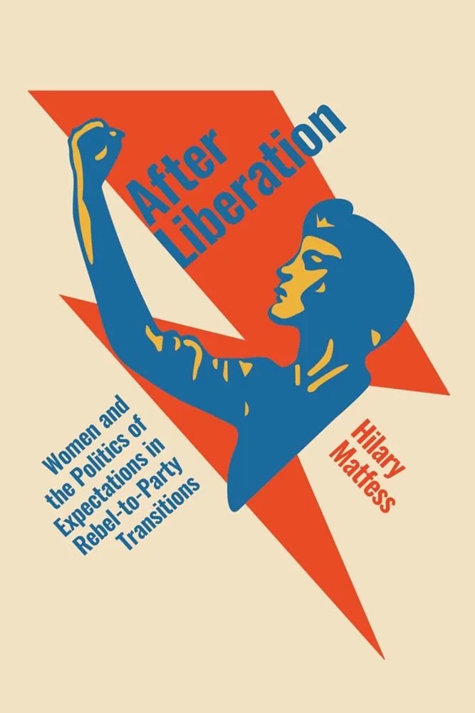
To paraphrase the description: “Why are women that were once lauded as the backbone of the revolution so frequently relegated to the backburner after war?”
And what hand gestures might they make? (Sorry. Had to ask.)
This titles studies situations where there the successes gained were — and weren’t — translated into meaningful participation. Given that, the design chosen brings just the right style and drive to the party.
Are you a book cover creative, art director, or publicist? If you want your work, or the work of your press, to be reviewed be sure to get in touch with us.
Please include the cover designer’s name, the art director’s name, any additional details like illustrator or photography credits, and the publication date. (Yet-to-be-published titles are welcome, with embargo dates if applicable.) Images should measure 1200-1500px on the long side, preferably in JPG format and the sRGB color space.
We look forward to featuring your work soon!
A freelance designer and photographer, Giles has been writing about book design for nearly thirty years. During his spare time, he walks, explores architecture, and enjoys music on a great stereo. He lives in Middle Georgia with a dog and cat.