University Press Coverage, May 2026
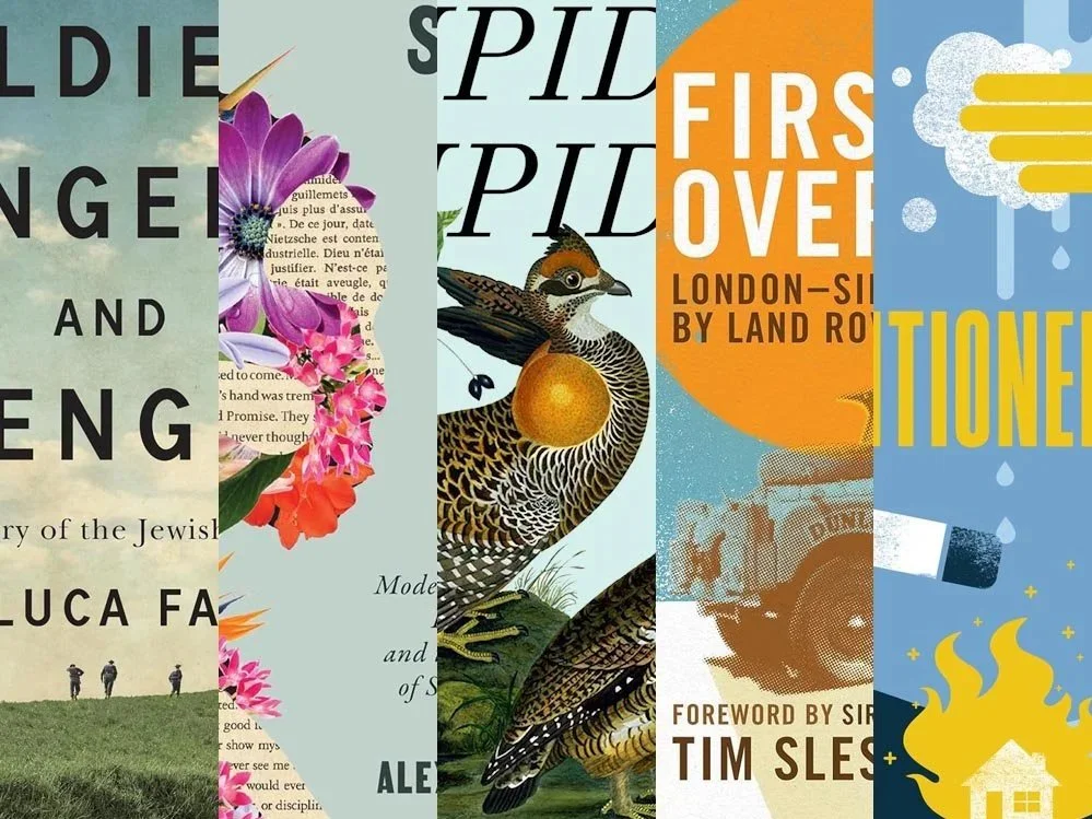
Welcome to our University Press Coverage — known as the Uni-Press Round-Up on the right side of the Pond — a ongoing feature in which we highlight, with commentary, a selection of university and academic cover designs published this month. Please enjoy this celebration of amazing work.
The selections are in alphabetical order by press. Where possible, credits are listed in the captions (often with links to the designers’ other work), and each cover includes a link to the university’s official page for that title.
As with all cover designs we feature, we encourage you to head to your local library, college or university library, or bookstore to view the works in their full splendor.
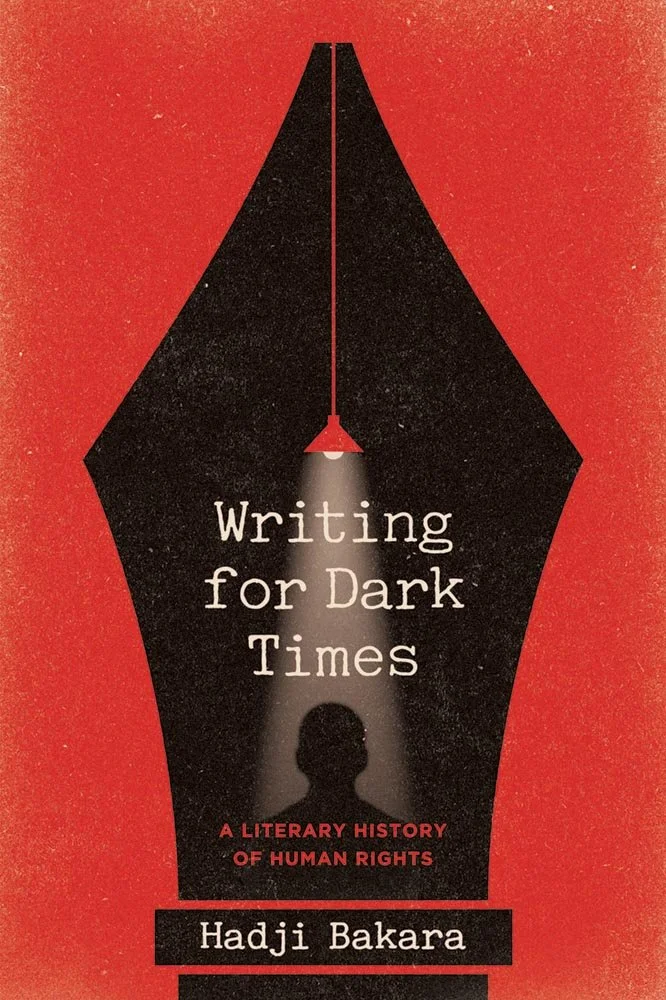
The “story of the writer’s distinct place in the history of human rights” could not be more ably covered: the vent as a shadow-caster is brilliant.
(What that cover, they should have retitled it, “Writing for dark tines,” but His Nibs editorial might have intervened.)

Georgetown University Press. Cover design by Trudi Gershenov / TG Design; production editor, Elizabeth Sheridan-Drake.
The style of a period handbill with the typography to match: posted!

University of Georgia Press. Cover design and art direction by Erin Kirk.
“I thought about all sorts of ‘rejection’ concepts,” Erin Kirk writes, “but decided to go with the classic thumbs-down. The book covers a wide range of time, so I thought the old type and paper was a fun mix with how we think of thumbs-down in modern times.”
Tapbacked with a thumbs-up.

Harvard University Press.
“Toward the end of his life, Thomas Jefferson made his most famous statement about American slavery: ‘We have the wolf by the ear, and we can neither hold him, nor safely let him go,’” the description reminds us.
The mini portrait is good (off-center, on-trend), and the background and type choices correct — but it’s the wolf’s shadow that’s going to follow you, nip at your heels, and eventually wear through.
Exactly right.

Johns Hopkins University Press. Cover design and illustration by Kelley Galbreath; art director, Molly Seamans.
The way this works is what makes it special: basic-but-not illustrations — done by the designer — and a limited color palette are elevated well beyond simple with great style and presentation.

Ultimately, this selection is all about the image on the left: one can’t help but wonder about the situation while simultaneously admiring the woman’s proud, intelligent, and oh-so-communicative, straight-into-the camera stare.
When combined with the off-center presentation — perfect — and the illustration on the right, this title earns its place.

McGill-Queen’s University Press. Cover design by David Drummond; art director, Elena Goranescu. Image: Pideura area, Italy. Photographer: Levine, 196th Signal Photo Co. Photo Source: U.S. National Archives. Digitized by Signal Corps Archive.
At first glance, this title marches in the “simply, elevated” category: good type over a well-chosen image.
But the moment you look at it a second time, more is revealed. It’s a great photograph, showing “Infantrymen of the Jewish Brigade leave the road and cut across country on their way to the front,” taken in March, 1945.
Drummond made a wise choice: when history is pictured as well as it is here, let the type cover the flanks.

How do you get seven official portraits, including party affiliation, onto a book cover without turbulence? Or doing something Rudd?
Ironically, it took Design by Committee.

University of Minnesota Press. Cover design by Michel Vrana; art director, Daniel Ochsner. Photograph: Main Street and 200 South, facing southeast, captured by Charles Roscoe Savage in the 1880s. Utah State Historical Society.
The first of two fiction titles in this month’s column, a category not often seen — but just as deserving of a great cover as all University titles.
For this one, there’s no mystery: it’s the strong image — with its strong color — and classically-strong type. (And that Wasatch wasp.)

Oxford University Press.
A sterling example of cover design, with interesting photos, great halftones and texture, just-right colors, and, of course, the sunny highlight of the title: you don’t know it’s in the 1950s, but get the idea.
As an aside, glass raised to Sir David’s 100th.

Princeton University Press. Cover design by Katie Osborne; art director, Maria Lindenfeldar.
It’s sometimes difficult to notice in the imagery we use … but in print, the texture of de frock is easy to see.

University of Tennessee Press.
Quilted excellence sews confidence, necessary when comforting mistrust.

The second of our fiction titles for this month — also a mystery of sorts, albeit completely different from the one above.
The egg is eye-catching enough that not knowing it’s lead character Ignatius’ nickname is okay; when combined with the “secretive ground-dwelling” birds, color, and type choices, you’re likely to want to discover.

I know the women-with-flowers thing is a trend — but here, the interesting shapes and (apropos) text background take it somewhere new. I like both the background color and type choices, as well, and while it’s difficult to see against the light gray background, bonus points for the white margin.
“[R]ethinking the self in ways that exceed constructions,” indeed.
Are you a book cover creative, art director, or publicist? If you want your work, or the work of your press, to be reviewed be sure to get in touch with us.
Please include the cover designer’s name, the art director’s name, any additional details like illustrator or photography credits, and the publication date. (Yet-to-be-published titles are welcome, with embargo dates if applicable.) Images should measure 1200-1500px on the long side, preferably in JPG format and the sRGB color space.
We look forward to featuring your work soon!

A freelance designer and photographer, Giles has been writing about book design for nearly thirty years. During his spare time, he walks, explores architecture, and enjoys music on a great stereo. He lives in Middle Georgia with a dog and cat.