Trust Signals and Identity Creation: The Case for Imprint-led Book Cover Design
Walk into any lit-fic dominant bookshop — or browse your aesthetics-driven bookish social media of choice — and you’ll quickly notice a growing trend: minimalist, serialized cover design.
This might come in the form of classic paintings across similar-looking covers. Or just a white serif font on the same block of royal blue. No real clues about the contents of the book, and yet the right reader will immediately know what they’re looking at.
While upmarket fiction publishers stick to eye-catchingingly unique motifs, smaller literary fiction presses are increasingly turning to this type of imprint-led cover design. That is, design where the prevailing visual signals the publisher, not the story. Why is that?
The shift from communicating content to curation
This move towards imprint-led design, especially in literary fiction, marks a subtle but important culture shift. For some time now, covers have functioned as interpretive tools — translating a book’s content into something legible at a glance. Whether they indicate genre, tone, setting, or even plot, great book covers have historically worked as effective visual summaries of the stories within.
Now, many lit-fic covers are doing something different. They still create reader expectations, but they are less specific, less story-based. It’s no longer “what is this book about?”, but rather “does this book align with my pre-existing idea of who I am?” Put shortly, these covers can connect to readers’ identities — potential or actual.

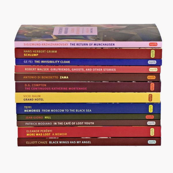
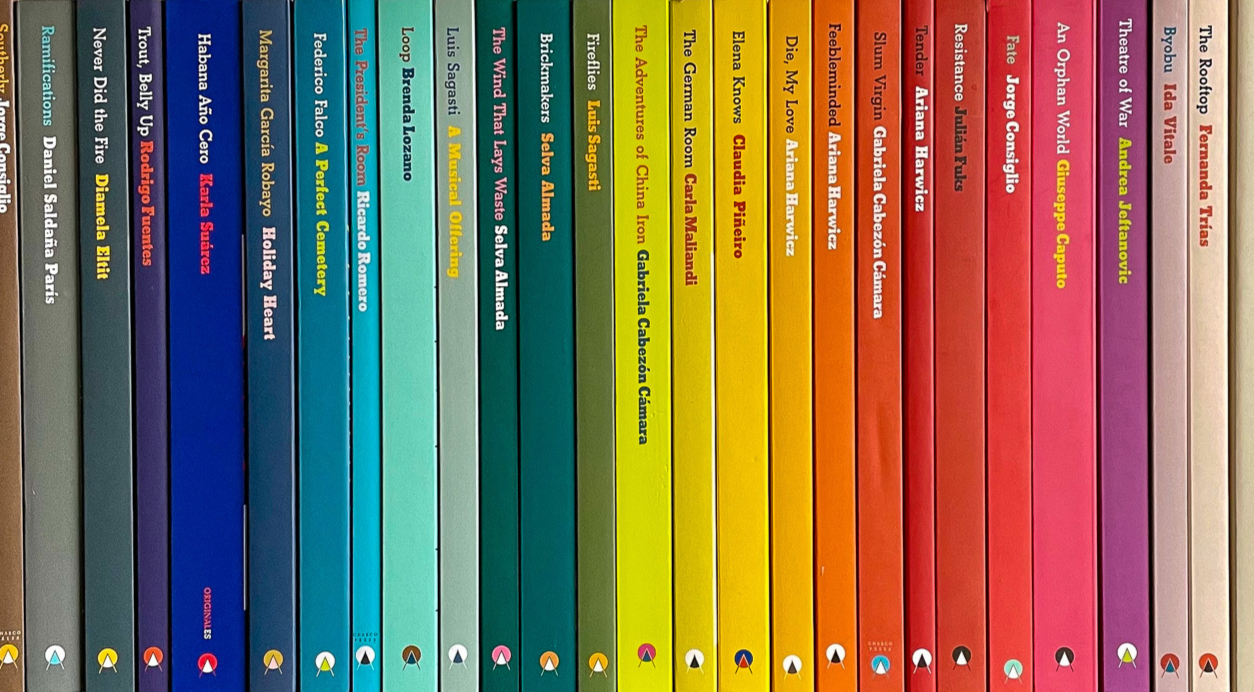
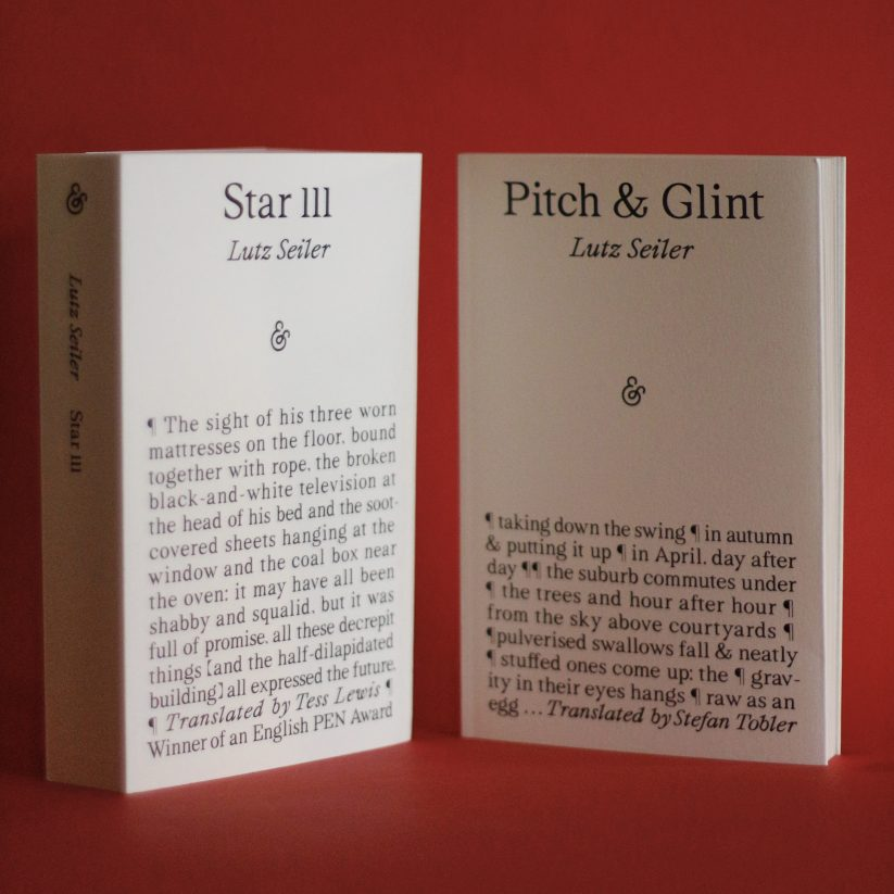
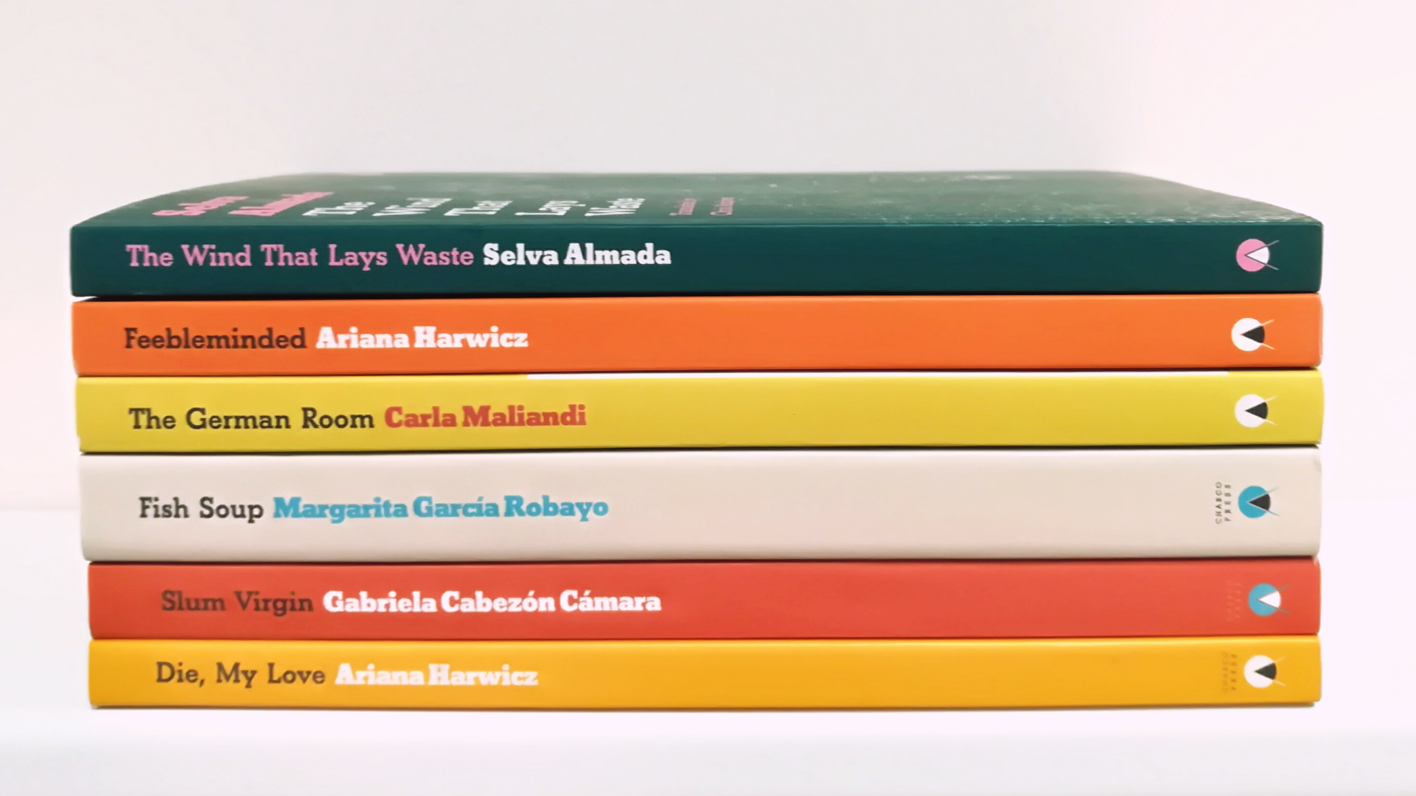
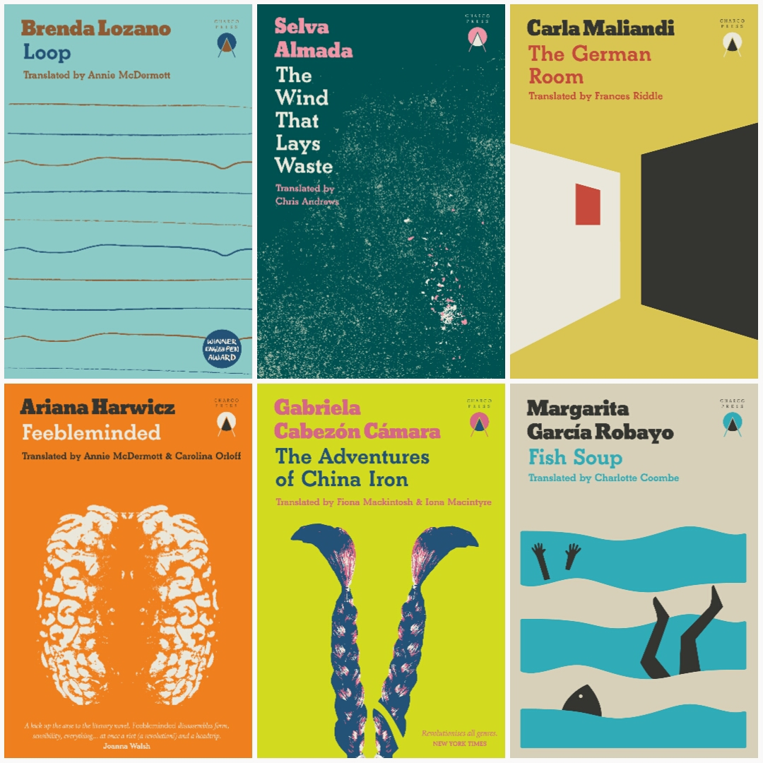
Take Fitzcarraldo Editions. Their now-iconic cover design — fiction in International Klein Blue with white serif font, and non-fiction in an inverted color scheme — has nothing to do with plot or subject matter.
Rather than appealing to readers on the basis of content, they are counting on a certain set of literary values: seriousness, internationalism, and prize-winning prestige. Readers who identify with these values will consistently return to their catalogue even if the author and content shifts.
Needless to say, this also results in a flattening of narrative difference. A novel about exile, a philosophical essay, and a work of autofiction will all appear visually indistinguishable. But as readers begin to trust the imprint, buying decisions shift from “do I want this book?” to “do I want to read something like this?”, with the publisher acting as guarantor.
In short, the cover design is no longer selling a story. It is selling a taste profile.
The minimalist paradox: less specificity, more projection
Minimalism plays a key role here, but there is, of course, a trade-off.
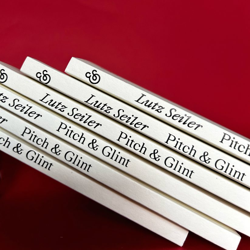
By stripping away imagery and narrative cues, minimalist covers remove specificity. However, in its place we get cohesion, recognition, and trust via their reassuring continuity. That sense of reassurance, in turn, creates a subliminal “safe space” for abstraction and projection.
Again, think about how typical cover designs use elements like typography, color, and design “language” to communicate things like genre and tone. In serialized cover systems, the signals shift from being about genre to being about brand. But equally, the less a cover tells you, the more it allows you to project onto it.
As I touched on above, this projection can often relate to prestige and self-image; with a Fitzcarraldo Edition, for example, a reader might imagine the story to be dense yet innovative, challenging yet rewarding. Then, because they think of themselves as the “type” of person to read such a book, they’re more likely to pick it up.
Indeed, even for many “non-projecting” readers, minimalist design is a welcome shift. It simplifies choice, reduces friction, and creates a clear pathway through an overwhelming market.
How lit-fic has borrowed from genre fiction
It’s a well-known fact in book marketing that series sell. If people like the first book in a series and it already has a sequel, they’re likely to buy it right away — and so on for further books.
Genre fiction publishers and self-publishing authors have harnessed this principle for decades. Fantasy, romance, and thrillers rely heavily on series — not just narratively, but also visually. Matching covers, recurring fonts, and consistent layouts create continuity and train readers to quickly recognize, trust, and return.
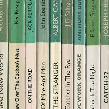
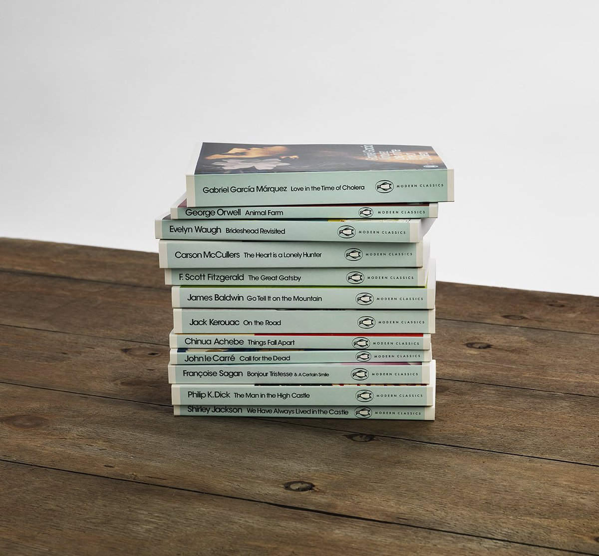
Mid-century imprints like Penguin Books built their identity on similar visual systems. Orange spines for fiction; blue for non-fiction; green for crime. The design was standardized, repeatable, and unmistakable. We still see this with their different classics series — from the pale blue modern classics to the iconic black spines.


Contemporary literary fiction has had a harder time adopting this model, largely because the genre focuses on standalones, and smaller houses may not carry the same seal of approval that Penguin automatically does. Since each book is self-contained, lit fic publishers have instead typically chosen to home in on their unique selling points — trying to distinguish them from the competition through bold, striking motifs or author branding.
Imprint-led design offers another way. A Fitzcarraldo title may not be a sequel, but it feels like part of an ongoing project which readers can follow over time. As trust is established, a reader who buys one is more likely to buy another, eventually building a collection of standalones.
Some publishers even add the catalogue number of each title to their cover design to indicate what number in a sequence of works the reader is holding in their hands. For completionists, seeing a shelf full of spines from the same publisher, numbered from 1 to infinity, will have the same satisfying effect as collecting the complete works of Stephen King — and this holds true even if the authors and contents of the books are wildly different.
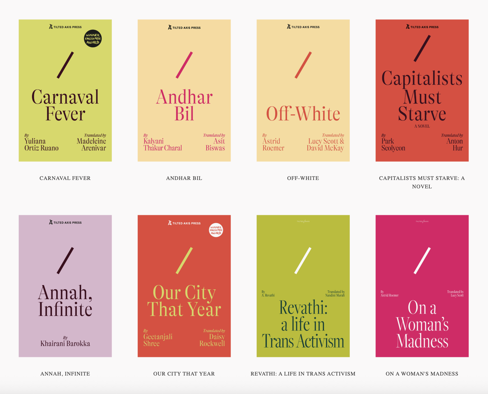
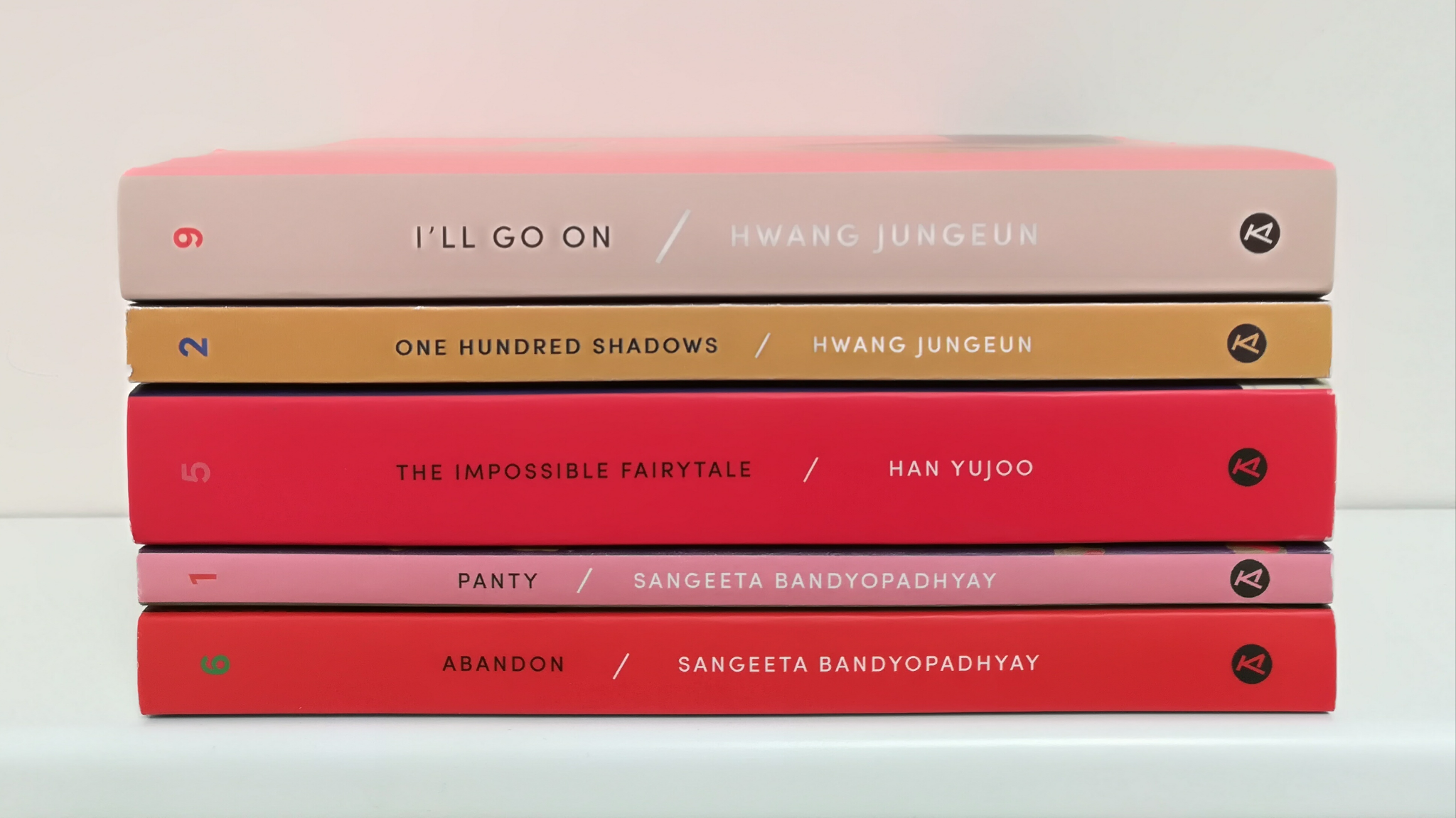
In other words, the serialized, imprint-led cover design is a way for lit-fic presses to replicate the marketing advantages of the series-model — without actually needing to publish sequels or build up individual author brands.
The social media effect: reading as a public performance
Another reason this type of design has taken off is because reading is, in part, performative. Books are no longer private objects. They appear on social media, among curated collections, in tote bags, in carefully composed “currently reading” posts.
I’m not saying this in a cynical sense. On the contrary, it can be nice to think that reading has become more visible, shareable, and socially meaningful than ever before. We want to find people who share our tastes to discuss and dissect these books with us.
Uniform cover design makes books quickly legible within this ecosystem. Like a peacock flaunting its feathers, the serialized cover design works as a signal, widely understood within reading communities that speak the same visual language. Without even having to see the title or author’s name, fellow Fitzcarraldo or NYRB readers can easily spot their peers in the wild (or on the internet) and flock together to curate their aesthetics and identity.
In this context, books (once again) function like cultural markers — but in an even more collectivist sense than I talked about above. They communicate affiliation, camaraderie, and even shared aspirations. Who am I, and with whom do I want to be associated?
The economics of sameness
Finally, beyond aesthetics and identity creation, there is also a more pragmatic driver behind this trend: efficiency.
Designing a bespoke cover for every title is expensive and time-consuming. It requires concept development, illustration or photography, multiple iterations, and coordination across teams.
Indie publishers with smaller teams and slimmer profit margins can use these types of visual systems to streamline their operations. This allows them to focus on literary curation rather than “traditional” marketability.
It also reduces risk. Instead of betting on a new cover concept for every title, publishers invest in a system that accumulates value over time. In this sense, serialization is not just an aesthetic choice — it is a business strategy. It allows small, independent publishers to build a recognizable presence, even without the resources of a Big 5 publisher.
As the industry continues to hollow out — leaving a handful of mega-publishers at one end and a growing number of niche presses at the other — identity has become a key differentiator. Smaller presses can’t compete on scale, but they can compete on curation, taste, and cohesion.
Imprint-led design is one of the clearest expressions of that strategy. It allows publishers to build something greater than what they can achieve with any one cover: a catalogue with collectors’ value. A system that readers can recognize, trust, and, crucially, see themselves in.
In that sense, these covers are doing exactly what good design has always done — communicating meaning at a glance. The meaning may have shifted, but the central mission has not.
Linnea Gradin is a writer for Reedsy — a website that connects authors with freelancing publishing professionals and gives advice on everything writing and publishing related, and how to get into the publishing industry, from how to become a book cover designer to how to set your design rates, and where to find book design jobs. When Linnea is not reading, she can be found dribbling on the football pitch, dabbling in foreign languages, or exploring the local cuisine of whatever country she happens to be in at the time.